
Check out the Cardinals Shop page … They have new fan jerseys on sale now in the new Nike template.

We’ve heard lots of information about the new Nike templates and their attempts to streamline the uniforms. I am fairly certain that these jerseys for sale are only replicas of the real thing, not on-field authentic jerseys, because they aren’t chain stitch embroidered. We got word from Paul Lukas at Uni-Watch talking to BD3 that the team would still use chain stitch embroidery for the on-field uniforms, and that’s a good thing. Again, these jerseys are noticeably not chain stitched. We still haven’t seen how the actual 2024 on-field jerseys are going to look, but we got some info from BD3 via his interview with Paul Lukas as Uni-Watch. Here’s what Bill said, “We are maintaining the chain-stitching next year with the new Nike template — I had to fight hard to keep it. But the compromise was that it will need to be applied to a patch, which will then be applied to the uniform.” Check out that Uni-Watch article here.
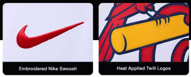
Regarding the jerseys on the Cardinals Shop page… Nike says on the site these new Vapor Limited jerseys have “heat applied twill logos,” which means that it’s a piece of fabric, or rubber, or whatever material, that is applied to the fabric with heat, like an iron on logo, and then I assume reinforced with the tiny twill stitches on the outlines. It’s curious that they boast about embroidering the Nike logo, but put a big non-embroidered patch as the jersey logo. Different types of embroidery, but still. It’s not perfect. BUT AT LEAST THEY GOT THE LOGO CORRECT! If you want to know more about getting the Birds on the Bat correct, keep reading, I put the preface in the middle.

The preface. I was 5 years old when I saw the Birds on the Bat being drawn and created. And even at that young age, it was exciting and interesting knowing the team was going to get a new logo and new uniforms. And when the uniforms debuted, as a 5 year old, I looked at the uniform and said to my dad, that’s not the logo you designed… It was explained to me that because the Birds on the Bat was hand embroidered onto the uniform, it would never be exact. In the next 14 years the embroidery remained inaccurate to the digital graphics, and got worse and worse on the uniform until we had tiny birds with almost no detail. We put our foot down during the 2012 season, and in 2013 it got fixed. Hats off to Majestic Athletic for being able to combine a new computerized stitching technique with real chain stitch embroidery to create something that was far more accurate to the actual logo. The rendering on the jersey wasn’t a perfect copy of the digital logo, but that remains nearly impossible with chainstitch embroidery. And we weren’t looking for an exact copy, either. With chainstitch embroidery, it is sort of limited to a single line weight when making the outlines, and that reduces the details that can be shown. The trade off from not having an exact logo on the jerseys is that we get beautiful texture from the chainstitch embroidery, and we get to maintain a 100 year old tradition. With the new computerized techniques, the jersey was the closest it ever had been to the real logo and still looked good. How good? We think it looked the best it ever had.
When Majestic lost the contract after the 2019 season, and Nike took over, we got a little nervous how the uniforms would change. Luckily they didn’t. Nike has done a great job producing the Cardinals uniform from 2020 through 2023. The chain stitch embroidery was done directly on the uniform and was in the same accurate rendering of the logo that Majestic had done for 7 years. But that leads us to back to the upcoming 2024 season.
Lots of information has been coming out about Nike’s new uniform template. It has a number of new features to it, and the embroidery is a big part of it, but let’s talk about the other features first.
First up. Nike has new pants and specifically new belt loops. Instead of traditional looking double belt loops in the front, it has changed to wide angled belt loops. Check out the slideshow on this site to see how the wide belt loops look.
Next. The numbers on the uniforms have little perforation dots in them. This seems to be the case for both the front and back numbers. A reddit user got some great shots, see slideshow of the perforation dots of that here.
Next. The shirt front will have added little collar thing around the neckline to the jerseys. I often refer to it as the “little collar thing,” I’ve seen it been called an extra seam, and it also reminds me of the sun collars we saw the Cardinals wear starting in 1909. I don’t think it makes sense to have the little collar thing on our uniforms, it serves no purpose. I would prefer the old uniform template.
Finally. The shirt will now have a very skinny placket. The placket is the area where the shirt folds over itself in front and buttons together. Nike has made this significantly skinnier than past years. This will affect our uniforms in two ways. One, the piping down the center of the cream and blue alternate jerseys will now run through different parts of the Birds on the Bat and lettering. Two, this will affect how the logo breaks across the shirt front. Paul Lukas of Uni-Watch covered some of this for other teams.
Now going back to what BD3 said, “…the compromise was that it will need to be applied to a patch, which will then be applied to the uniform.” Meaning that they are going to chain stitch the Birds on the Bat onto a white patch, and then stitch that patch onto the jersey, similar to what the Phillies do. Does this mean we will see thick white outlines around the logo like the Phillies have? Not sure. Does this mean they are going to have to stitch the birds in two different patches and apply them separately so they line up? Not sure. Personally I think all of this is odd and kind of dumb, because if you look inside of the former on-field Cardinals jerseys, there is already a felt patch inside of the jersey that the Birds on the Bat is embroidered on to. Essentially, DeWitt had to fight to get Nike to continue to do what they were already doing, but now the white felt patch will be visible on the outside of the jersey, instead of hidden on the inside? Yet to be seen.
At this point in time, we’re just hoping they get the logo right, and that it looks good.

I have never been a fan of how replica jerseys look, period, and in my limited experience with them I have noticed that the iron-on/heat-applied twill logos tend to get dirty/fade/stain much more quickly than the rest of the jersey. We’ll see how these new Nike’s hold up
As for the authentic on-field uniform changes that we have yet to see in person, I find all that I have heard about them to be quite unnerving. Speaking about the Cardinals specifically, smaller NOB, and that damned patch do not sit well with me. My hope is that they have the jersey logo chain-stitched onto patches that match the color of the jersey they will be on, but I fear all uniforms will feature a logo outlined in white. It won’t be all that noticeable on the home whites, and I think it will actually look nice on the Spring Training/BP jerseys (a-la the 1998-2006 BP jerseys), but on the road grays, home cream, and powder blues it will be offensively bad. I am having flashbacks to when they wore some pretty awful throwbacks in the mid-aughts that had a logo on a patch sewn onto the front of the jersey. Disregard how terrible the logos themselves were; the white patch stands out (and not in a good way) on its own.
From 2007 – A road gray with patched logo: https://ibb.co/9YsqdkW
Also from 2007 – A powder blue with patched logo: https://ibb.co/yfZdLh7
Photo credits go to William F. Henderson’s invaluable Game Worn Guide to MLB Jerseys
LikeLiked by 1 person