

Derek Goold on Twitter sent out a picture of the front of the jersey, our first look.
My first impression? It’s wrong in so many ways. Let’s cover all the points we can see.
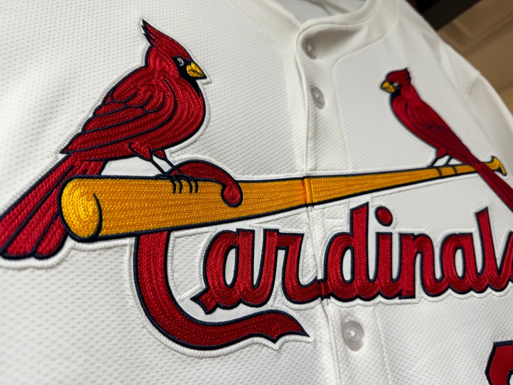
First, let’s start with the shirt buttons. Historically with the Birds on the Bat the buttons have been even spaced down the jersey. This was necessary because of how the Bat and Cardinals script sits so much lower than the Birds. Now it has the first two buttons close together and then a big gap. With other teams who have full lettering in that space, the two close buttons makes more sense, but not for the Birds on the Bat. See below for comparison.

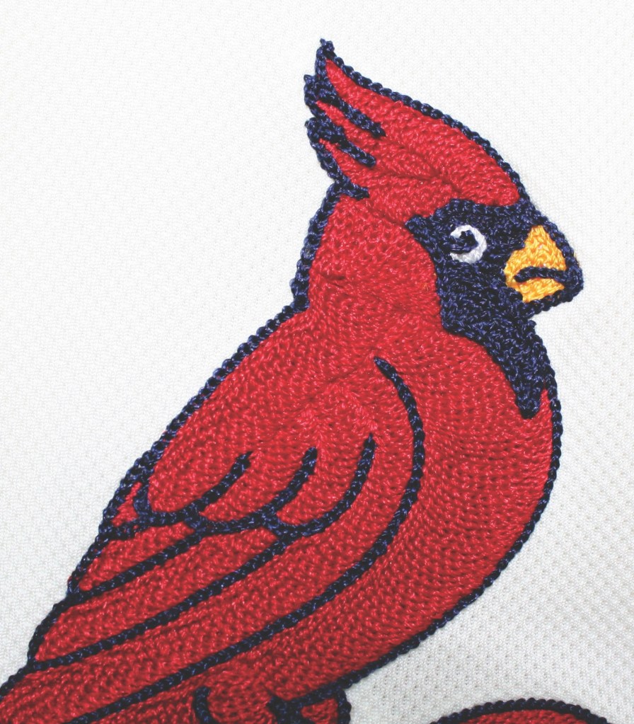
Next let’s talk about the stitching itself. The blue outlines, let’s be clear, ARE NOT CHAIN STITCH EMBROIDERED. The blue outlines are embroidered similar to Nike’s selfish vanity splotch on the chest. They are smaller stitches, and while they do allow for more detail to be as exact as possible to the original logo, that’s not the point. The point is that the entire Birds on the Bat logo is chainstitch embroidered, and this is not. This looks like they laid down big fields of red and yellow chainstitching first, then came back over the top with the smaller blue stitches to get the logo as exact to the graphic as possible. And I think that makes it look really cheap. The original intent in 1922 was that the graphic was hand embroidered. It’s decorum was unmatched in professional sports, and it lasted for 102 years (not including 1956).
Looking closer at the red and yellow, those are indeed chainstitched, but they’re in a very different pattern than previous seasons, and the 2024 stitching doesn’t look like it has nearly the same depth nor quality of thread as previous years. I think the lack of depth I’m perceiving is because the blue outlines seem so much more raised over the other colors. See comparison below.

Next. Look at the white patch outline around the logo. I can see that the white jersey fabric and the white patch DO NOT MATCH in color, and it’s just so disgustingly unattractive and an extremely negative downgrade to the Cardinals uniforms. You can see stitch marks all around the outline of the patch giving it even more texture that clashes with the Birds. There’s also a few really gross spots that got filled in too much creating uneven weights throughout the logo. Take a look between Left Bird and the Bat, lots of white space that doesn’t match the color of the uniform. Take a look all around the first A in Cardinals, lots of white space. Take a look how the D in Cardinals connects to the bat, awful.
And finally, take a look at the quality of the fabric the jersey is made out of. A number of reports have said how poor the quality of the fabric is. And Paul Lukas at Uni-Watch hilariously stated, “Does anyone else think Nike’s new jersey fabric looks like a paper towel?” I think it looks like shit mostly because the two white colors don’t match.
Overall… I think it’s BAD. It looks like a half assed made patch with a gross white outline that doesn’t match the jersey color and applied onto an ultra thin piece of shit fabric with bad button spacing. At least the logo looks correct? NOPE. This is a downgrade to what we had.
The future is here and I don’t like it.


Even worse than I imagined. Thank you for taking the time to detail this shit storm of a uniform. It can only be worse for that jerseys that aren’t white.
LikeLiked by 1 person
oh god i forgot to talk about the gray, cream, AND blue fabrics. I would hope they don’t use the white patch for the colored fabrics.
LikeLike
And MLB and Nike say to you all: “We don’t give a sh!t what you think.”
Make a deal with the devil…
LikeLiked by 1 person
Well, as awful as these are (and they are awful) this photo would indicate that, at the very least, they will be using gray, cream, and blue patches for the corresponding jersey tops:
https://ibb.co/wBqhsMp
LikeLiked by 1 person
Yes, i got a good look of the road grays on the Cardinals instagram, and the patch job doesn’t look nearly as bad as the white uniform, but I can still see a multitude of issues.
LikeLike