

Amongst the changes of the new 2024 uniforms the font for the player names is also changing. We’ve seen this in photos in the last few weeks, but now we’re here to show them graphically to get the best comparison.
In the image below, the letters on top are from 2023 and prior years. The Cardinals have used those letters for many years now. The letter set on bottom is the new font set for 2024 and Nike’s new standardization.

Notably at first glance, the new letters have more line weight and aren’t as tall as the previous letters. And I must give Nike a tiny bit of credit in creating these letters, because when going into the graphics of the old letters, I found that each letter had incredibly inconsistent line weights, seldom having and 90 or 45 degree angles at the corners, and very few letters were actually the same height. It was a mess. So I took some time to redraw all of the old letters to all be consistent. The new letters, on the other hand, were much more consistent. I couldn’t find many errors at all. There is consistent line weight, good angles, all uniform, they line up at top and bottom… I must say they were created very well.
But! Let’s talk about how they look overall and especially how they appear on the uniforms. Take a look at some Mikolas mockups I made and see how they compare. You’ll see how in 2023 the name appeared much bigger than in 2024, and with much less of a circular arc. The new letters seem a little dinky, and it’s not just graphically. It really looks awkward on the uniforms, and I think it’s because humans just aren’t shaped that way. The way a human’s shoulders and upper back are shaped, the old lettering really feels more natural with the more subtle arc.

First let’s look at how it appears on a graphic jersey straight on…. Yes, I am using the old uniform template for both players below, but it really gives you a good idea how it appears so small and oddly shaped. Both #39s are the same size, and have been perfectly centered on the jersey back. The only difference is how the letters appear.

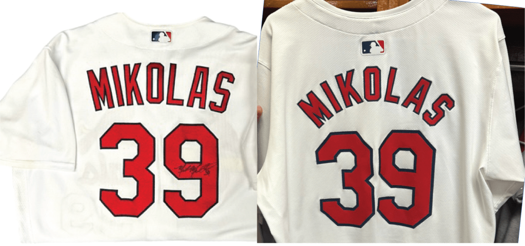
Take a look at the source photos below.
Ron Darling also had some great words in the first Spring Training as the Mets took on the Cardinals. See video below.
As always, tell us what you think.

I am not a fan of the new lettering at all. I don’t care if it does closely resemble the NOB lettering of days gone by; it is an eyesore in 2024. They are incredibly hard to read, and as has been stated numerous times in numerous places, they look cheap.
LikeLike