
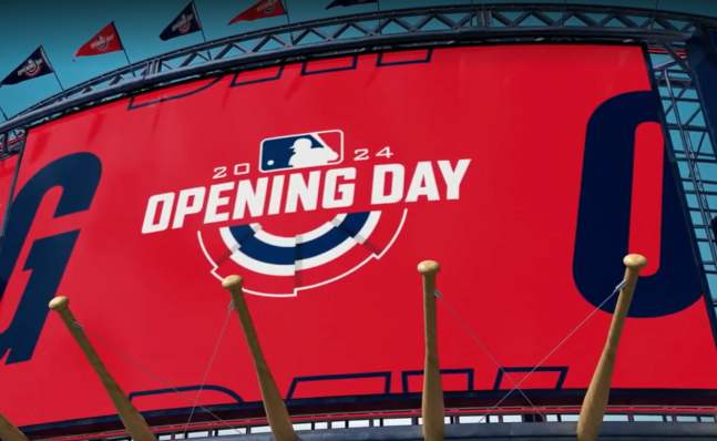

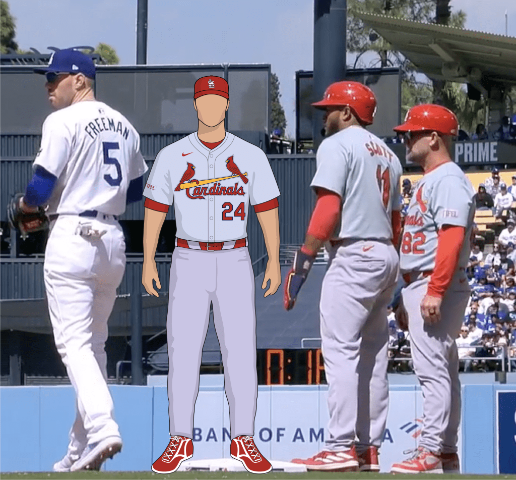
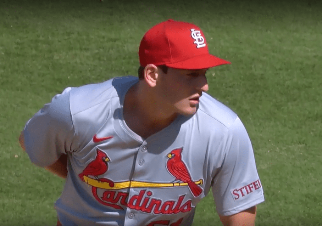
Cardinals opened the 2024 season yesterday, March 28, in Los Angeles against the Dodgers. It was a highly visible look at the team wearing the new cheap nike uniforms, and we got to see them in different lighting other than the Florida sunshine. I was able to grab some screenshots from the broadcast. Here’s what we noticed…
The Gray Still Doesn’t Match
The issue reported during spring training that the shirt and pants are different colors of gray is persistent. I will admit, it looked A LOT better on TV from Los Angeles in peak daylight hours, but it was still noticeable. The shirts are more on the blueish green side, the pants are more on the magenta pink side. I’m interested to see how good/bad this will look as we play in other locations and other times. I think we’re going to see this look very different depending on the ballpark we’re playing in, the lighting at each ballpark, the time of day, and the cameras being used, etc.


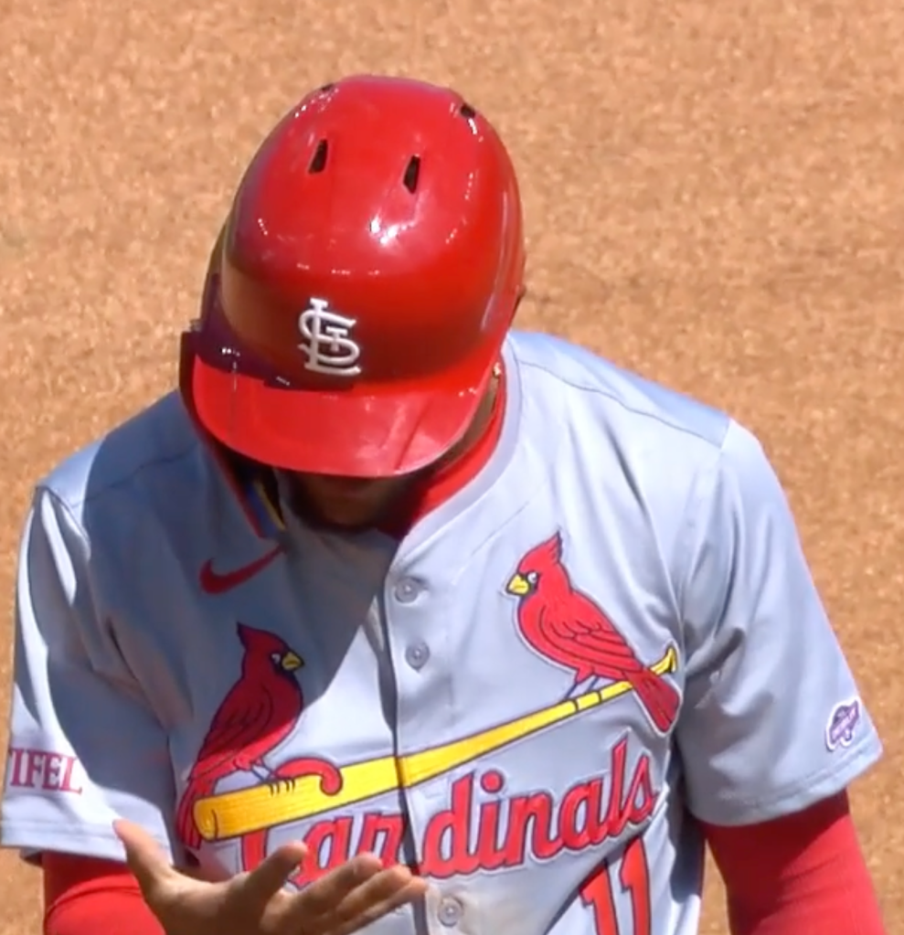
Birds On The Bat is an Ugly Patch for the First Time in History
I know BD3 fought hard to keep the chain stitch embroidery for these new uniforms, and yes there is some chain stitching there. However, watching the game on TV, these look like cheap third-world jerseys with a cheap ugly patch applied to front.
The edges of the patch are disgustingly visible, it creates really dark shadow beveled edges, and it looks cheap. Did I mention how cheap and ugly it is? I’ll try and let the photos speak for themselves, but it’s just such an ugly patch job. The Birds on the Bat even seems a little smaller than usual. And I just can’t stop staring at the edges of the patch.


Cardinals Wear Puny Name on Backs
Yes we’ve seen too much of this during Spring Training, but nothing was fixed. The names on back look puny. There were several camera angles (that I didn’t take screenshots of) where it was near impossible to read the player’s names on their jersey because of how small the letters. Beyond that, I wasn’t paying enough attention, but I’m certain we’ll see some more posts from Uni-Watch this season that the names also aren’t centered on the jerseys. I grabbed 1 screenshot of shit-eating farmer Miles Mikolas.

How about some better news…
Victor Scott II Makes MLB Debut, Wears MLB Debut Patch
As is new tradition starting in the 2023 season, players making their MLB debut have worn, and will wear, a tiny MLB Debut patch on their jersey for their first game. VS2 wore his yesterday. Side note, I think it’s cool that Victor Scott II is wearing 11, so his jersey says Scott 11.


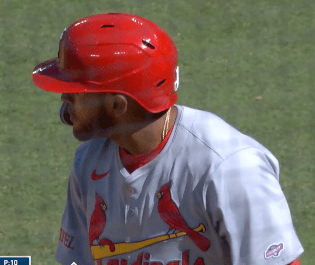
Puffy Helmet Numbers
Here’s something I’m just noticing, some one will have to let me know if this also happened last year or not. A few seasons ago most MLB teams started wearing batting helmets with puffy silicone type logos that extrude from the helmet. The puffy logos replaced the standard transparent stickers applied to the front of the helmet.
I noticed in yesterday’s game that not only is the STL on the front applied in the puffy 3D material, but the number and MLB logo on the back of the helmet is also puffy 3D. Interesting.
That’s what we got from yesterday. Let us know if we missed anything, send us some screenshots, and pray for more than 70 wins this year.
