
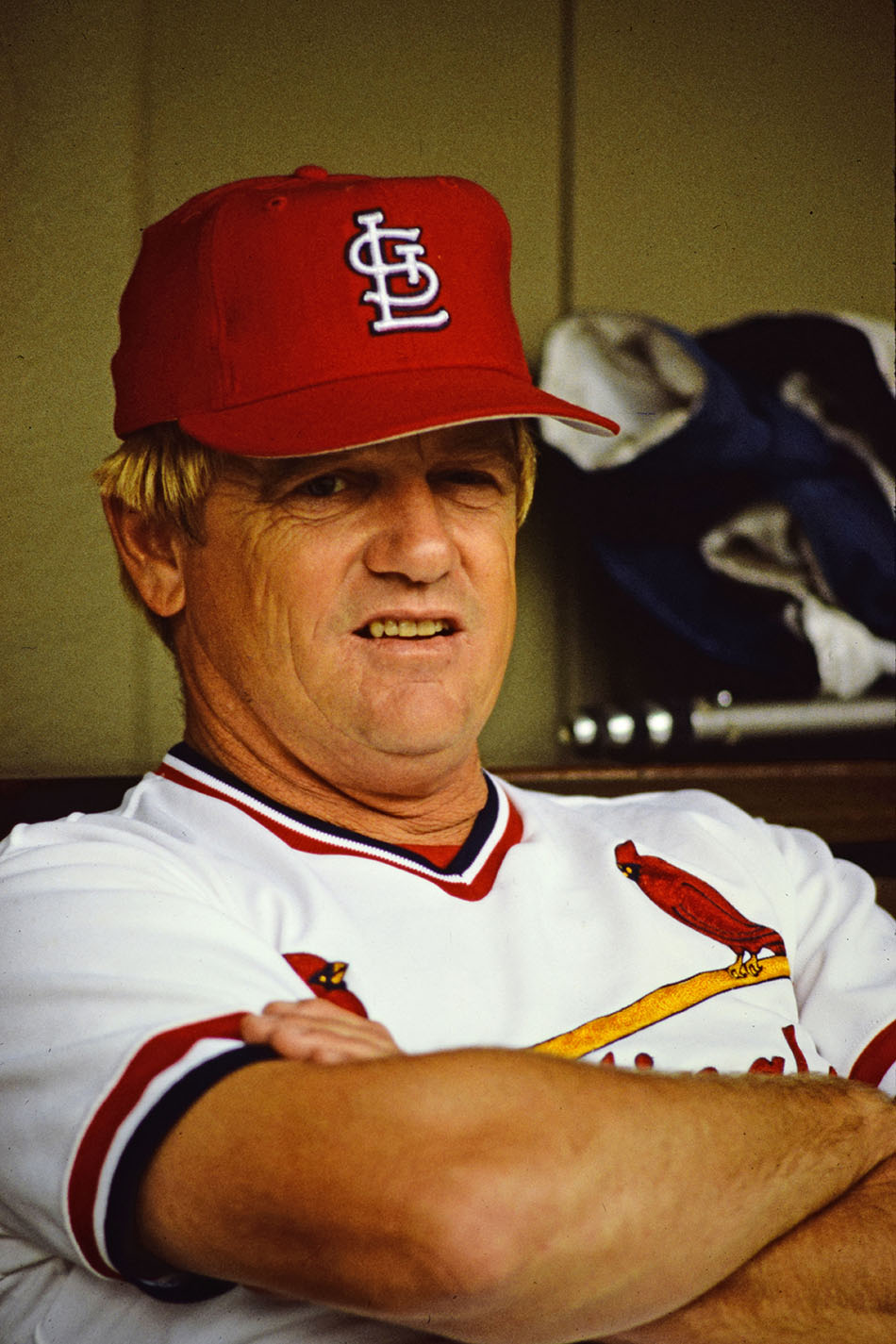
This weekend I received an interesting email about the STL logo on the caps from the 1980s, specifically during Whitey Herzog’s tenure as manager. The STL had one particular detail we have never noticed. Here’s what the email said…
“With all of the Whitey Herzog tributes coming out over the last week, I’ve seen a ton of old photos of the late former Cardinals skipper. One in particular caught my eye. It’s an un-dated photo that shows Herzog wearing a cap that has a very clear and distinct serif on the lower part of the “S.” I had never seen a Cardinals cap from that era featuring the extra serif.”
Here’s the photo in question:

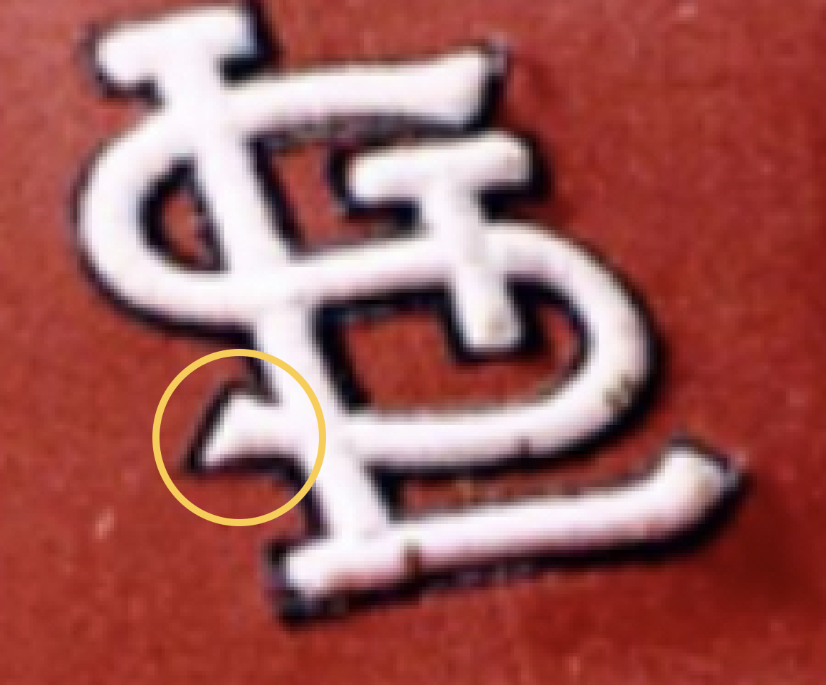
What they are referring to is the little pointy bits at bottom left of the S. From what we understand, the Cardinals have never worn this version of the STL with the S having the extra serif on the bottom left as seen in the photograph. We were under the impression the STL emblem introduced in 1963 went unchanged up until 2020, with the only exception being the trapezoid T vs square T… But nonetheless, we can clearly see another variation in this photo.
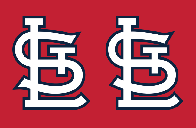
Here’s a graphic mockup of the two STLs next each other. The STL on the right is the standard graphic we believe to be accurate, the STL on the left has been modified to resemble the emblem seen on Herzog’s cap.

This is quite an interesting detail that we have never noticed, so I started doing some research to figure out what year this photograph was taken to determine if we can find more examples of the double serif STL.
The first thing I noticed, in the reflection of Whitey’s sunglasses is a player wearing #16. Take a look at the image flipped and zoomed in.

I am assuming this a Cardinals player and not a Red or Philly, so I dug through BBRef’s almanac of Cardinals uniform numbers, and selectively looked at all Cardinals who wore #16 during Herzog’s tenure (1980-1990), and crossed referenced those players that look like they have a similar amount of letters in their name. I came up with only one match, Jamie Quirk, and luckily he only played a single season for the Cardinals. 1983.
I emailed back my findings about Jamie Quirk, and got a response with a different lead on some one else who wore #16:
“I, too, looked at the reflection in his shades. I believe it’s Nick Leyva we see reflected. He was a coach for the Cardinals from 1984-1988, and wore Number 16. You can clearly see the first letter of the last name is an “L” and the second is an “E” and that it is five characters long and appears to end with an “A.” Leyva fits that perfectly.”
Nice detective work! Considering either Jamie Quirk or Nick Leyva, this would narrow our search down to 1983-1988. So we went through a large stack of photos and baseball cards to try and identify the years. Here’s what we found.
The following photo is from January 3, 1983 showing Whitey Herzog as The Sporting News’ Man of the Year.

The cap he is wearing clearly does not have the extra serif on it. And because this is from January of 1983, there is no way that this can be a 1983 photograph. It is likely a 1981 or 1982 photo, and therefore eliminates 1982 and prior from our search.
So we started looking at anything labeled 1983. The first here is a Whitey Herzog baseball card. It’s hard to tell, but we think he MIGHT have the extra serif in this cap. Not definitive though.

Next we have a photograph of Herzog dated to 1983. In this one there is clearly an extra serif on the S, but it’s not as pronounced as the original photo.
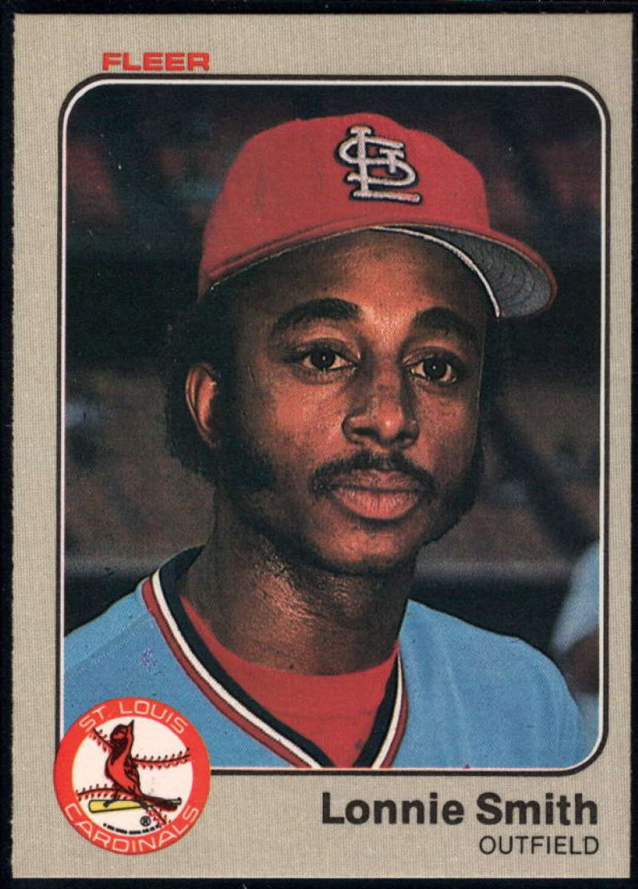
Here is a Lonnie Smith baseball card from 1983. It’s worth mentioning that baseball cards from this era were typically taken during Spring Training of that season. Lonnie here clearly has an extra serif on his cap.
Here is a photograph dated 1983 of Bruce Sutter. Hard to tell, but we think the extra serif is there.

And with all of those photos, we think we can definitively say the double serif STL existed in 1983.
What about 1984? We were scarce on photography of the cap in 1984, but found some good baseball cards that could corroborate. First is this one of Art Howe.

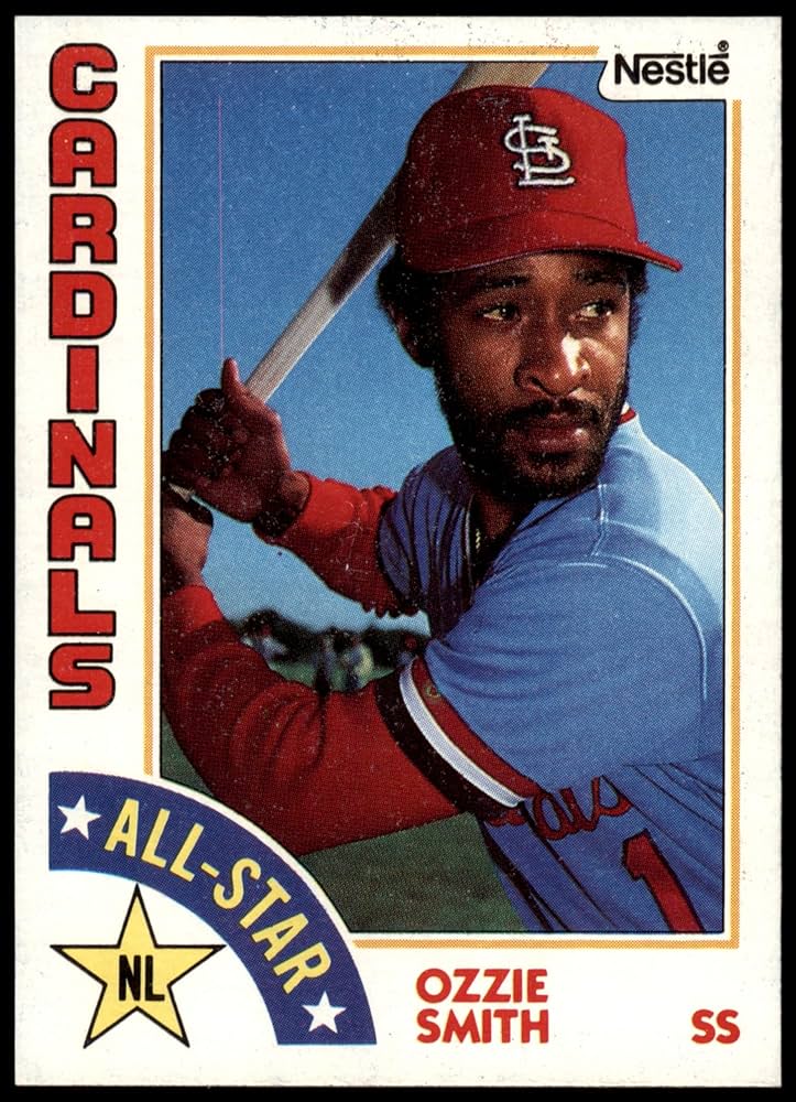
And we found two 1984 cards of Ozzie. In both photos we think he has the extra serif on the S.

The only other photo we could find to corroborate the double serif was the following headshot of Bruce Sutter. We don’t have a date on this photo, but Sutter only played with the Cardinals through 1984, so we think we can definitively say this photo is from 1983 or 1984.

Unfortunately none of the images I found and linked here have nearly as big of a pointy accent as the original Herzog photo sent to me. But because the extra serif is definitely noticeable in those photos, we can likely say that the double serif STL existed in 1983 and/or 1984. Pretty cool! It existed!
That of course begs the question, WHY? Do we know why the STL was different in 1983 and 1984? No, we have no idea. It could have been the manufacturer changing things for no reason, it could have been an experiment set in motion by some one in the front office, unfortunately we just don’t know.
Many thanks for writing in and bringing this to our attention!

One thought on “1980s Double Serif STL”
Comments are closed.