

Yesterday, May 12, was Mother’s Day, and as is tradition since 2016, the team wore pink uniform elements. Here’s what it looked like.
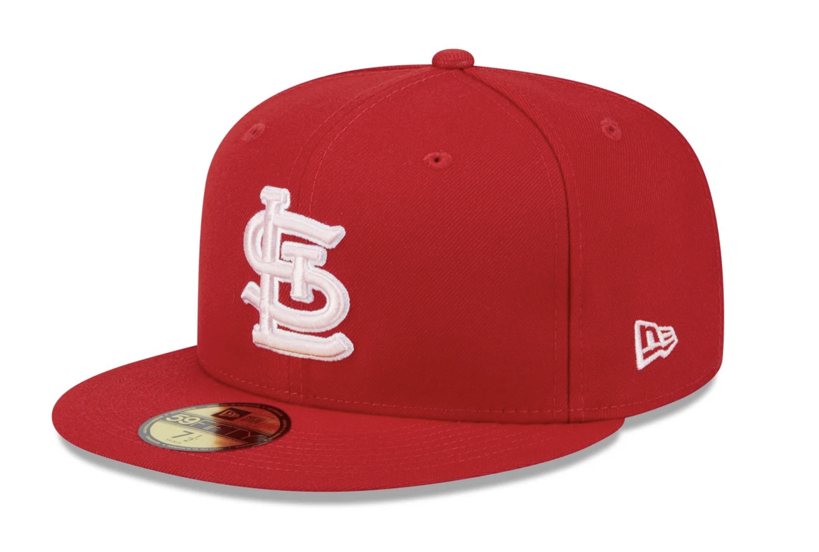
The standard red hat was modified with a pink STL and a white outline. Really hard to see the differentiation between the white and pink considering how light the pink is. It looked like a big blot on the cap on the broadcast when viewed from afar, and when zoomed in it looked like one giant fat pink monogram.


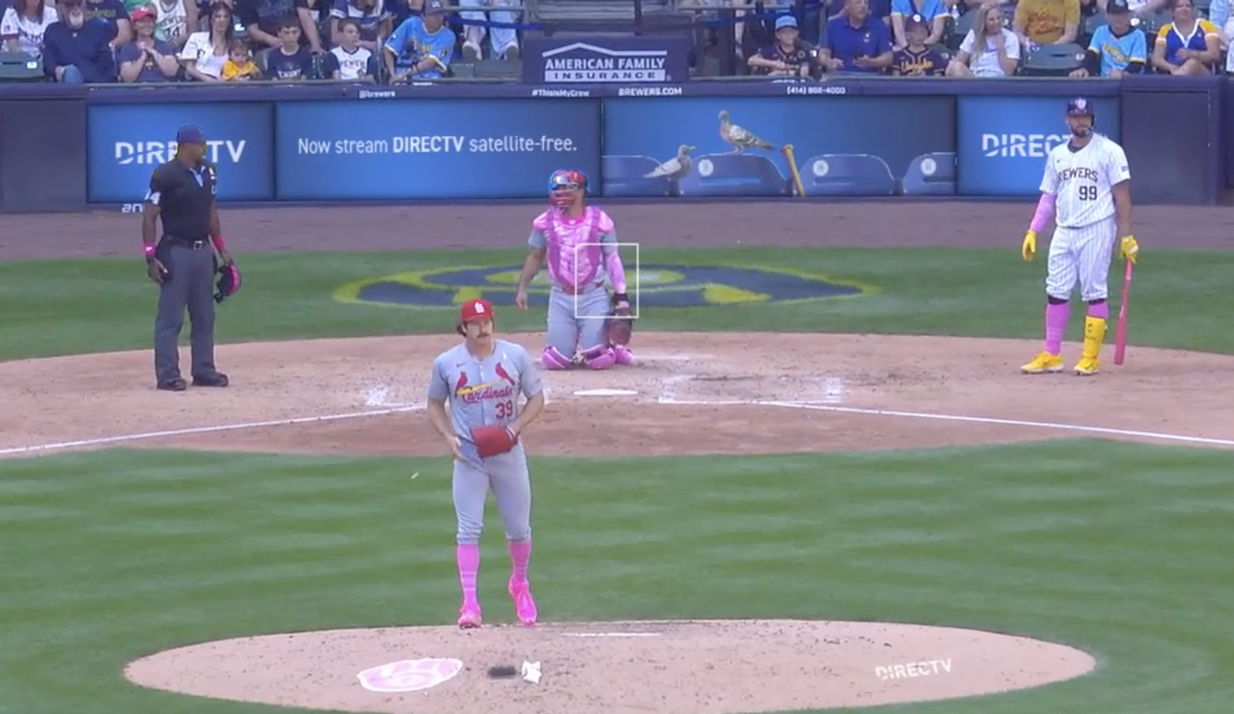
Cardinals wore their mismatched road gray jerseys with the Birds on the Patch, and added a pink breast cancer awareness ribbon to the chest of the jersey. But don’t forget, if we raise money for breast cancer, we can’t just put a pink ribbon, it needs to have MLB’s logo on it. Vanity is the most important part of philanthropy.


I noticed on the broadcast the Brewers were wearing pink helmet decals, but the Cardinals were not. The Brewers were also wearing pink belts, but the Cardinals opted to wear their standard red belts. Didn’t take a screenshot.
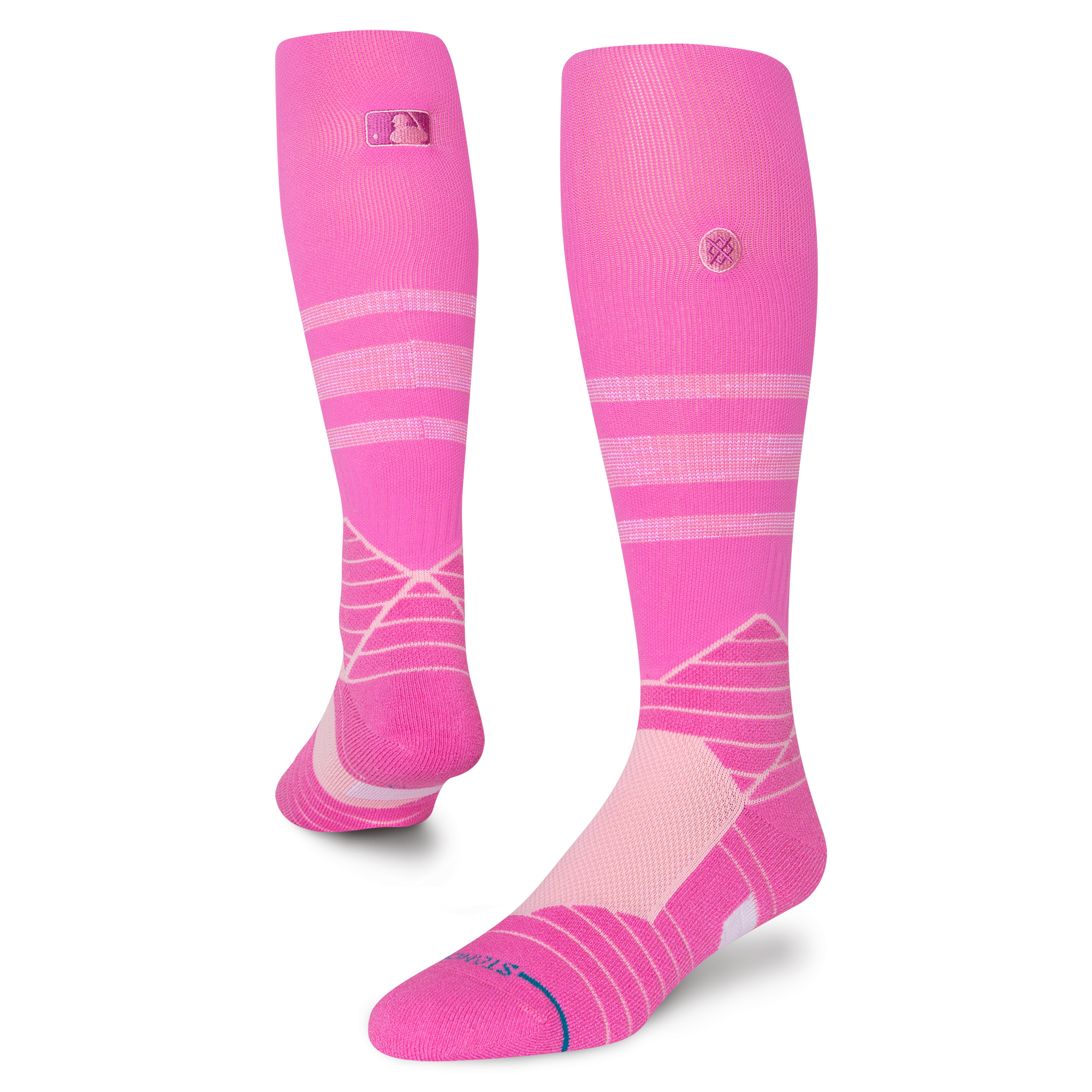
Both teams were wearing pink hosiery, with a unique design. Since teams started wearing pink themed socks for Mother’s Day in 2017, they have worn 7 different sock designs. 7 years, 7 designs, Merchandise, Merchandise, Merchandise, Merchandise, Merchandise, Merchandise, Merchandise.
I do admit though, at least the socks this year were a lot more tame when compared to some of the lavish and outrageous designs from previous years.


While I’m not crazy about the 8,000,000 uniform and cap variations MLB teams wear for everything from Mother’s Day to Armed Forces Weekend, I do appreciate the relative restraint used here. At least they didn’t do pink uniform logos like they have in years past.
Side Note: I was not at all surprised that the Brewers wore a matching helmet decal. They have long been a stickler for wearing helmets that match, even for one-off caps and unis. I appreciate that, minor though it may be.
LikeLike
The pink uniform accessories are unappealing and unnecessary. It hurts the eyes and the teams” brand. MLB could recognize and fund cancer research and awareness without using the uniforms. They could still continue their consumer merchandising and raise money for cancer without messing with the uniforms. Why do we continue to assign the color pink to represent females? Actually, in the 19th century it was just the opposite. Pink was a color assigned to males and blue to females. Either way it is unnecessary stereotyping in an era where we are growing far more pluralistic and understanding about a variety of gender orientations.
LikeLike