
We’re waiting to see what happens with the Cardinals this offseason, both in terms of the roster AND the uniforms. We’ve heard some reports that they’ll be fixing some of the uniform issues from this past season, but all of the changes are yet to be known. While we wait, I’ve come up with some concepts for what I think the team should look like.
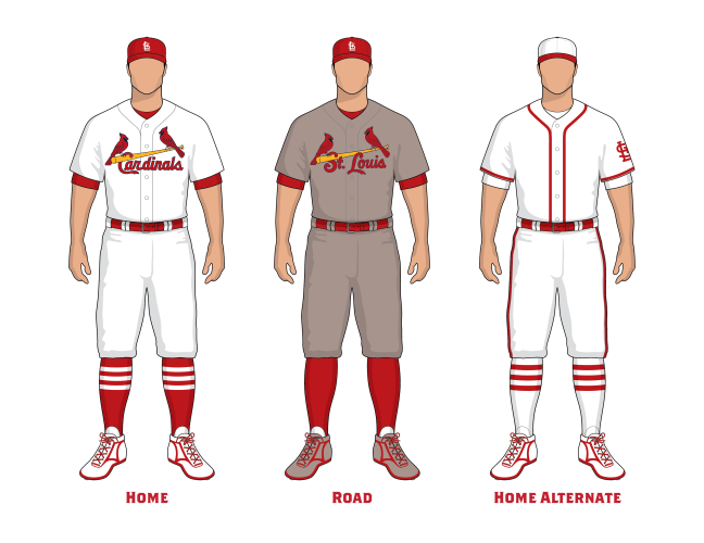
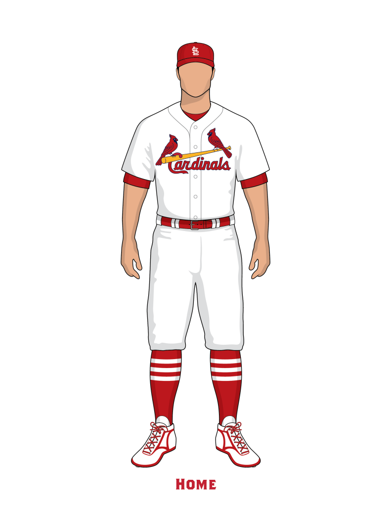
First, I think being Cardinals, we should just be a red team. I know how good the blue looks, I know how well blue works in many different applications, but I prefer the single color look as much as possible. Why? I think it’s a classic look, and helps identify the Cardinals as one of the classic teams in Major League Baseball.
Second, please lets go back to the 2013-2023 chainstitch embroidery technique. Those 11 years were objectively the best the Birds on the Bat on the uniform have ever looked.
Third, on the uniforms below you’ll notice no extra patches, no advertisements, no maker’s marks, no bullshit. Trim the fat, make it minimal, keep it classic.

For both the primary red cap, I removed the blue outline behind the STL, because again, I think it looks more classic. Some classic cap logos in MLB that don’t use an outline around the letters: Yankees, Dodgers, Tigers, Giants, White Sox, Phillies, A’s, Pirates. No outline, no shadow, no tricks. Simple, classic.
For the Birds on the Bat, notice it says Cardinals at home, and St. Louis on the road. I like wearing the team name at home and the city name on the road. I’ve also changed the Birds’ beaks to red, calling back to the 1998 season. In ’98 the Cardinals refreshed their brand and designed new birds, and one of the tweaks, to be more anatomically correct, was to use red beaks. I like the look of it, let’s just be a red team.
For the road uniform I chose a reddish gray color instead of a standard colorless gray. The Padres get to use a custom brown-gray road color, I think we should also use a red-gray road color. The reddish-gray color is also a nod back to a newspaper account from 1931.
St. Louis Globe Democrat: March 22, 1931
The home uniforms…usually are of white flannel whereas the “road” uniforms…are of grayish flannel, the Cardinals using a reddish gray.
For the alternate uniform, this calls back to two different uniforms. Overall it is based on the 1926 World Series home uniform. Plain stark white uniform with red accent piping. However, instead of thin braid piping, I chose thicker soutache braid style piping, similar to that of the Cardinals 1940s uniforms. And on the sleeve is the simple current STL.
Check them out individually, click images to expand.


Send us some concepts!
