
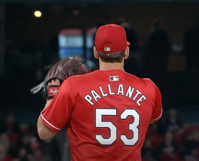
In last night’s game I noticed that the players’ names on the backs of their City Connect uniforms are still using the tiny letters from last season.

One of the big gripes from fans and players last season was the names on the back of the jerseys had changed to noticeably smaller letters in a more radical arch shape. Luckily the Nike+Fanatics heard the outcry and announced they would be going back to the larger lettering. This change was noticed and implemented on the Cardinals home, road, and home alternate uniforms.
But last night the Cardinals debuted their City Connect for the 2025 season with the tiny letters, and I found myself throughout the game saying out loud, “Why didn’t they fix the letters on the City Connects?”
Let’s speculate wildly. Perhaps Nike+Fanatics just got lazy and forgot to fix the names on the Cardinals City Connects. Maybe they’ll make up a lie and tell us it’s an intentional design choice that matches the concept of the uniform. Who knows.
The other tidbit I noticed is the front number is also the taller number that exactly matches the number on back. Whereas the home/road/alternate uniform has reverted back to the thicker squattier front number. Take a look if you’re interested in more info on the Cardinals front numbers, and also the 2023 v. 2024 name on back letter comparison.
With these observations of the front number and the name on back, it means there was no change made to the City Connect uniforms this season.
