
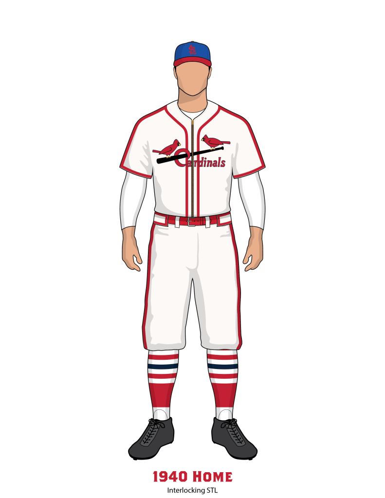
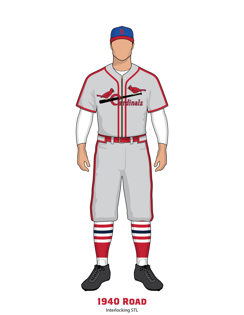
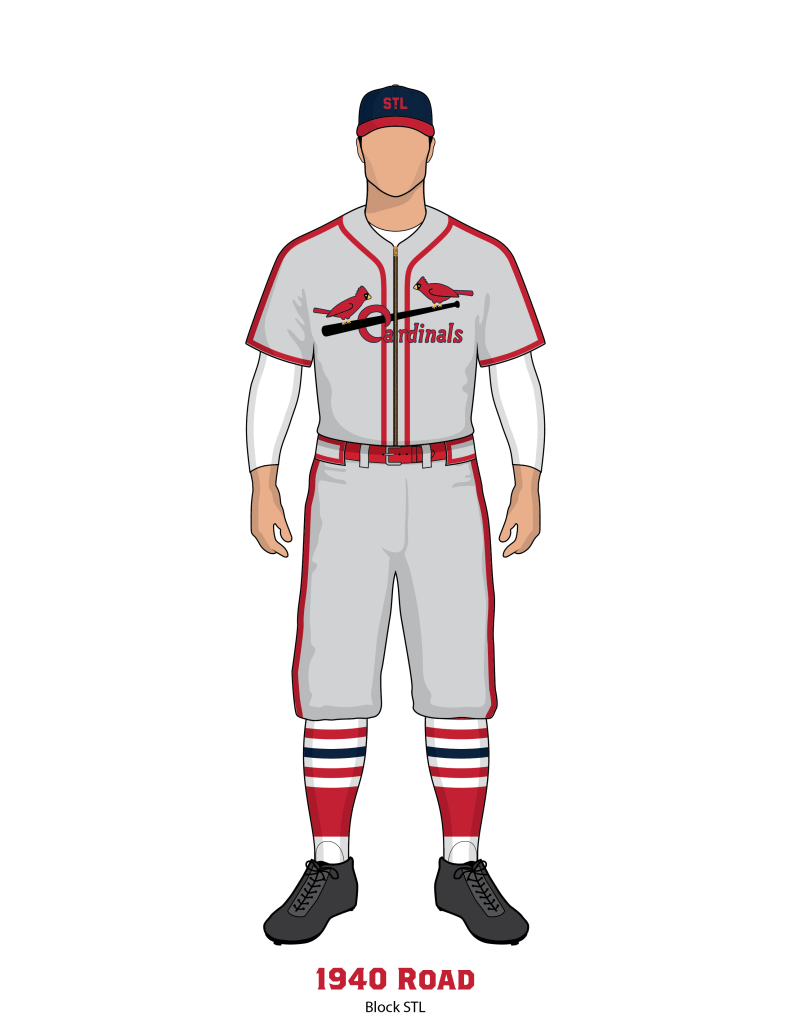
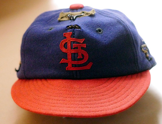
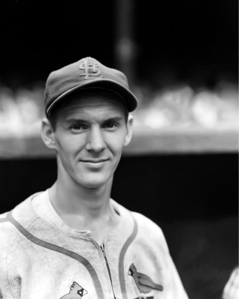
The 1940 uniforms featured brand new two-tone hats, the first time wearing blue caps since 1919. There were two different caps, one with an interlocking STL emblem, the other with a block STL featuring an exclamation (!) T. Both cap emblems were applied as a felt patch. We don’t exactly know how each cap was used. Black and white photography in this season proved very tricky for us. Many photos make it seem like the caps were actually red with a blue emblem. See below for much more in depth information provided by Phil Hecken and Gary Chanko.
The jersey featured similar piping from the previous season, but would have the thick red piping also running from the shoulders down the side of the arm to the ends of the sleeve.


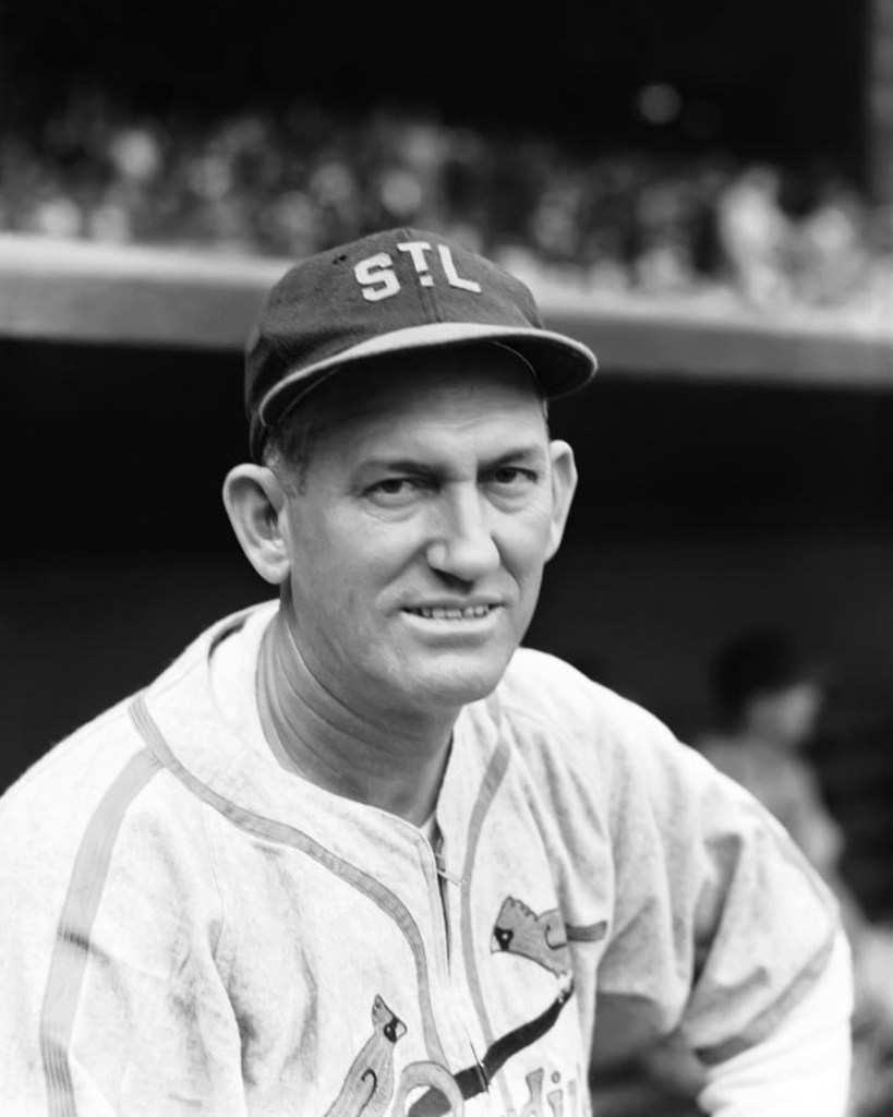


What is Blue and What is Red?
Many photos from 1940 show what appears to be very light colored caps. After consulting with other experts, we have concluded that this is simply black and white photography playing tricks on us. Phil Hecken, from Uni-Watch, and Gary Chanko, author of Classic Scoreboards, have both given us some excellent information on the topic.
Phil’s experience is with the New York Rangers hockey team, he says the following:
“What I can tell you from experience — alluded to with the Rangers — is that the caps depicted in your two b&w photographs … even though they look almost white or gray … are, I’m 99.9% sure, blue crown/red bill, just like your sample photograph.”
And Gary linked to a very interesting forum post about the type of film used in the 1930s and 1940s. There are two posts that explain the different films and how they react.
Black and white films of the time were basically of three types, although the boundaries between these types were not always entirely clear-cut in practice:
Ordinary or common film ( color-blind) was sensitive to light in the blue spectrum, violet and ultraviolet, and besides being cheaper, it only required yellow -green or red light in the darkroom. Using this film the red and yellow tones in the final print looked very dark and the clouds of a blue sky tended to become invisible, blending into the background unless a filter was used.
Orthochromatic films themselves, sensitive to the spectra blue, violet, ultraviolet, but also green and yellow in varying degrees depending on the quality and type. These films require dark red light in the development phase and while the yellow tones can be lighter in print than using colour-blind film, their hue varies depending on the quality of the emulsion and the processing, while red tones still appear dark, seen that the film is not sensitive to red light. They were often the preferred choice for portraits because of the good rendering of contrast.
Panchromatic film, sensitive to blue, violet, ultraviolet, green, yellow and red, while translating the colors into shades of gray closer to the experience of the human eye, remained also variable in the results because of its quality, conservation status and the skill of those who developed it, and it required total darkness in the darkroom. This films, however, offered a reduced contrast compared to common and orthochromatic.
With all of these kinds of film the use of filters was very common: yellow and amber, in particular, often intended to diminish – with variable results – the effect of ultraviolet light, invisible to the eye but very visible on film, or to correct contrast and brightness of the final result. At the time the use of these filters was an integral part of the art of the photographer, and they were used very often.
The above is an extreme simplification of the technology available at the time, and there were in fact emulsions which came “halfway” between the types described, despite being advertised and sold as orthochromatic or panchromatic. The subject would deserve much more research and I am sure I have just scratched the surface of what we could find.
I hope that this may help a better understanding of how difficult – and indeed treacherous – the interpretation of colours from B/W prints can be.
This difficulty also partly affects colour emulsions of the time but I must confess I have not got around to finding out what the exact differences between – say – American and German film were.
US made b&w film was made to be less sensitive to blue light. US photogs tended to use orange filters more.
German film was made to be more sensitive to reds. Use of light [very pale] yellow filters more common.
French made film was more sensitive to greens. Use of mid-yellow filters more common.
British films were more sensitive to reds/greens. Use of light to mid yellow filters more common.
Russian films tended towards an ortho film. No use of filters common.
All western films changed about 1958, to a more common pan film and sensitivity ratings – ASA
WarPac films changed between 1968-72, to about three types of pan film, ranging from near ortho to true pan and two sensitivity ratings – GOST and DIN
Thanks to Phil Hecken and Gary Chanko for providing such in depth resources.
Newspaper Accounts
St. Louis Post Dispatch: April 13, 1940
The Cardinals surprised the fans with new caps–dark blue, with red visors and buttons.
St. Louis Globe Democrat: April 14, 1940
The Cardinals 1940 uniforms are a combination of their old clothes, as well as the Reds and Cubs’. The Cards have most of their old trimmings, but their caps of blue with red peaks are just about “carbon copies” of the Cincinnati caps of other years. The Cardinal uniforms also have braid along the shoulders, down the sleeves and trousers similar to those of the Cubs and Browns. Yesterday the Cards had on their gray traveling uniforms. The Browns wore their white home uniform.
Team Colors
Cardinals Red – PMS 200
Vintage Yellow – PMS 1225
Navy Blue – PMS 289
Bright Blue Cap – PMS 2728
Black – CMYK: 50/50/0/100
Off-White Fabric – CMYK: 1/2/3/0
Gray Fabric – CMYK: 0/0/0/20
