
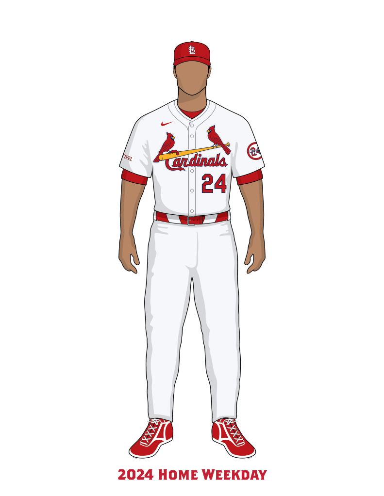
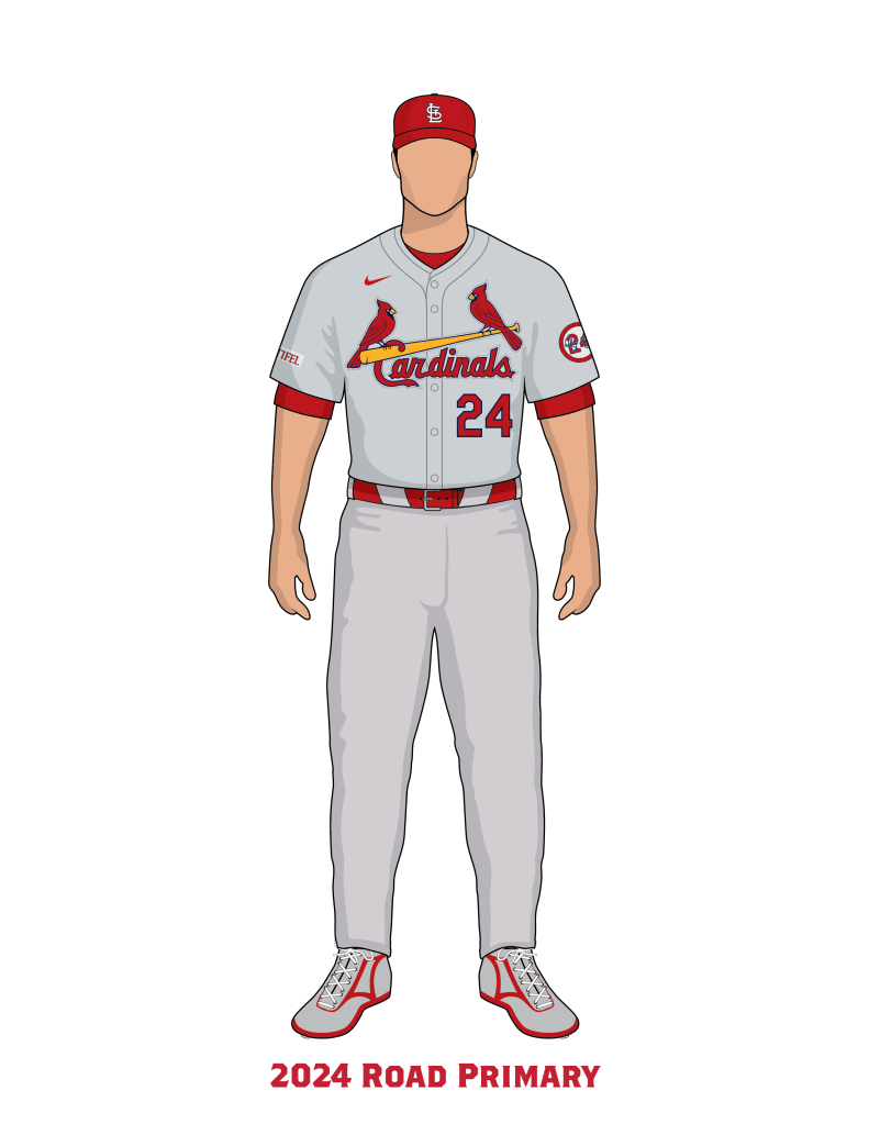
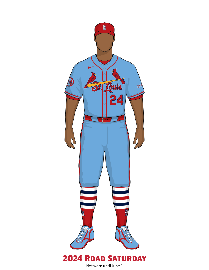
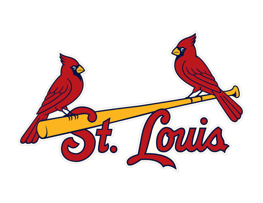
In 2024 the Cardinals wore the same six uniform combinations from 2023, and added a seventh uniform; a Nike City Connect uniform. Despite wearing the “same” uniforms from the previous season, Nike made many changes to the 2024 uniform template.
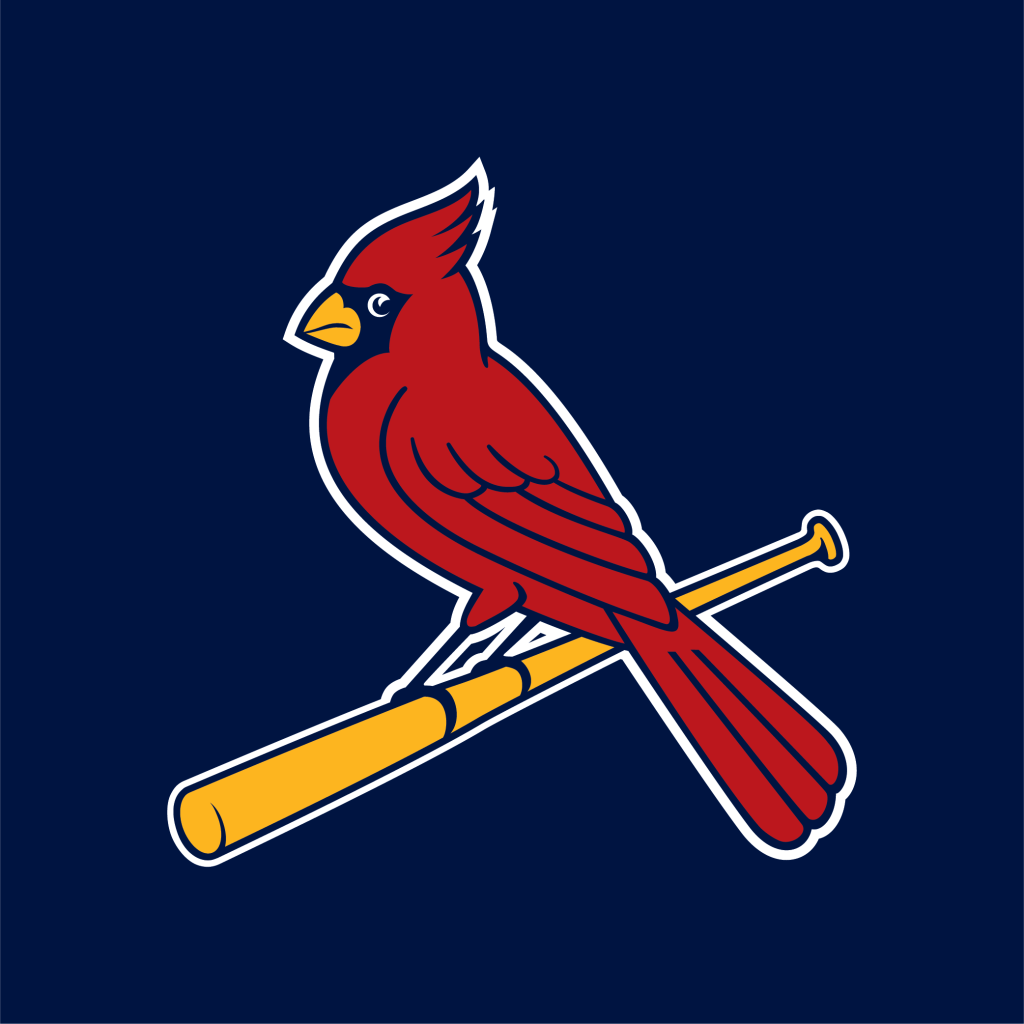
The Birds on the Bat were replaced for the Birds on the Patch. There was promises before the season began that the Birds on the Bat would be chain-stitch embroidered, however, only the red and yellow portions of the logo were chain stitched, and all of the blue lines were satin stitch embroidery. The Birds were also embroidered onto a patch instead of directly onto the jersey fabric. This marked the first time in over 100 years that the Birds on the Bat were not completely chain-stitched and not stitched directly onto the uniform.
Nike also changed how the garments are put together. The shirt construction for the 2024 uniforms now had a skinnier placket on the front of the shirt, and added extra fabric and seams around the neckline collar of the shirt. The end of the sleeves on the two alternate uniforms opted for extra pieces of fabric as sleeve extensions with printed on sleeve piping instead of real braid. The belt loops on the pants were also modified. Long angular shaped front belt loops were used instead of “traditional” skinny double loops in front.
The gray fabric for the road uniforms was inconsistent in color from shirts to pants, and appeared as two slightly different shades of gray; the shirts were more blue/green gray, and the pants were more magenta gray. The mismatched shirts and pants were noticed during Spring Training, and continued to be noticeable the entire 2024 season.
The players names on the back of the uniform were rendered in much smaller letters and in a more radical arch shape.
The Cardinals were not able to wear their alternate home uniform until May 18 and their alternate road uniform until June 1 due to Nike’s production incapabilities.
Players, fans, and media were incredibly vocal during spring training and throughout the season about the cheaper quality and poor designs of the uniforms.
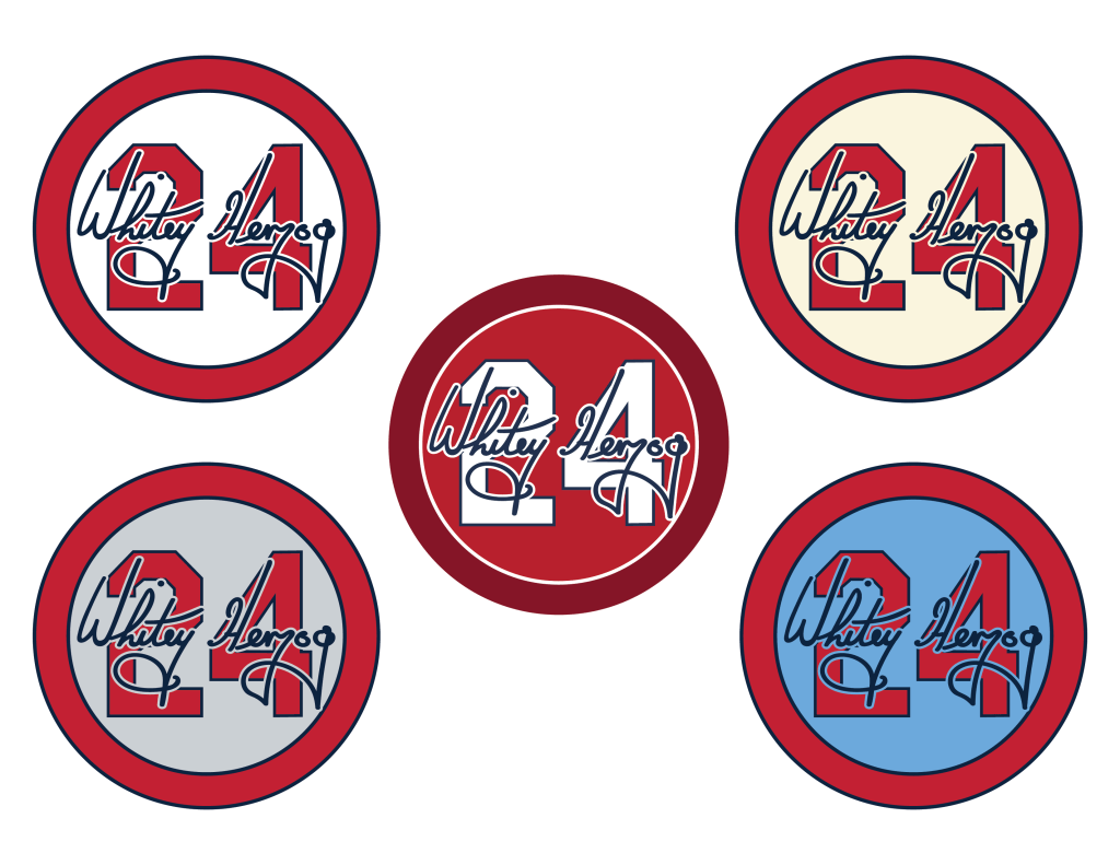
On April 16, Hall of Famer Whitey Herzog passed away. The Cardinals began wearing a Whitey Herzog patch on their sleeve on May 17. The patch was designed similar to other patches to honor Cardinals Hall of Famers who have passed away, but was a printed iron-on patch instead of an embroidered patch. On June 22 the Cardinals switched the printed patch to an embroidered patch.
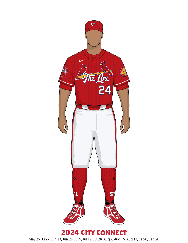
On Monday May 20th, the new Nike City Connect uniforms were unveiled and announced to be worn on twelve select games throughout the 2024 season; May 25, June 7, June 23, June 28, July 9, July 12, July 28, August 7, August 16, August 17, September 8, and September 20.
The Cardinals subtly made a color change to their team graphics to try and better match the fabrics they were wearing. PMS 200 Red and PMS 289 Navy Blue both were changed in favor of different CMYK color mixes. See color information at the bottom of the page.
On April 15th the Cardinals wore Jackie Robinson themed uniforms for Jackie Robinson Day.
On May 12th the Cardinals wore Mother’s Day themed uniforms.
On May 17th, 18th, and 19th the Cardinals wore Armed Forces Day uniforms.
On May 27th the Cardinals wore Memorial Day chest patches.
On June 2nd the Cardinals wore a 4 patch for Lou Gehrig day.
On June 14th the Cardinals wore cap patches for Play Ball weekend.
On June 16th the Cardinals wore Father’s Day themed uniforms.
On June 20th the Cardinals wore uniforms inspired by Negro League uniforms at Rickwood Field.
On July 4th the Cardinals wore Independence Day themed uniforms.
On July 20th the Cardinals wore cap patches for Hall of Fame Induction Weekend.
On August 16th, 17th, and 18th the Cardinals wore cap patches for Player’s Weekend.
On September 1st the Cardinals wore a yellow ribbon patch and yellow gear to raise money and awareness for Children’s Cancer.
On September 11th the Cardinals wore a 9/11 Memorial patch on their cap.
On September 15th the Cardinals wore a Roberto Clemente patch for Roberto Clemente day.


Newspaper Accounts
Uni-Watch.com: December 18, 2023
EXCLUSIVE: Cards’ Script Will Still Be Chain-Stitched on New Nike Template — Sort Of
As we all know by now, the St. Louis Cardinals have their chest insignia chain-stitched onto their jersey. This gives their script a gorgeous sense of texture that’s rare in today’s uni-verse.
With all MLB teams switching to Nike’s new template next season, several Uni Watch readers have wondered aloud whether the Cardinals’ logo will still be chain-stitched, especially since we’ve already seen some adjustments being made to the Dodgers’ script.
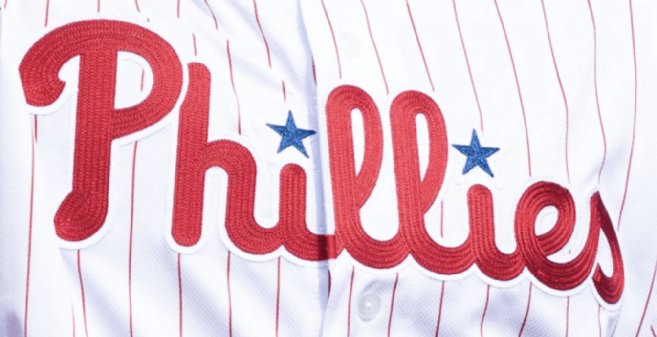
I emailed Cards prexy Bill DeWitt III to ask about this. His response had a mix of good news and bad news: “We are maintaining the chain-stitching next year with the new Nike template — I had to fight hard to keep it. But the compromise was that it will need to be applied to a patch, which will then be applied to the uniform.”
To explain a bit further: The Cards’ chain-stitching has always been done directly onto the jersey. By contrast, the Phillies — the only other MLB team that has used a chain-stitched jersey insignia in recent years — have their chest mark embroidered onto two white-backed patches, which are then sewn onto the jersey, as you can see here.
So the Cardinals will now be doing something like that.
St. Louis Post Dispatch STLToday.com: February 18, 2024
Derrick Goold: …As the team shifts to new Nike-designed, Fanatics-manufactured jerseys, the Cardinals are not certain if the alternate jerseys will be available on time for their start of the season. The Cardinals open with a four-game series in Los Angeles and then a three-game stop in San Diego, and they may have their road grays for all of them if the victory blues for Saturdays are not yet available. The team’s City Connect jersey is expected to be revealed early in the season and debut before Flag Day.
The Spun: February 20, 2024
MLB Players’ Union Getting Involved In The Uniforms Fiasco
The Major League Baseball Players Association is involved in the embarrassing situation involving the league’s new uniforms.
The rollout for MLB’s new Fanatics-produced Nike jerseys has not gone well, to say the least. Fans have lambasted the new unis, which look like cheap knockoffs of previous versions, and while some players have come forward in support of the gear, it’s clear they don’t speak for all of their constituents.
Now MLBPA President Tony Clark admitted that players are “frustrated” with the jerseys, which has led to the union’s involvement.
“Any time there’s change, there’s an adjustment period. Sometimes that adjustment period goes well, sometimes not so much. In this instance, there appear to be some misses that could have otherwise not been misses,” Clark said, via The Athletic’s Marc Carig.
Among the complaints from players include “smaller lettering, a cheaper look, incorrect coloring and an inability to customize the jerseys in ways they were previously able to do.”
Clark said he is hoping to have the issue resolved by the end of spring training.
Meanwhile, MLB commissioner Rob Manfred defended the uniform construction last week.
“We always pay attention to what people are saying about any new initiative,” Manfred said, via ESPN. “As you know in baseball, with any new initiative there’s going to be some negative feedback. First and most important, these are Nike jerseys. We entered into this partnership with Nike because of who they are and the kinds of products they produce.”
The Atlantic: February 20, 2024
What Happened to Baseball Jerseys?
Fans are doomed to keep paying more for merchandise they want less.
By Amanda Mull
Last week, as American sports fans’ eyes moved from football to baseball, a great cry—or at least a significant grumble—was heard from MLB players arriving at spring training: The new uniforms are bad.
The MLB announced the uniforms, which have been redesigned by Nike for all of the league’s 30 teams, in a press release last Tuesday. It included praise from some of the biggest baseball names on Nike’s endorsement roster. As images of the uniforms began to circulate, however, a number of other players voiced, shall we say, differing opinions. Many were upset that they’d no longer been given the chance to tailor the fit of their pants. The uniforms are thin and flimsy feeling. Some of the colors seem off. The design elements are poorly spaced and sized, and the lettering for players’ names seems too small. According to The Athletic, some players feel so strongly about the changes that they’ve taken their concerns to their union. The Chicago Cubs shortstop Dansby Swanson, who has an endorsement deal with Nike, has said that he contacted the brand himself to see if some of these concerns could be resolved.
It’s hard to dismiss the aesthetic complaints, especially when you compare the new jerseys with those of previous seasons. The new ones look tawdry and a little swagless, like replica jerseys. Fans quickly joined the chorus of outrage. Regular people are the actual primary consumers of pro-sports jerseys, and Nike plans to offer three versions of the new uniforms to buyers, each with varying levels of fidelity to what players wear on field. The two currently available cost $175 and $395. One post on X from the popular MLB-fan account Korked Bats said the jerseys looked like players’ moms had gotten them on clearance at TJ Maxx.
The uniforms might bear the Nike logo, but in looking to assign blame, fans have largely seized on what has become a familiar villain in American sports: Fanatics, the sprawling memorabilia conglomerate that manufactured the new uniforms on Nike’s behalf. Over the past couple of decades, Fanatics (with the apparently full support of all of the major American sports leagues) has upended the licensed-sports-merch market and centralized much of the production and sale of team gear under its control. If you’re a fan who wants a T-shirt or cap with your team’s logo, Fanatics has immense power over your options. Complaints about the quality and prices of the products it sells abound…
…As you might expect, complaints about jersey changes are far from new, in baseball or in any other sport. Some level of player pushback tends to crop up any time major changes are made, and the MLB uniforms unveiled this week use what Nike describes as an entirely new “chassis.” (Yes, that is how self-serious these things can get.) Fans, too, tend to be a nostalgic and change-averse group of people, and perhaps in regard to no American sport more than baseball, where some logos, colors, and other aesthetic elements of uniform design date back many decades.
Even so, one has to acknowledge that the new uniforms look like a team of designers sat down with last year’s MLB template and found as many little details as possible to make worse. The off-putting finished product gets only more perplexing the deeper you dig into how the new MLB uniforms came to be. In 2019, Nike won a decade-long contract to design the league’s uniforms, the first of which debuted in 2020. Despite being one of the biggest sportswear brands in the world, Nike has never produced the actual jerseys itself. Instead, the company contracts with Fanatics to manufacture them. This production takes place in a Pennsylvania factory that has made all MLB uniforms since 2005; Fanatics bought it in 2017, and prior to that, it was owned by another jersey maker, Majestic Apparel. Production subcontracting is incredibly common across all sectors of the apparel market. Relatively few brands manufacture their own clothing, usually to save money by using existing manufacturers overseas or to access production capabilities that would be too costly or inefficient to build in-house.
Production subcontracting is just what it sounds like—production. The manufacturer receives the specs and materials and turns them into a product, but it is not responsible for the actual design. By all indications, that’s the case with the MLB jerseys. A representative for Fanatics declined to answer specific questions about the creation of the new MLB jerseys but told me that Fanatics was not involved in the design of the uniforms or the development of the materials used in them. This claim aligns with last week’s press release announcing the new uniforms, which fully credited Nike with everything but the actual manufacture of the garments. The journalist Paul Lukas, who runs the website Uni Watch and has been covering American sports uniforms for decades, came to much the same conclusion.
Nike did not respond to repeated requests for comment, nor does the company seem to have addressed the controversy publicly. But the evidence suggests that the flop is on Nike more than anyone else. The biggest sportswear brand in the world delivered a dud.
Part of this problem isn’t really Nike’s, or at least not entirely. An inherent tension exists in the two distinct purposes for which jerseys are developed and sold—for actual athletes engaging in physical competition, and for fans of those players who want to signal their team affiliations to the world. Garments independently purpose-built for each of these users would probably diverge mightily from each other; a 21-year-old elite athlete has different physical needs than a middle-aged insurance adjuster at a sports bar. But jerseys are valuable as consumer products precisely because of their relationship to what a very particular person is wearing when they hit a game-winning home run or burst through a defensive line and into the endzone; fidelity to the original is what makes them desirable.
When the distance between the practical needs of players and the emotional needs of fans increases, the space for conflict grows. Over the past few decades, high-end athletic-apparel brands have sunk their resources into developing proprietary synthetic textiles that they claim outperform more traditional fabrics when used for actual physical activity—things with trademarked names such as Dri-FIT and AEROREADY and HeatGear. Garments using these textiles are generally cut close to the body, and they promise to be lightweight, stretchy, highly breathable, moisture-wicking, and quick-drying—the kind of thing you want to wear when your job involves a lot of running or twisting or jumping, especially in summer heat. (For brands, cycling new materials through pro equipment also serves another purpose: Creating an association with elite performance is a potent marketing opportunity to sell expensive workout clothes.)
Over time, more and more design elements of professional sports jerseys have bent themselves to this same logic of thinner, lighter, stretchier. Details that in the past might have been highly textured have been lightened considerably, and are even screen-printed or heat-pressed by some brands. Those changes reduce bulk and remove stitchwork that could impede the textile’s ability to stretch. These changes can also make production and maintenance of these uniforms cheaper and easier. The end result is a flatter, simpler-looking garment, but one that should, at least in theory, perform better under extreme conditions of human movement.
What makes for a good piece of performance gear, though, doesn’t necessarily make for a good piece of casual clothing. Jerseys are expensive, and for many of the people who buy them, they’ll be among the priciest garments they’ve ever owned. What signals quality in regular clothing is everything that performance brands have worked to strip out of athletic apparel: thick, weighty textiles; layers of added detail; textural variation; embroidery. Sports fans are also a nostalgic beast; the people with enough money to buy official jerseys en masse are likely at least approaching middle age, and for a lot of fans, how a jersey should look is however it looked when they first became a fan, back when jerseys were thicker and more embellished and had bigger, blockier proportions. This is not a strictly rational thought process, but sports fandom isn’t rational. This is true of the players, too, who were usually fans first. When Dansby Swanson calls up Nike to make sure that the team takes the field on opening day wearing actual “Cubbie blue,” it’s not because doing so will make him a better shortstop.
Practicality is only part of the explanation, however. Some of the changes made to the new uniforms—especially a lack of customization options in the fit of the pants—seem to be more about ease and cost of manufacturing rather than adhering to the on-field preferences of elite competitors. (Nike has sent tailors to address this issue to at least one team, the Cincinnati Reds, but according to the Cincinnati Enquirer, those tailors will only tweak waists and inseams, not overall fit.) Shrinking down players’ names, too, serves no discernable performance advantage and makes the real jerseys look like hastily drawn-up knockoffs.
These changes point to a larger issue that’s driving so much dissatisfaction with team merch in general, among players and fans alike. Design and fabrication duties used to be shared by many different brands and producers; for much of professional-sports history, teams all chose their own jersey suppliers. But those duties have become more and more centralized in the past few decades, leading to a market where the aesthetic choices are controlled by a very small group of companies—Nike, Fanatics, a handful of other inescapable sports brands—that have dominion over nearly the entire market, no matter the sport. The result: A lot of things now look sort of bad, and also sort of the same. When one of those brands duffs a new release, far more people notice because it affects a far wider swath of fandom than it would if the decision making weren’t so centralized. Nike didn’t make just one baseball team’s jerseys reminiscent of a knockoff—it made all 30 look that way. It’s no coincidence that as this collection of behemoths has executed a widespread blanding of the sports-merch market, sales of vintage sports apparel have exploded
This phenomenon is hardly limited to sports. Clothing is available in larger quantities than ever before in human history, but that quest for scale has resulted in reduced quality and an inescapable blandness all over the apparel market—in knitwear, leather goods, clothes of all kinds. Fans venting their frustrations over jerseys have likely encountered a version of these issues while trying to buy other things, but the jerseys are a bridge too far. Sports are such a potent presence in American culture because they are an animating force in how so many people relate to their family or to their city or to their understanding of themselves. Sports are compelling precisely because of all of the emotional heft that humans invest in them, and all the meaning we imbue in particular colors and fonts and markings as a result.
When companies and organizations with near-infinite money and resources—Nike, MLB, Fanatics, whoever—cannot even seem to bother to get those things right on behalf of all the people who have made them rich, the fury it elicits is maybe not rational, but it’s legitimate. They have you over a barrel and they know it, because you have nowhere else to turn if your son wants a jersey for his birthday or your team wins a championship and you want an object to remember it by. No one has to do a very good job, and they’ll still get to charge you $400.
Fansided.com: February 24, 2024
MLB insider reveals one of biggest new uniform issues is entirely league’s fault
The 2024 MLB uniforms have been defined by change and growing pains. One of the issues with the new unis can be attributed to a request the MLB specifically put in for the new uniforms.
The 2024 MLB uniforms, which have been completely redesigned and re-engineered, earned a few early complaints about the refresh. What started as just a few player complaints has turned into an all-out meme war, with pictures circulating on social media of see-through pants and NSFW outcomes of purportedly thinner material.
For now, it’s all laughs, but it is quickly turning into a serious problem for the league and its uniform partners.
The situation is dire enough that one player had to even purchase his own pants at a sporting goods chain store.
The complaints have bubbled up so far that the players’ union is involved in mediating complaints and asking what can be changed before the 2024 regular season kicks off.
The uniforms are a joint venture between the league and two companies: Nike — which handles design and development — and Fanatics — which handles production. They are now more lightweight and breathable, but some of those performance upgrades have led to changes in the longstanding and familiar characteristics of the jerseys, like heavy twill and stitched lettering and numbers.
Turns out, one of the obvious changes and issues, player name stitching, is in part due to something the league asked to be changed.
MLB asked for batterman logo to be lowered
By far one of the most incomprehensible changes to the jerseys is the placement of the batterman logo on the back of the uniforms. It used to be near the top of the neck of the jersey, but has been lowered a few inches. On some uniforms, there’s a solid color stitched along the neckline, and the MLB logo always has sat above that line. Now, it sits below it, and makes the area of the jersey above that line of stitching look empty and purposeless.
Maybe it’s just because we’ve become accustomed to it being in the same place for so long, but it just looks… wrong the way it is on the new uniforms.
The league, evidently, asked for that logo to be moved down so that the league’s brand would gain as much exposure as possible. Possibly, players with longer hair were blocking the logo when it sat higher up on the jerseys.
Once that logo was moved down, it resulted in less available space for player names or anything else on the back of the jersey, and is one of the reasons the lettering is so much smaller and overall cheap-looking.
Here’s what Eduardo Perez said on a recent episode of the Baseball Tonight Podcast about the placement of the batterman in particular.
“[The batterman] was brought down. And because it was brought down the names have been brought down, and because the names have been brought down the brand also has been brought down of the team. And that’s a decision that really wasn’t made by Nike or the players or the teams. It was made by Major League Baseball. And that’s the part that we have to understand, look, you want to get that brand out there, you want to be able to showcase it, you want it a little bit bigger, these are the sacrifices that are having, that have to be made.” – former Cardinal Eduardo Perez
Clearly, massive differences in the sizing of the names. Looking at the batterman logo, you can see how far down it was shifted, and as a result, what was once large and clearly legible about player names has become small and tough to read.
The sizing of the lettering is one thing, but jerseys have been handed out to players that also featured off-center and amateurish-looking letter placement, too.
The blunders and changes with names is a low-key advantage for the few teams who wear name-less jerseys (the Yankees are the only team to wear nameless for home and away games, other teams like the Red Sox don’t wear names for home games).
It’s unclear what, if anything, will change about the jerseys in the immediate or near-term future. But if there’s one thing fans would love to see brought back, it’s the batterman higher and larger name lettering.
Good luck to all the tired souls that need to sort this out, fix errors, and get the league and fans bought in with whatever direction the new jerseys ultimately end up going in.
ESPN.com: April 28, 2024
Jeff Passan:
Major League Baseball plans to address its uniform fiasco after changes this spring to the standard jerseys and pants led to widespread complaints from players and fans, according to a memo obtained Sunday night by ESPN.
The prominent modifications include a return to larger lettering on the back of jerseys, remedying mismatched gray tops and bottoms and addressing the new Nike jerseys’ propensity to collect sweat, according to the memo distributed to players by the MLB Players Association on Sunday.
The changes, which will happen at the latest by the beginning of the 2025 season, will also include fixes to the pants, widely panned this spring for being see-through.
The union informed players of the coming changes in a letter that placed the blame on Nike and the debut of its Vapor Premier uniform, which was advertised for its superior performance but remains disliked by players.
“This has been entirely a Nike issue,” the memo to players read. “At its core, what has happened here is that Nike was innovating something that didn’t need to be innovated.”
The union also absolved Fanatics, the manufacturer of the uniform that has received the majority of public scorn for the uniform mess, saying the company “recognizes the vital importance of soliciting Player feedback, obtaining Player buy-in and not being afraid to have difficult conversations about jerseys or trading cards. Our hope is that, moving forward, Nike will take a similar approach.”
While the new uniformed debuted at the 2023 All-Star Game, its rollout this spring led to reams of bad publicity. The shrinking of the letter size on players’ name plates gave jerseys an amateur look. The pants — which, according to the memo, will “return to the higher quality zipper used in 2023” — had myriad issues, including the see-through fabric, a lack of tailoring and rips and tears that players believed unnecessary.
Nike’s partnership with MLB began in 2019, when it took over as the league’s official uniform supplier as part of a 10-year, $1 billion deal for MLB. Fanatics has partnerships with the league and the union, both of which have invested in the company and own small stakes.
“We cautioned Nike against various changes when they previewed them in 2022, particularly regarding pants,” the union memo read. “MLB had been, and has been, aware of our concerns as well. Unfortunately, until recently Nike’s position has essentially boiled down to — ‘nothing to see here, Players will need to adjust.’”
MLB declined to comment. Nike did not offer immediate comment when reached by ESPN. Fanatics did not respond to a request for comment. The MLBPA declined to comment.
St. Louis Post Dispatch: May 21, 2024
Cardinals unveil speciality uniforms
Part of plan includes team increasing its sales of merchandise.
From Allie to Nelly. The iconic Cardinals uniforms – with the eternally perches birds on the bat – was inspired in 1921 by a St. Louisan named Allie May Schmidt. For a gathering, she painted red cardboard cardinals and put them upon brown twine. This stirred the mind of attendee Branch Rickey, a Cardinals executive.
And now, 103 years later, the latest incarnation of a Cardinals uniform was inspired by a St. Louisan named Cornell Haynes Jr.
Or perhaps you know him as Nelly.
On Monday, the Cardinals officially unveiled their City Connect uniforms – a modernized design that pays homage to an MLB team’s city. Across the chest, the birds remain on the bat. But instead of the chain-stitched lettering of “Cardinals,” the specialty jerseys will say “The Lou.” … continued on Page B6.
Team Colors
Cardinals Red – CMYK 5/100/100/20 (PMS 200)
Yellow uniform use – PMS 1235
Yellow print use – PMS 108
Navy Blue – CMYK 100/76/12/70 (PMS 289)
Cream – 50% of PMS 7506U
Victory Blue – PMS 284
Gray Fabric – CMYK: 0/0/0/20
City Connect Red 1 – Sport Red 62Q
City Connect Red 2 – Gym Red 6DL
City Connect Navy – Midnight Navy 44B
