
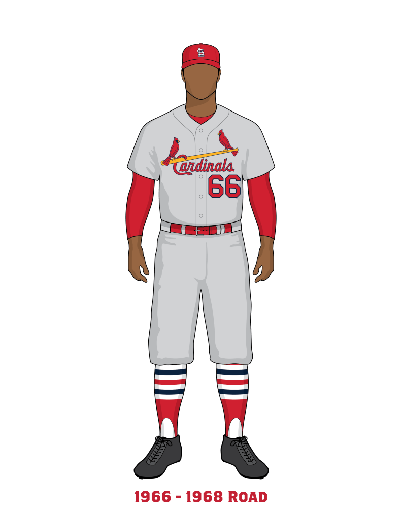
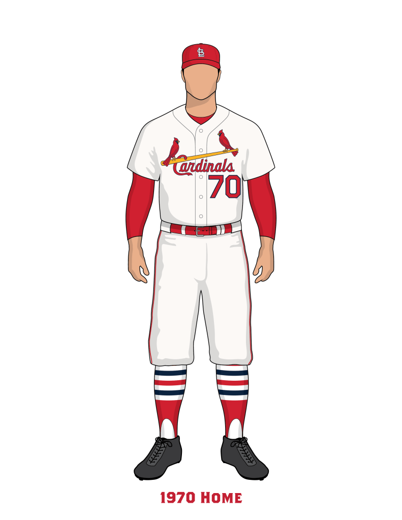
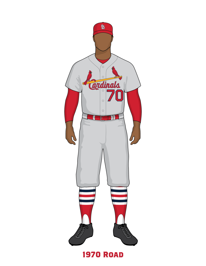
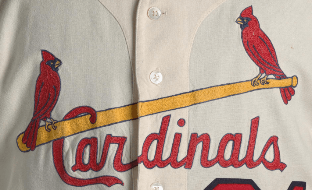
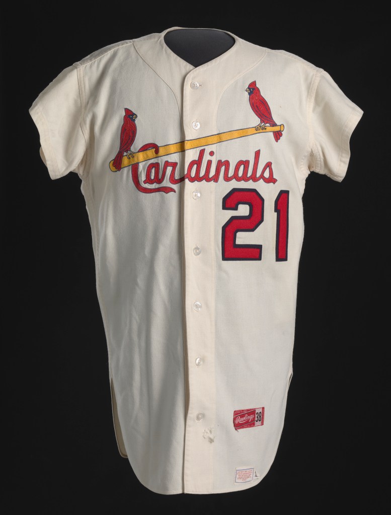
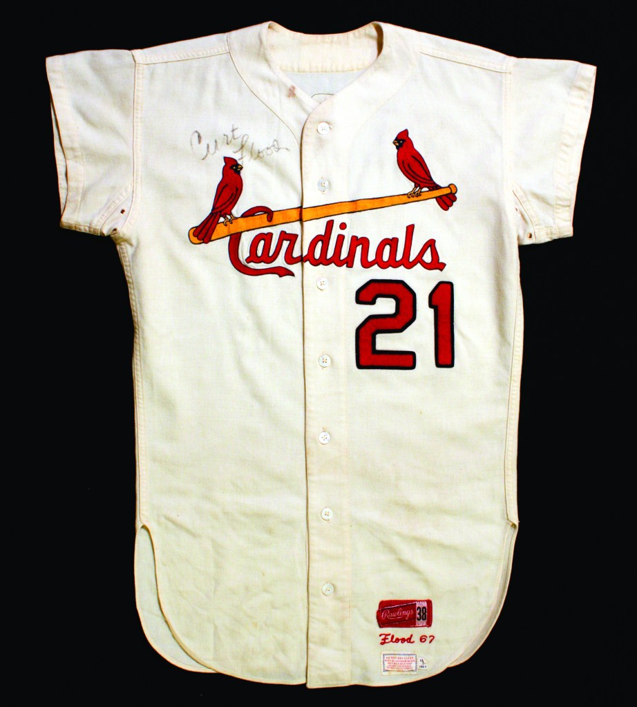
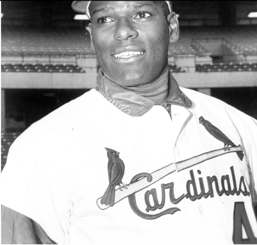
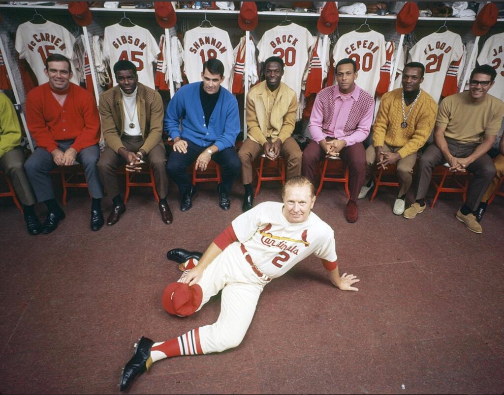
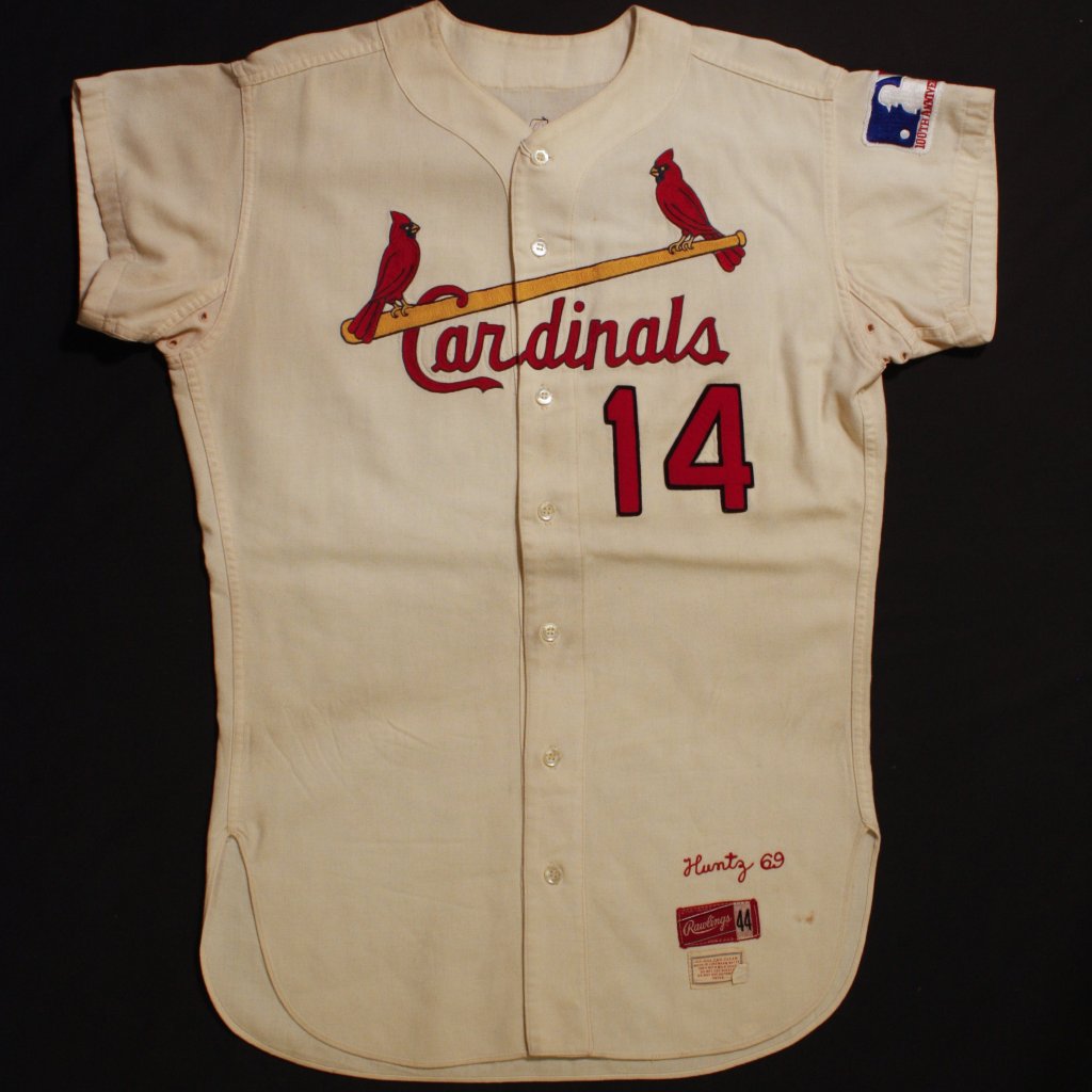
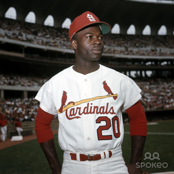
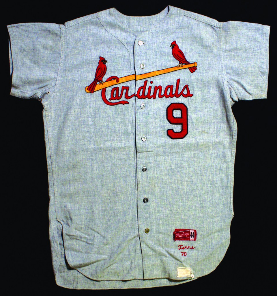
In 1966 the Cardinals changed the Birds on the Bat design. The Cardinals script did not change, but the birds were a completely new design. This Birds on the Bat design would last for 30 years and endure through multiple uniform designs.
A smaller detail noticed in 1966, the STL cap emblem flattened out the top of the T. In previous seasons we observed a trapezoid shape at the top of the T, and starting in 1966 it would become a rectangle shape. See comparison below.
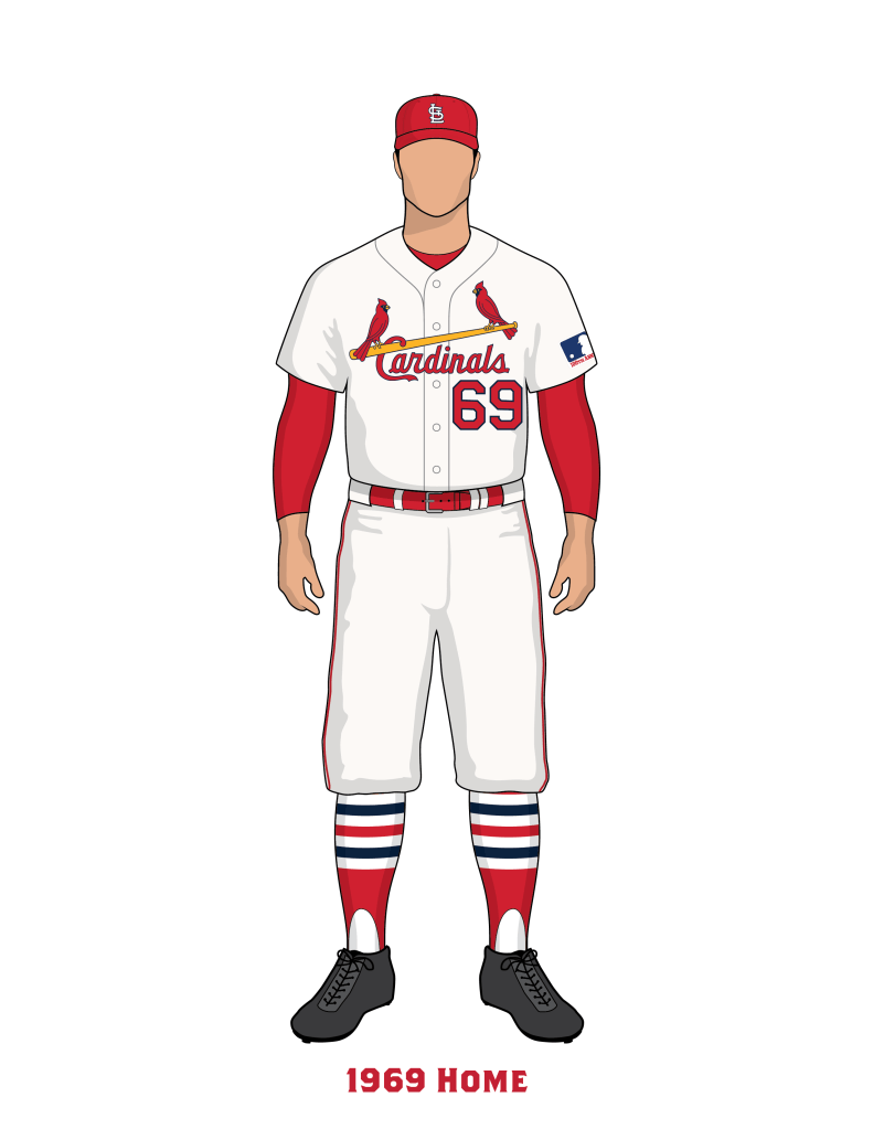
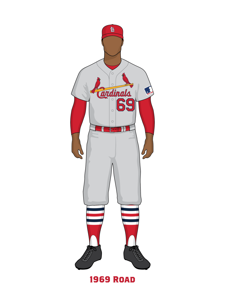
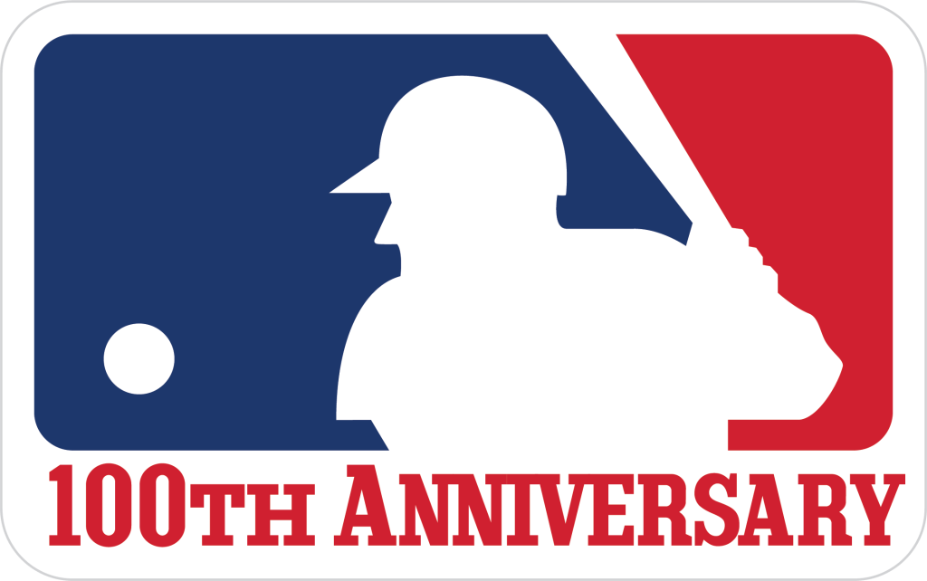
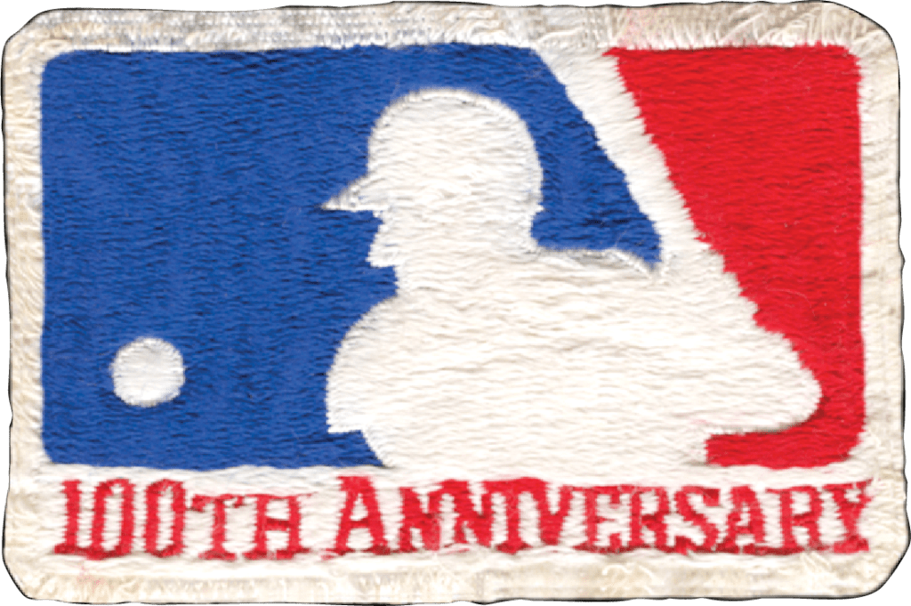
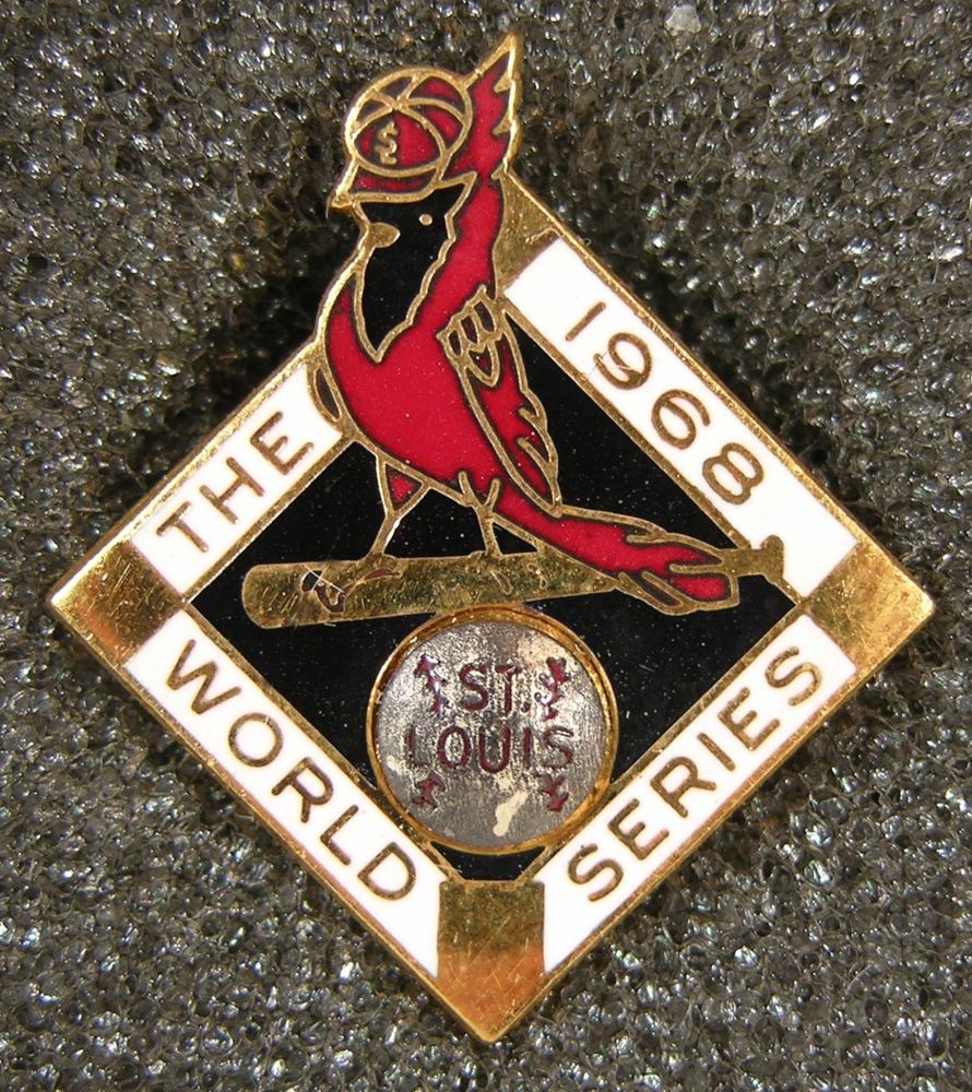
These five seasons have been combined because the only change made was in 1969, in which the Cardinals wore an MLB 100th Anniversary patch, but otherwise would be the same uniform from 1966-1970.
The Cardinals in 1966 started to use official print graphics and official team logos. These logos were different from the uniform graphics.
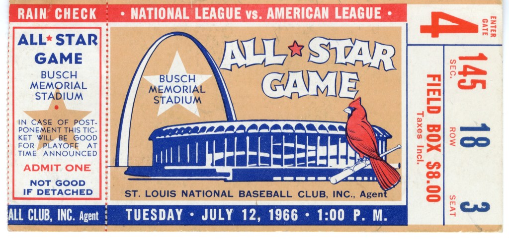
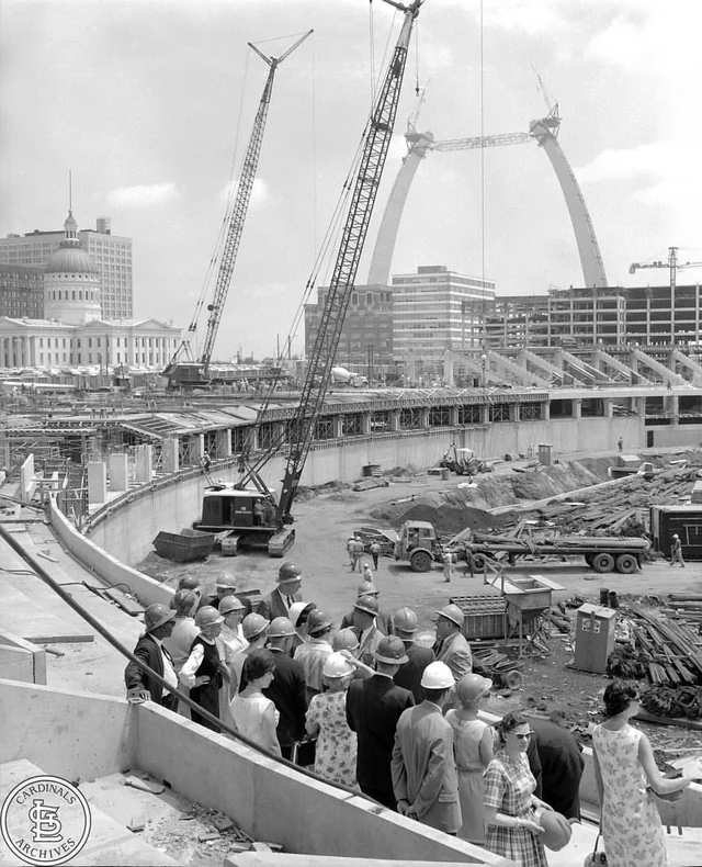
In 1966 the Cardinals began playing at Busch Memorial Stadium, “Busch 2.”
In 1970 we observed another STL cap emblem. However, this emblem is inconsistent and we do not know its use.


Team Colors
Cardinals Bright Red – PMS 186
Yellow uniform use – PMS 1235
Yellow print use – PMS 108
Navy Blue – PMS 289
Off-White Fabric – CMYK: 1/2/3/0
Gray Fabric – CMYK: 0/0/0/20

In looking at your site, I noticed that the Cardinals number font underwent a slight change between 1965 and 1966, on both the front and back numbers.
LikeLike
Yes that is what we have observed. We have all the numbers and letters and drawn, just not displayed on the site. 1965 had more chunky fatter letters with blocky serif ends. In 1966 they went through a rebrand and everything got skinny. Skinny numbers, skinny letters, skinny birds.
LikeLike