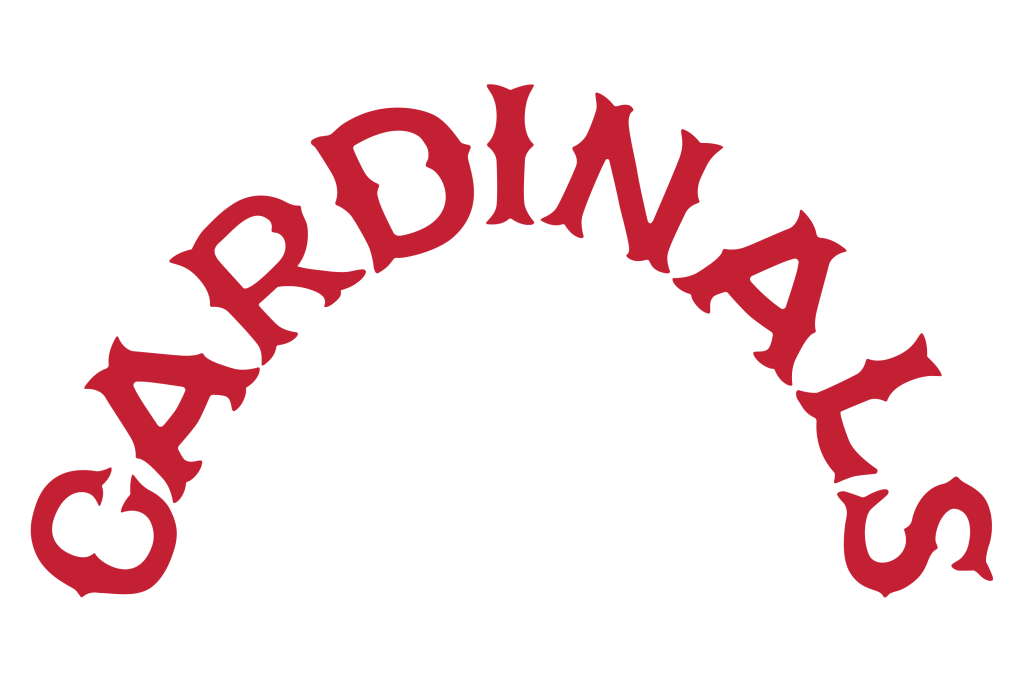
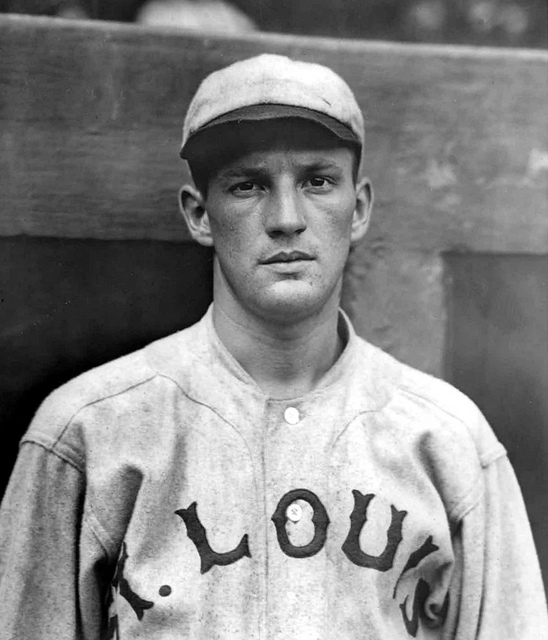
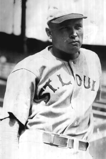
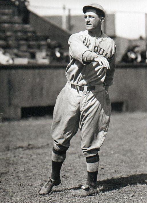
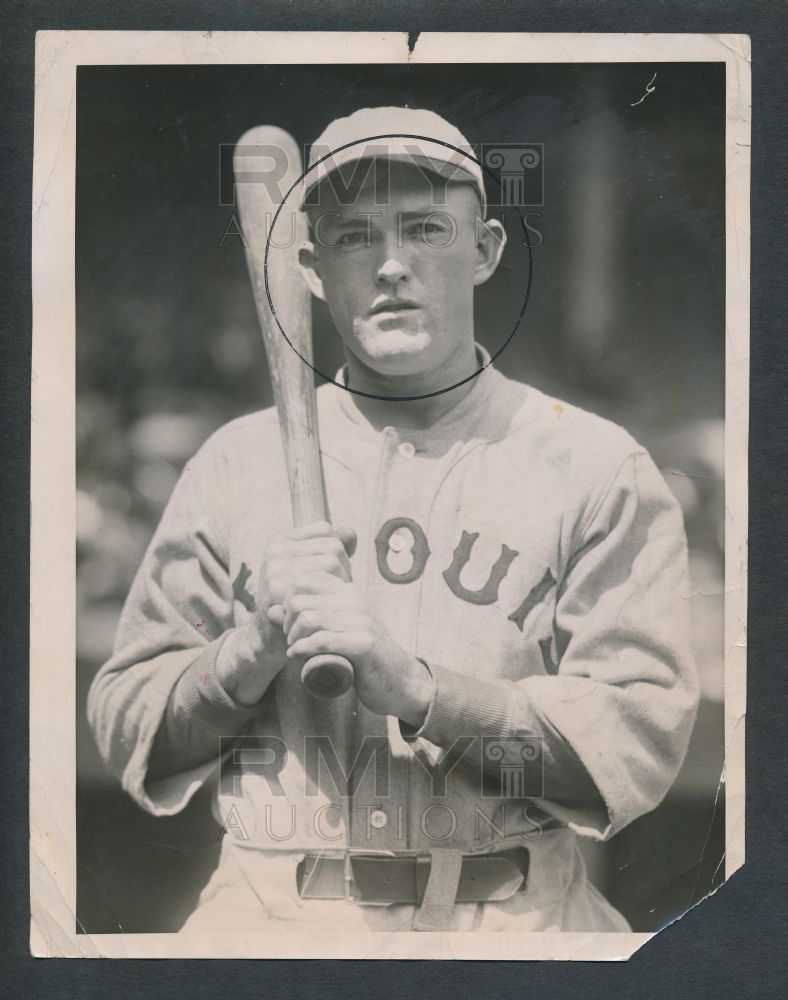
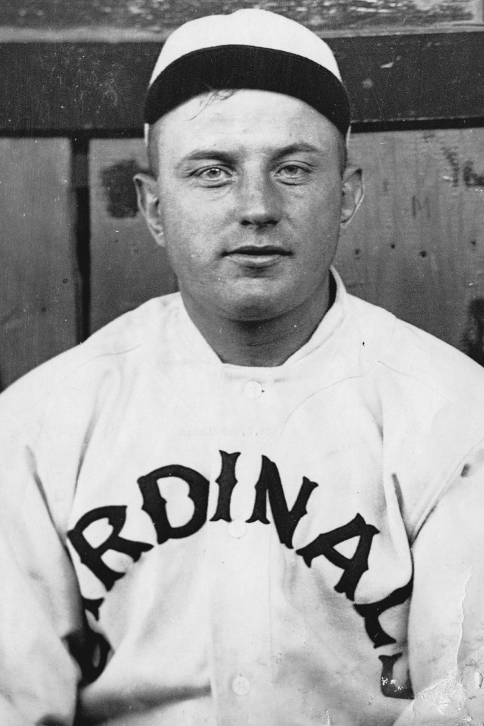
In 1921 the ST. LOUIS lettering changed. The spur serifs became pointy, but remained similar to the previous season. We observed through photographs that the lettering was typically applied too big across the chest, and would often tuck underneath players sleeves. Another uniform exists that says CARDINALS, but we have only one photo of it. Verne Clemons is seen wearing a similar sharp spur serif lettering, and the letters are applied so large and in such a radical arch, that only RDINAL can be seen in the photo. We don’t know how this uniform was used.







Team Colors
Cardinals Red – PMS 200
Off-White Fabric – CMYK: 1/2/3/0
Gray Fabric – CMYK: 0/0/0/20

