
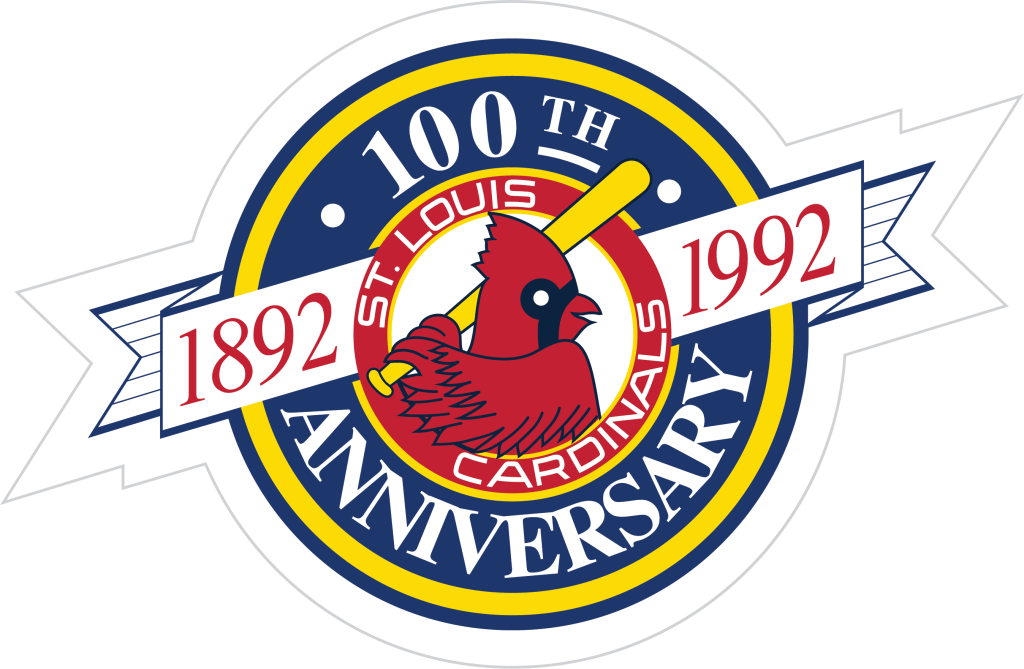
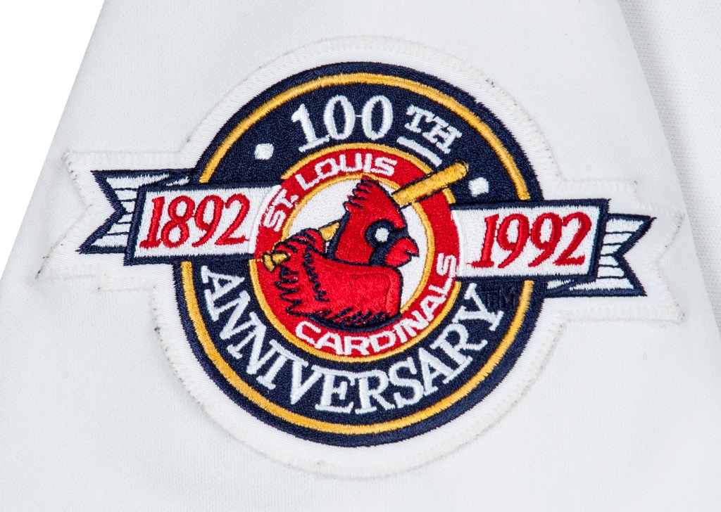
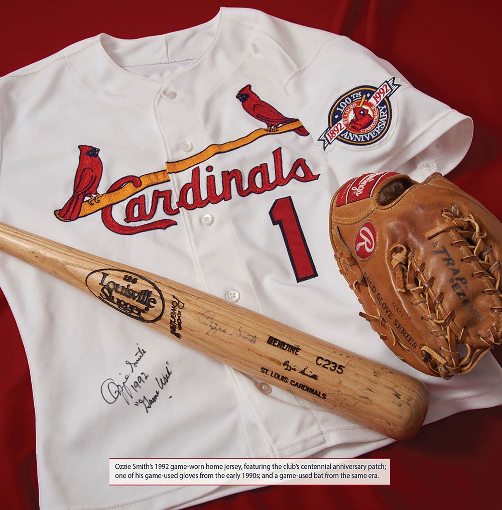
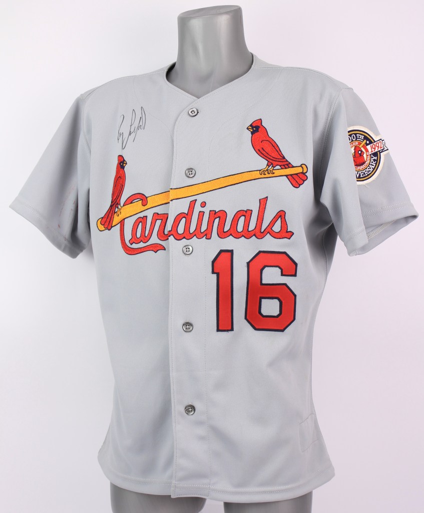
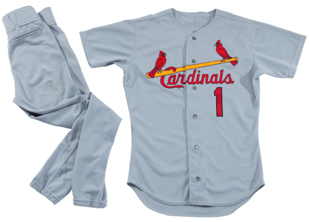
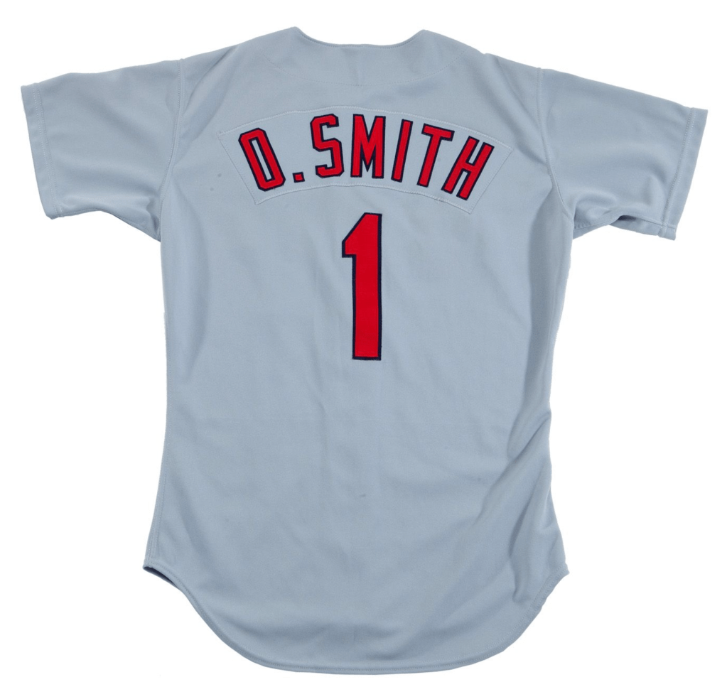
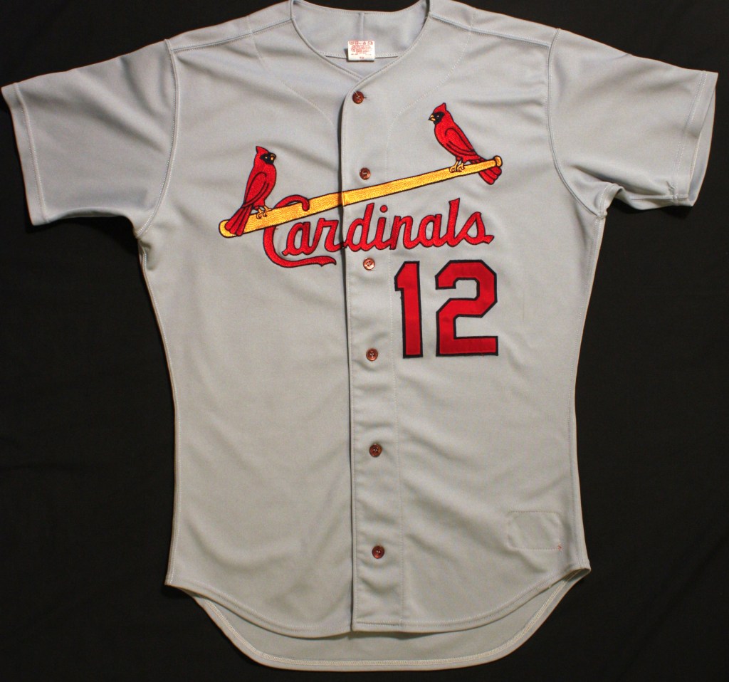
In 1992, the Cardinals retired the polyester pajamas and reinstated traditional button down jerseys, pants with belts, and a dedicated blue cap for the road uniforms. The team also celebrated their 100th anniversary this season by wearing a sleeve patch.
The ’92 Anniversary print logo was different colors from the sleeve patch worn. It should also be noted that 1992 marks the centennial of the franchise in the National League. In 1892 the Browns entered the National League, but existed in the American Association back to 1882.
In 1993 the team continued with the traditional baseball uniforms but dropped the sleeve patch.
In 1994 the Cardinals wore a patch commemorating MLB’s 125th anniversary.
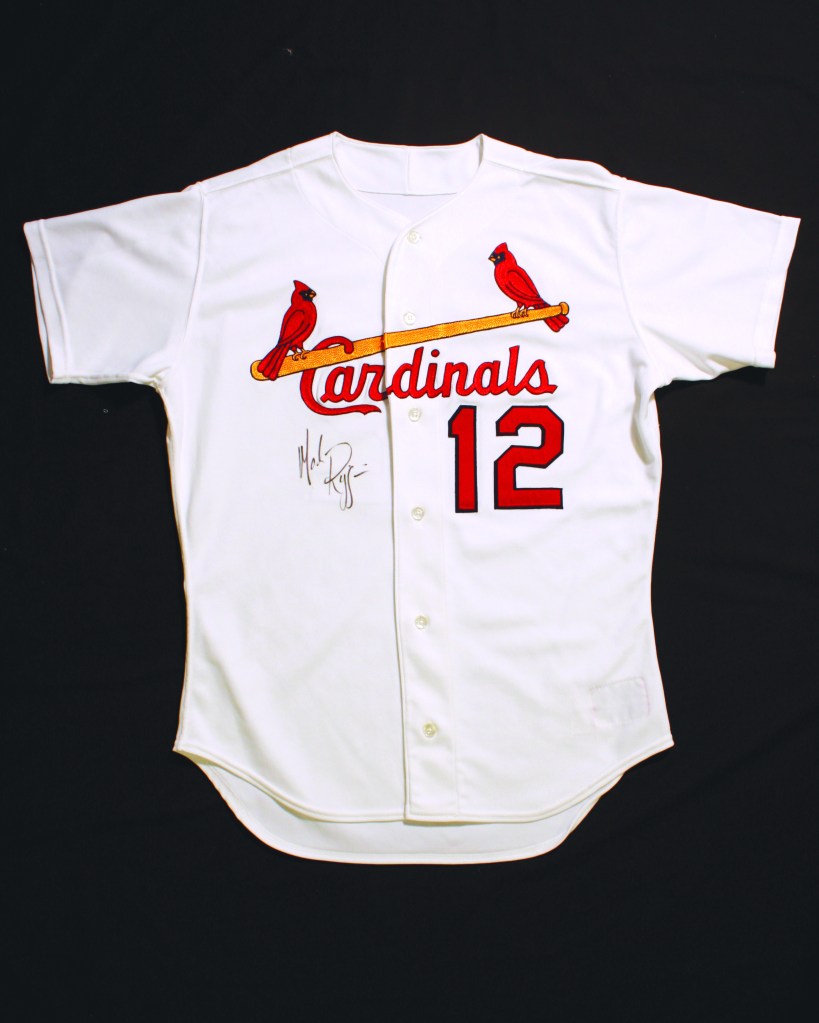
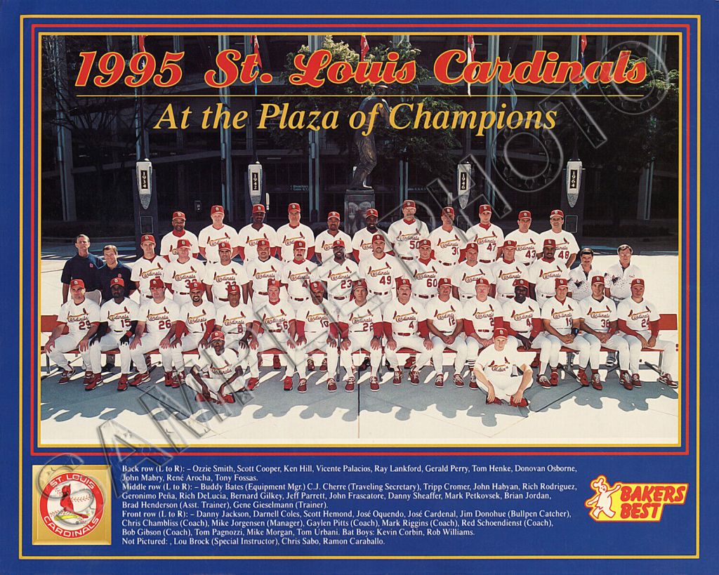
In 1995, after noticing the birds on the jersey had become noticeably small, Cardinals President Mark Lamping decided to increase the size of just the birds without modifying the design of the logo.


Newspaper Accounts
The Rock Island Argus: November 20, 1991
Cardinals adopt uniform changes
The St. Louis Cardinals will don new uniforms for the 1992 season, including navy blue caps and warm-up jackets on the road, team officials announced Tuesday.
The new uniforms feature a return to the traditional button-up jerseys with belted pants. At home, the team will still wear its familiar red cap and warm-up jackets.
However, both the home and road versions of the new uniforms will continue to sport the traditional “Birds-on-Bat” logo across the chest.
The road caps, navy blue with a red “StL” logo, are a return to the style the Cardinals wore in the late 1950s and early 1960s. St. Louis adopted red caps in 1964.
The home uniforms will be white with red belts, the road uniforms will be light gray with blue belts, and both versions will feature red numbers and letters.
The 1992 uniforms also will lack the blue and red trim featured on the neck, sleeves and pant legs of the old double-knit uniforms, which St. Louis began wearing in 1972.
The Springfield News-Leader November, 20 1991
Cardinals unveil new uniforms for both road and home games.
The St. Louis Cardinals put the finishing touches on a makeover Tuesday, unveiling new, old-style uniforms and blue caps for road games. The Cardinals join a growing list of teams looking to their past to update their look. The new look isn’t a drastic change, and it’s actually the style of uniforms with minor alterations and caps that St. Louis players wore from 1956-64. Among the subtle changes, the white home and gray road uniforms eliminate red, white and blue trim from the sleeves, resulting in a cleaner look. Pants now have belts instead of a waist band. Pullover jerseys have been strapped in favor of button-down shirts. The team also will wear blue jackets on the road for the first time. The move to more traditional-style uniforms with button-down jerseys completes a cosmetic transformation for the franchise. The Cardinals, who hadn’t significantly altered their uniforms since 1971, also are installing a new artificial turf surface and bringing in the outfield fences in an effort to increase home-run output at spacious Busch Stadium. “We’ve been looking for a couple of years at trying to do something different with our uniforms,” said Marty Hendin, Cardinals vice president of marketing. “I think the fans will like what we’re going to do.” . Jerry Harper, the founder of a 1,000-member fan club in East Moline, IL., is a little dubious about the changes. “We kind of hated to hear about the blue caps,” Harper said. “We’ll get used to it, I guess.” But Jeff Laski, an attorney who is president of another Cardinals fan club in Denver, thinks it’s a great idea. “The Cardinals are such a tradition-rich club that I think the new look is going to be real good,” Laski said. “The tradition of the Cardinals is so great, hey, let’s remind people of it.” Hendin conceded the Cardinals were a little behind the times in going to the retro look. They had been one of only three teams wearing pullover jerseys, along with the Detroit Tigers and Toronto Blue Jays, before making the switch. “It just kind of slipped up on us,” Hendin said. “It’s been going on for a while, and it’s time we got back to our roots.” The changes coincide with the team’s 100th anniversary. Uniforms will feature commemorative patches. The only quibble among the players is that they’ll have to wear non-color coordinated uniforms on the road, with the shoes staying red, visiting clubhouse manager Jerry Risch said.
Note the following newspaper account is not 100% accurate in its depiction of Cardinals uniform history. Good not great.
St. Louis Post Dispatch: April 5, 1992
The major breakthrough for the Cardinals began in 1921, according to a story that originally appeared in a 1943 edition of The Sporting News. Capolino includes the tale in his catalog of vintage clothing because “it’s so schmaltzy, it’s priceless.” The logo was conceived by Allie May Schmidt in 1921. She was decorating for a dinner in Ferguson at which Branch Rickey, then vice president of the Cardinals, was to speak. At a loss for ideas, she stared out the window and spied two redbirds perched on a bare tree branch. She made cardboard cutouts of them for centerpieces. Rickey was so enamored of the idea that he adopted the emblem for the uniforms the next season. The uniforms were a hit with the fans, Okkonen writes. “It helped offset the routine dullness and conformity of baseball uniforms in the ’20s.” But they hardly were a tradition. The birds on the bat were dropped from the home uniform in 1926, when the Cardinals won their first World Series, and were replaced the following year by a single bird circled by the words WORLD CHAMPIONS. In the late ’20s, numbers made their first appearance. Players received the number of their position in the batting order. The system quickly grew impractical.
The Gas House Gang: The birds returned In 1928 but in 1930, ST. LOUIS temporarily replaced CARDINALS on the front of the uniform. CARDINALS returned in 1933 with extra piping along the button. Front zippered shirts first appeared in 1939. The Cardinals adopted it, but not without misgivings. “They were tricky,” said former equipment manager Butch Yatkeman, who began his Cardinals career as a batboy in 1931 and retired In 1982. “They weren’t the same quality as you’d find today. They ran clear to the bottom of the shirt, so it was easy for them to fall off the track and come undone.” Yatkeman’s solution was “to have the shirt bottoms sewn together, so the players would have to put them on over their head. No more broken zippers.”
The ’40s: In 1940, the team adopted a cap with solid navy blue crown with STL monogram and red bill. On the road they wore the same hat with a bird logo in place of STL Major and minor changes to uniforms abounded in the ’40s. Striping on socks varied for home and road uniforms, patches on the sleeve appeared and disappeared, piping on the sleeves was added, the “C” in Cardinals was elongated, and the position of the birds was changed. “There was not the tradition then,” said Dave Eshelman, plant manager of the Liebe Co., which has sewn the birds on the bat on the Cardinals uniforms for more than a half-century. “Teams could change styles more often without worrying about tradition.” Bill Smith started with Rawlings Sporting Goods Co. 49 years ago as a designer, so he has been involved in his share of changes. Rawlings for years was the official supplier of uniforms to all major league teams. “Sometimes you have to deal with the club owner’s wife,” said Smith, now head of pro sales. “Maybe she drew a sketch. Sometimes an artist would have a concept “Often enough, artists wouldn’t know what would work. There had to be a lot of compromises, and that often meant a lot of minor changes.”
The 1950s: More minor changes. The amount of piping down the front diminished; the zipper disappeared in 1956; fusible plastic lettering replaced felt notorious for fading, shrinking and bleeding. But one major change, in 1956, demanded not to go unnoticed. Frank Lane was general manager that season and was told to revamp the team. He replaced three starters in the pitching rotation, traded Red Schoendienst to the Giants for Alvin Dark, then wiped the Birds on the Bat off the uniform. “He was told to remake the team,” said Jerry Vickery, curator of the Hall of Fame Museum at Busch Stadium. “He took them literally.” “I think it was a whim,” Smith said. “People reacted pretty quickly.” Fred Hutchinson was hired as manager in 1956 as part of the Cardinals facelift along with players Charles Peete, left, and Bob Blaylock, all in the unpopular birdless uniforms. And negatively. Fans disliked the new look, which was clean, modern, sterile. The club finished second.
In 1957: The birds returned. In spite of such whimsical changes, players had little to say about their uniforms. “It’s a good thing,” Yatkeman said. “The uniform they were handed is the one they wore.”
The ’60s: Subtle tailoring became noticeable. The pants began to taper slightly and were less roomy in the hips, thighs and knees. The solid red cap replaced navy in 1964, and a wool orlon blend replaced flannel. Numbers appeared on the front of the Cardinals uniform for the first time in 1962. Some teams tried to capitalize on color TV. The A’s, in gold and green, and later the Astros with their rainbow shirts tried some snappy color combinations that didn’t last.
The ’70s: The Cardinals and Pittsburgh Pirates broke ground when they introduced the pullover, double-knit uniform in 1971. The advantage was the fabric’s lightweight comfort and durability. Its biggest effect was to make players more body and image conscious. “Players tend to think those uniforms make them look good,” Smith said. “I don’t think some of them look in the mirror.” Yatkeman, though, preferred double knits to their predecessors. “Some of the players had silly reasons for disliking the pullovers,” he said. “Maybe because they had to take their caps off and that would muss their hair.” The Cardinals joined the color bandwagon by switching to red shoes, from black, in 1973. Also popular in the ’70s were blue road uniforms, which gradually died out as player’s image became more important so did personal style in uniforms. Yatkeman’s favorite story is about George Hendrick, who came to the Cardinals from San Diego in 1978. He found out from the Padres’ equipment manager that Hendrick liked his pants long. He had to special order the pants, which took a while. “In the meantime, I got the biggest pair of trousers I could find, ripped out the seams and made them as long as they could be. “George was practicing in right field when he was spotted by general manager Bing Devine, an impeccable dresser. “Bing pulled me aside, kind of upset and said, ‘Can’t you find a pair of pants that fit that man?’ “I said, ‘You told me to keep the players happy. Why get a new player upset? If that’s what he wants, make him feel at home.”
Since the ’80s: The uniform remained essentially unchanged through the ’80s. This season’s uniform is still tight and double-knit but the shirt is a spitting image of the one used by the Cards in 1968. Yatkeman had Just one piece of advice for his successor, Buddy Bates, when he found out that the new Cardinals uniform had buttons. “He better know how to sew them back on.”
Liebe: Birds’ Best-Kept Secret By Kathleen Nelson Photos by Jerry Naunheim Jr. of the Post-Dispatch Staff for almost seven decades, a small company in Chesterfield has had the Cardinals’ number. And now it’s got the number of all of Major League Baseball and the National Basketball Association. And their logos, and lettering, too. Tucked away in an Industrial park off Chesterfield Airport Road is Liebe Co., a small business that is really big time. The company embroiders the Birds on the Bat and does the lettering and numbers on the official Cardinals uniforms. The Cards are the only team that has kept the human touch to its uniforms; each of the birds on the bat is sewn into the garment. The process takes eight women about 90 minutes to complete one garment. It begins with transferring the pattern to the garment. One woman will embroider the bat to the shirt, another the eyes and beak, another the birds, another the word Cardinals. Most players have two road and two home uniforms. Liebe also provides all the lettering, logos and numbers for Russell Athletic, official licensee of Major League Baseball, said Dave Eshelman, plant manager. The company produces these, then ships them to Russell, which applies them to shirts, jackets and other memorabilia. In the fall of 1990, Eshelman said, Liebe entered a similar agreement with Champion Products, official licensee of the NBA. Liebe Is a giant in its field, but is almost as unknown to the public as it was In 1923, when Bob Liebe started producing embroidered logos on a sewing machine in his basement. He toiled in relative obscurity for a decade, but his attention to detail earned him a contract with St. Louis-based Rawlings Sporting Goods in 1935. Liebe earned a name for himself in the business by developing a fusible vinyl film that replaced uniforms’ felt lettering, notorious for bleeding and fading. The company has kept its reputation and small-business appeal despite a fire five years ago. For two years, Liebe employees worked out of the company warehouse. “That almost wiped us out,” Eshelman said. The only thing that wasn’t destroyed were steel drawers containing 50 years of patterns. “They were soaked, but we didn’t lose a single one,” Eshelman said. That too, has paid dividends. Liebe also supplies vintage logos and lettering to Mitchell & Ness Nostalgia Co., which holds Major League Baseball’s license to historical replicas, putting the finishing touches on the Cardinals new uniforms at the Liebe Co. in Chesterfield. A collection of patches and logos produced over the years by Liebe. jerseys. Proximity to Rawlings helped in adjusting the design of the new Cardinals uniform, to be unveiled Monday. “They brought the whole batch of uniforms in, but the button holes were right where the birds needed to be,” Eshelman said. “Moving the birds down wouldn’t have looked quite right” So the shirts had to be redone. And then there was the rush job from the Major League office last fall. “The league called us when the (National) League playoffs were 2-2 that the Pirates had no room on their sleeves for the official World Series logo. The league called us and said, ‘When the Pirates win, we’ll need those patches rearranged.’
Team Colors
Cardinals Bright Red – PMS 186
Yellow uniform use – PMS 1235
Yellow print use – PMS 108
Navy Blue – PMS 289
Gray Fabric – CMYK: 0/0/0/20
