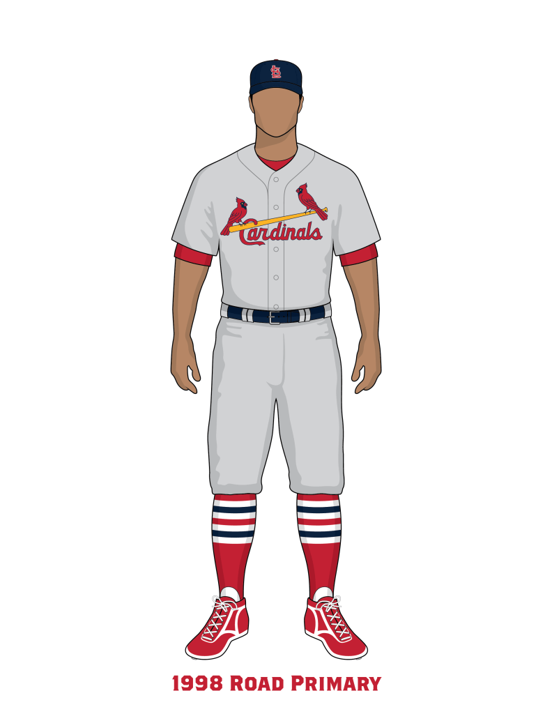
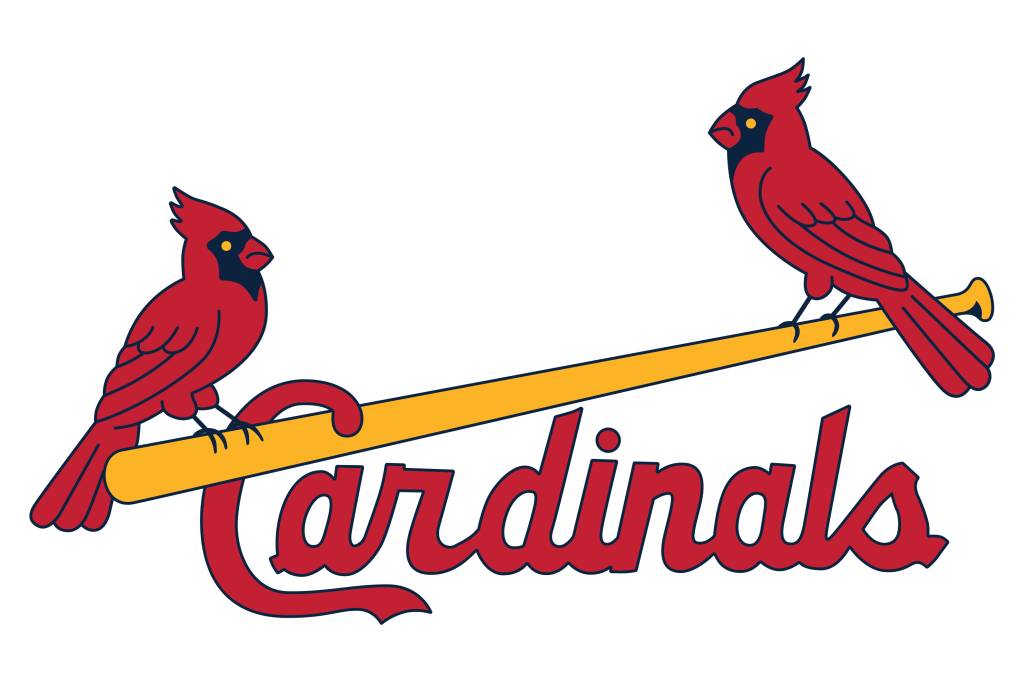
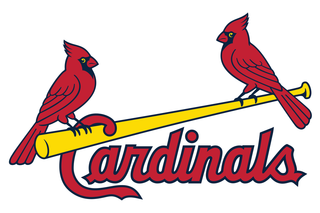
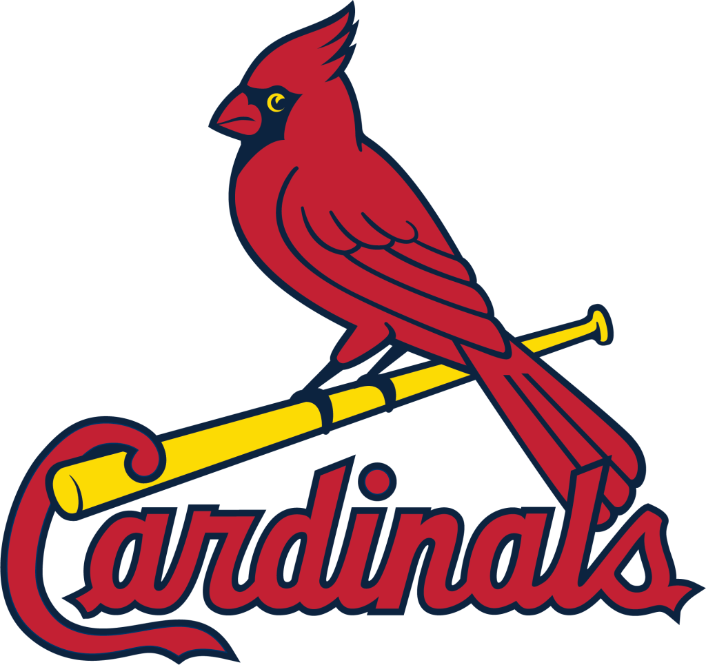
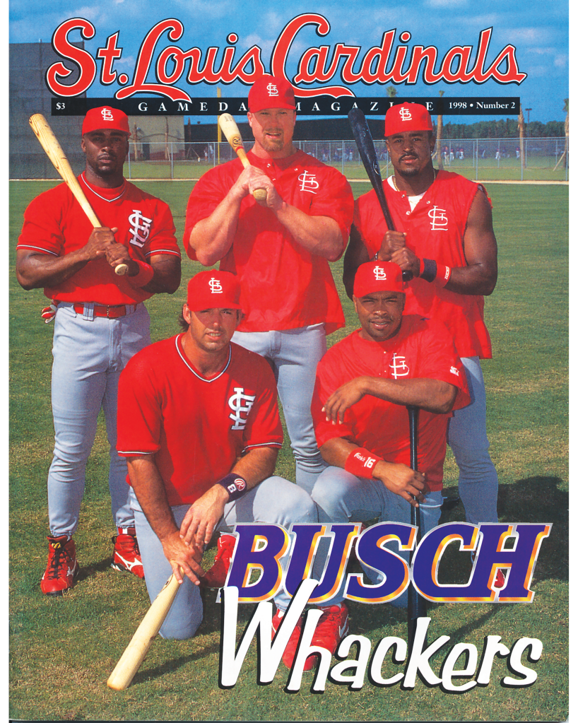
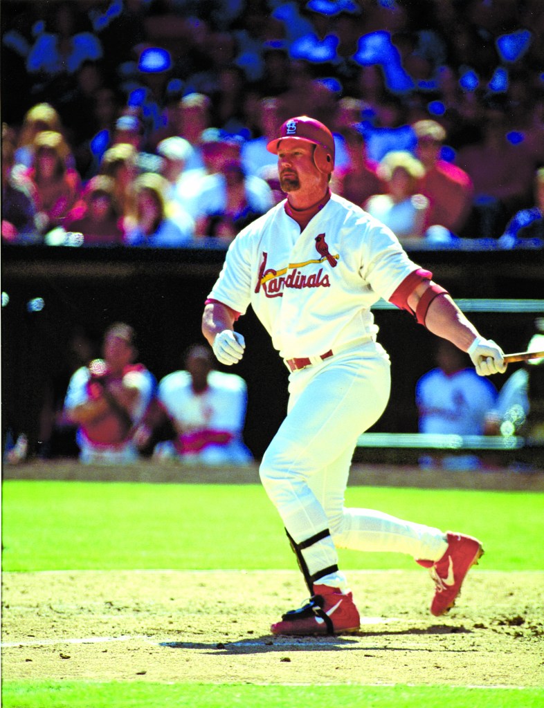
In 1998, after a year of research and design consultation, Bill DeWitt III unveiled a comprehensive update of the Cardinals uniforms and print logos. The three major goals set were to redesign the birds to resemble natural cardinal birds, to create a family of graphics that showed consistent bird designs between garments and print graphics, and to achieve a contemporary appeal while still maintaining the tradition of the Birds on the Bat.
When the uniforms were introduced, there was noticeable differences between the stitching of the Birds and the computer graphic. Because the Cardinals uniforms are chain-stitch embroidered by hand, the finer details couldn’t be translated onto the jersey. We noticed this occurring through 2012, with the birds slowly drifting further and further from the intended graphic.
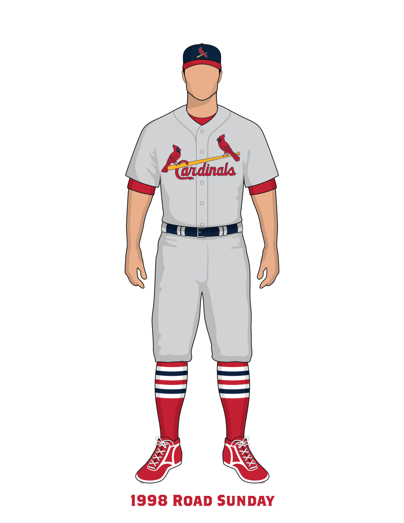
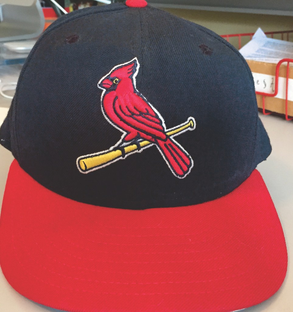
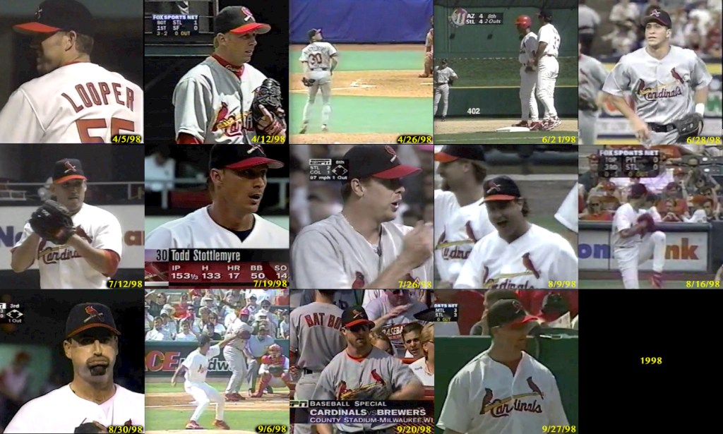
The uniforms maintained the Home and Road concept from previous seasons with a refreshed Birds on the Bat. The Cardinals added a new cap with a single bird on it. This cap would be the 2nd time in the team’s history to feature a bird on the cap, the first being 1941. According to quotes from Bill DeWitt III in newspaper accounts, this cap was intended to be worn on Sunday home games at Busch Stadium only. But, as pointed out by reader Elias Coblentz, it would appear the Cardinals experimented with the Sunday caps for both home and road in 1998, but were inconsistent in their use of it. Some Sundays, both home and road, they wore the new cap, and others they wore their regular cap. It seemed to be worn at the discretion of manager Tony La Russa.
On August 1st and 2nd the Cardinals wore St. Louis Stars throwback uniforms.










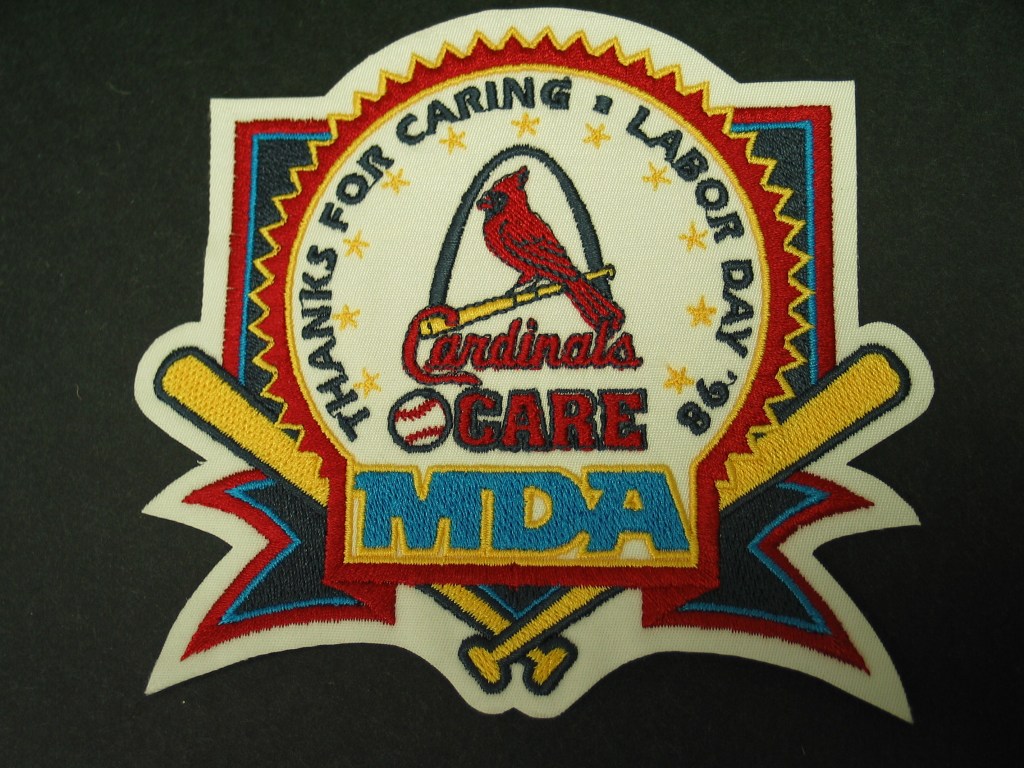



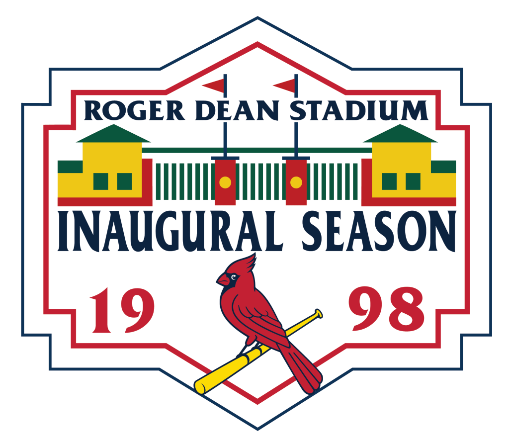

In 1998 the Cardinals opened Roger Dean Stadium in Jupiter, Florida, the site of the Spring Training facility. The team wore sleeve patches during Spring Training in 1998.
Newspaper Accounts
St. Louis Post-Dispatch: November 5, 1997
We’re not talking about changing the wheel, we’re talking about going from Pantone 186 to Pantone 200 on the color chart. “I knew people would think, Who is this DeWitt kid, changing the logo? What does he think he’s doing?” DeWitt said. “But try, if you can, to take away any team values or tradition that is connected with it and take a look at the old logo strictly on its graphic or aesthetic merits. If you do that, I think you’ll agree that it’s really pretty ugly.” Time for an overhaul. The red in the redbirds will be a deeper shade, closer to the color of the actual bird. The lines will be heavier, keeping the images from fading under certain uses. The birds are still there, perched on a bat, but they have a different attitude. To bring it out, DeWitt got together with Gary Kodner of St. Louis-based design firm Nehmen-Kodner and looked at more than 100 possibilities. “The concept stemmed from the opinion the team uses too many ‘cardinal’ birds for different applications,” DeWitt said. “We decided to come up with a new bird that would look great on the Birds on the Bat logo and also in a new primary logo. We agreed a more realistic bird was our goal.” The design team gathered books and drawings, studied paintings by Midwestern Audubon artist John Ruthven, researched the Cardinals Hall of Fame Museum, dug through archives for birds of a different feather. DeWitt even put a bird feeder in his yard to conduct field re search. The result is a more genuine bird, a more dignified specie, a cardinal with soul. “I went out and showed it to people in the stands late last season,” DeWitt said. It was very informal, just to get a feel. It’s amazing the reaction you get when you’re talking about changing the logo, but I would say, Now wait a minute. Take a look at the primary logo, take a look at this and tell me, would you go in this direction? And then people reacted positively.” For all the consternation over birds and logos, the wardrobe adjustments most likely to create a sensation among fans is the apparel. The batting practice shirt is a warm red, button-down mesh jersey with blue piping and Birds on the Bat on the front. The shirt is scheduled to be worn in pregame activities only at least for this season. Catcher Mike Difelice, who modeled the new uniform at the christening, would like to see the shirt become standard attire. “I think it’s cool,” Difelice said. This would be great as a regular jersey. On hot days in the summer, like those Sunday day games, it would be nice to be able to wear this. I think fans are really going to like the look of this. The dugout jacket made by Starter, brings back a traditional satin look and features red sleeves with a blue trunk. It will be adorned with the Birds on Bat on the front consistent with all the on-field attire. All the new items and logo merchandise will be available at various shops and outlets beginning today. DeWitt is confident the catalog will be well-received. The ‘Sunday cap,’ which will feature a blue crown, red bill and an entirely new Cardinal-on-bat logo, also figures to catch the eye. The cap borrows elements from a 1920s logo and combines them with elements from a cap used in 1942, a championship season and Stan Musial’s first full season. Not a bad foundation. The cap is targeted to be worn on Sundays and special situations, but Difelice suggested players will want artistic license. “It’s kind of a different flair,” he said. “These things definitely leave the door open for some superstitions. If we wear that cap and get something going, guys are going to want to wear it on a regular basis.” DeWitt said: “It’s no secret that a lot of clubs have changed their merchandise to generate revenue. It’s almost like if you can’t get a winning team, you change the logo. But that was not a primary concern in doing this. We felt we had a legitimate reason to take a look at the logo and see if we could bring it up to date and improve it. For me, it was certainly a labor of love. I think the things we’ve done bring an exciting new look to the Cardinals, while retaining the continuity and tradition of this storied franchise.”
St. Louis Cardinals Press Release, November 1997
In the megabucks world of sports licensing and marketing, the adage “if it ain’t broke, don’t fix it” doesn’t necessarily apply. Teams tend to change uniforms and logos almost as often as fans change channels with the remote. There is gold in them that threads, a vehicle to generate interest, a means of offsetting multimillion-dollar wages.
But when director of merchandising Bill DeWitt III pondered a re-design of the Cardinals’ logos, he knew he was treading on sacred soil.
Some distinguishing marks in sports transcend fashion and trend, and confront those who would tinker with a neon “hands off” sign. As countless numbers of their most intimate friends in St. Louis and surrounding areas might say: You don’t mess with the “Birds On The Bat.”
DeWitt, 29, was acutely aware of the volatile chemistry with which he played.
“There was a lot of apprehension,” DeWitt said. “That’s why we made sure with all the dramatic changes that were made, we could look back to what we had seen in the past and say, Hey, we’ve been there before. We’re just putting it together with today’s graphics.”
The alterations introduced during a Tuesday press conference at Busch Stadium would hardly fill a New York fashion stage. With the exception of an eye-catching new batting practice jersey, a new dugout jacket and a “Sunday cap,” the changes are primarily in the various logos.
The introduction reflected both the attention and the respect the club’s call letters command. We’re not talking about changing the wheel, we’re talking about going from Pantone 186 to Pantone 200 on the color chart.
“I knew people would think, Who is this DeWitt kid, changing the logo? What does he think he’s doing?” DeWitt said. “But try, if you can, to take away any team values or tradition that is connected with it and take a look at the old logo strictly on its graphic or aesthetic merits. If you do that, I think you’ll agree that it’s really pretty ugly.”
Time for an overhaul. The red in the redbirds will be a deeper shade, closer to the color of the actual bird. The lines will be heavier, keeping the images from fading under certain uses.
The birds are still there, perched on a bat, but they have a different attitude. To bring it out, DeWitt got together with Gary Kodner of St. Louis-based design firm Nehmen-Kodner and looked at more than 100 possibilities.
“The concept stemmed from the opinion the team uses too many ‘cardinal’ birds for different applications,” DeWitt said. “We decided to come up with a new bird that would look great on the ‘birds on bat’ logo and also in a new primary logo. We agreed a more realistic bird was our goal.”
The design team gathered books and drawings, studied paintings by Midwestern Audubon artist John Ruthven, researched the Cardinals Hall of Fame Museum, dug through archives for birds of a different feather. DeWitt even put a bird feeder in his yard to conduct field research.
The result is a more genuine bird, a more dignified specie, a cardinal with soul.
“I went out and showed it to people in the stands late last season,” DeWitt said. “It was very informal, just to get a feel. It’s amazing the reaction you get when you’re talking about changing the logo, but I would say, `Now, wait a minute. Take a look at the primary logo, take a look at this and tell me, would you go in this direction?’ And then people reacted positively.”
For all the consternation over birds and logos, the wardrobe adjustments most likely to create a sensation among fans is the apparel. The batting practice shirt is a warm red, button-down mesh jersey with blue piping and “birds on bat” on the front. The shirt is scheduled to be worn in pregame activities only – at least for this season.
Catcher Mike Difelice, who modeled the new uniform at the christening, would like to see the shirt become standard attire.
“I think it’s cool,” Difelice said. “This would be great as a regular jersey. On hot days in the summer, like those Sunday day games, it would be nice to be able to wear this. I think fans are really going to like the look of this.”
The dugout jacket, made by Starter, brings back a traditional satin look and features red sleeves with a blue trunk. It will be adorned with the “birds on bat” on the front, consistent with all the on-field attire. All the new items and logo merchandise will be available at various shops and outlets beginning today. DeWitt is confident the catalog will be well-received.
The “Sunday cap,” which will feature a blue crown, red bill and an entirely new Cardinal-on-bat logo, also figures to catch the eye. The cap borrows elements from a 1920s logo and combines them with elements from a cap used in 1942, a championship season and Stan Musial’s first full season. Not a bad foundation.
The cap is targeted to be worn on “Sundays and special situations,” but Difelice suggested players will want artistic license.
“It’s kind of a different flair,” he said. “These things definitely leave the door open for some superstitions. If we wear that cap and get something going, guys are going to want to wear it on a regular basis.”
DeWitt said: “It’s no secret that a lot of clubs have changed their merchandise to generate revenue. It’s almost like if you can’t get a winning team, you change the logo. But that was not a primary concern in doing this. We felt we had a legitimate reason to take a look at the logo and see if we could bring it up to date and improve it.
“For me, it was certainly a labor of love. I think the things we’ve done bring an exciting new look to the Cardinals, while retaining the continuity and tradition of this storied franchise.”
The Times: November 5, 1997
The St Louis Cardinals are changing the look of their uniforms and stadium next season, and seeing it in person will cost a little more. The team made three announcements Tuesday: ticket prices are going up; another $5 million is being spent on improvements to Busch Stadium; and the popular logo is getting some tinkering.
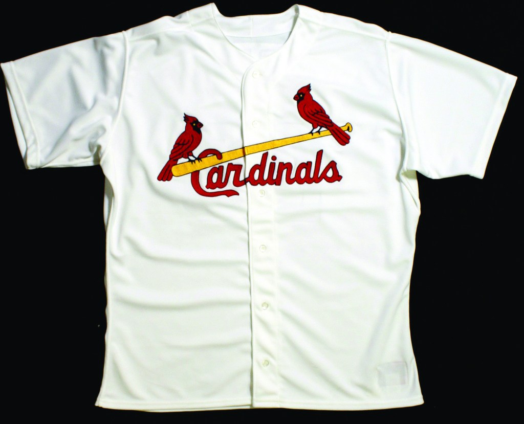
The birds-on-the-bat logo has adorned most Cardinals jerseys since 1922. Fortunately for traditionalists, the latest change is minor: The birds are bigger, a darker red, with navy blue legs instead of yellow.
They will remain perched on each end of a yellow bat, glowering, daring to be knocked off.
In 1956, then-general manager Frank Lane was nearly run out of town when he dumped the logo in favor of a bland “Cardinals” across the jersey front. That same season he considered trading Stan Musial. A year later, the old logo was back.
“We’re not going to take the birds and the bat off the jersey, and we’re not going to trade Mark McGwire,” merchandising director Bill DeWitt III said.
DeWitt also unveiled a few other changes that should spur additional sales just in time for Christmas. The team will use a new cap for Sunday home games that drops the traditional “StL” in favor of a single bird on a bat. The new cap is dark blue with a red bill.
Other than Sunday games at Busch, the cap could be used on other special occasions. “Maybe to break a losing streak,” DeWitt said.
The Cardinals will also go to a button-down mesh batting practice jersey that may also be sued in a few games.
COST
The jerseys and hat are already available at the Cardinals team store at Busch Stadium. The New Jersey sells for $140.38. The batting practice shirt is $79.55. The Sunday cap, $25.27.
The team’s uniform has gone through its share of transformations over the years – from the baggy wool worn by Frankie Frisch and Enos Slaughter tot eh powder blue double-knit road outfits that adorned the 1982 championship team.
But the birds-on-the-bat have remained exempt for 1956 and a few years in the late 1920s. It’s one of sport’s most recognizable symbols. In July, USA Today asked fashion designer Mr. Blackwell to assess major league uniforms. He cited the Cardinals’ look as one of the best.
Team Colors
Cardinals Red – PMS 200
Yellow uniform use – PMS 1235
Yellow print use – PMS 108
Navy Blue – PMS 289
Gray Fabric – CMYK: 0/0/0/20

I own the book, and love all the attention to detail. However, there is one glaring omission that bothers me: You fail to show (both in the book and on this website) that the Sunday “home” hat was initially the Sunday hat, period. The Cardinals introduced it in 1998, and wore it for all Sunday contests, Home and Road, in ’98 and ’99. It became a home-only cap in 2000.
LikeLike
Interesting, we are going to investigate and look at all the road Sundays from 1998 through 2000. I am finding a couple pictures of them wearing it on the road. From memory, sometimes they wore the single bird cap on the road, sometimes they didn’t. There was no hard and fast rule. We seem to remember it was a Tony La Russa decision what he wanted to wear.
LikeLike
Please do check, but I can assure you with almost 100% certainty that it was worn every Sunday, home and road, in 1998 and 1999. I have an extensive archive of games, and I am going through it as we speak, and thus far, every Sunday game in those two years has featured the alternate cap.
LikeLike
Turns out we were both right:
In 1998, the Cardinals seem to have worn the cap whenever TLR (or whomever) felt like it.
They wore it:
4/5 (H) , 4/12 (R) , 4/26 (R), 5/17 (H), 6/21 (H), 6/28 (R), 7/12 (H), 7/19 (H), 7/26 (R), 8/9 (H), 8/16 (H), 8/23 (R), 8/30 (H), 9/6 (H), 9/20 (R), 9/27 (H)
They wore their “regular” Home or Road caps:
4/19 (H), 5/3 (R), 5/24 (H), 5/31 (R), 6/7 (H), 6/14 (R), 7/5 (R), 9/13 (R)
They wore Negro League throwbacks in Atlanta 8/2, and thus wore a throwback cap.
In 1999, they wore it for every Sunday Game, Home and Road:
4/11 (H), 4/18 (R), 4/25 (R), 5/2 (R), 5/9 (H), 5/16 (H), 5/23 (R), 5/30 (R), 6/6 (R), 6/13 (H), 6/20 (H), 6/27 (R), 7/4 (H), 7/11 (R), 7/18 (H), 7/25 (R), 8/1 (H), 8/8 (R), 8/15 (H), 8/22 [Double Header] (R), 8/29 (H), 9/5 (R), 9/19 (H), 9/26 (R), 10/3 (H)
LikeLike
Incredible digging! Do you have a collection of photos for these dates as well? I’ll start on edits for 98 and 99. I need to get the right labels for the uniforms.
LikeLike
Thanks! I don’t have any professional photos from those games, but I can take video screenshots from them and send them your way, if you’d like.
LikeLike
please! Screenshots would be great. I can put them together in a collage and put dates on them. The more photo evidence we can add the better.
LikeLike