
The Cardinals officially unveiled their City Connects today Monday May 20, 2024, even though some of the promo photos were leaked late this past Friday evening May 17, 2024.
When I first saw these uniforms, I let out a huge sigh of relief. I really thought it would be a lot worse. I was even prepared to write an article about how the City Connect should just be our home uniform, and any lack of the Birds on the Bat would be a devestation to the brand.
Now that they’re released, we can talk details about the uniforms, and there’s a lot to unpack…From the top down.
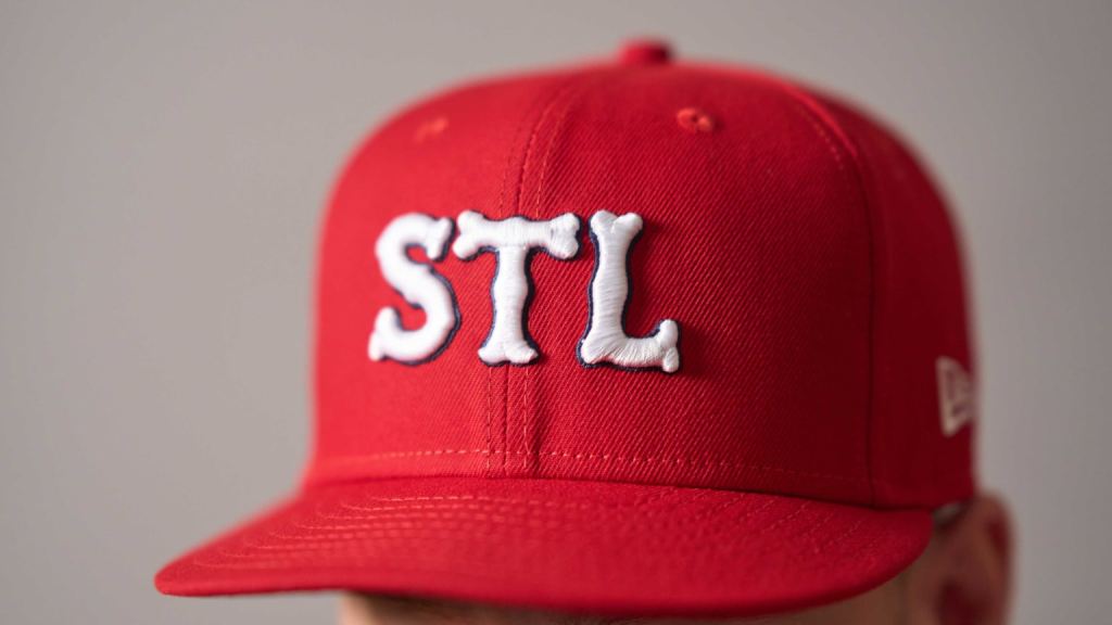
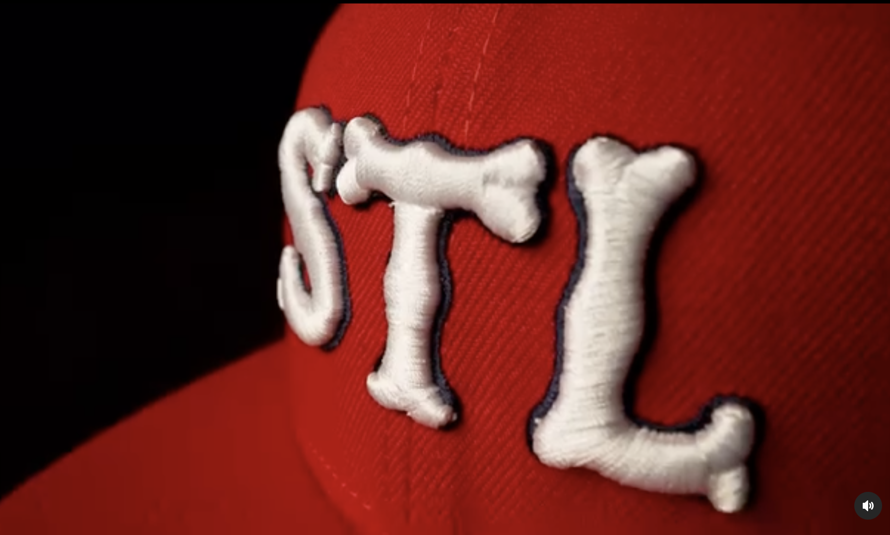
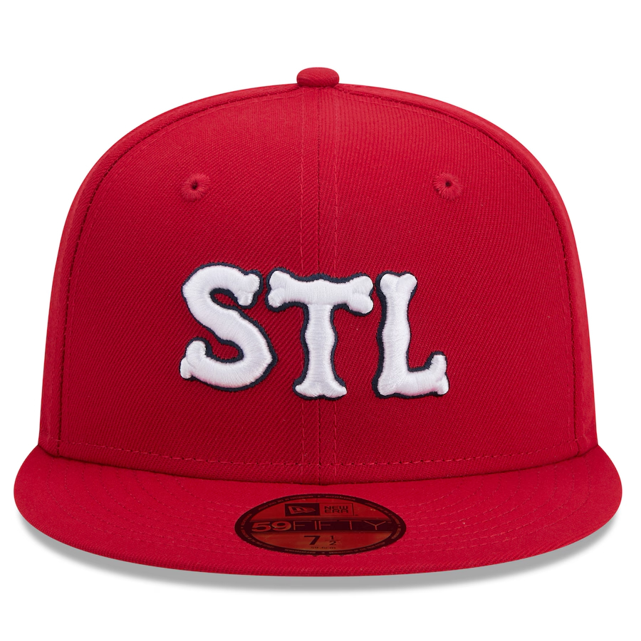


We feature a solid red cap with an STL in white and thin navy outline. This STL lettering harkens back to the 1920 jersey lettering, and even the alternate jersey worn in 1922. The biggest difference with the cap lettering is that it isn’t arched, it all sits horizontally straight across. I think an arched lettering would have been a little nicer touch, while the flat letters seem a little generic and boring. There are plenty of other STLs in our historic collection that would have been nicer to see on the cap. Plus, I think the importance of an interlocking STL emblem is paramount when the only stipulation for these uniforms is connecting the team to the city. This team is represented by two main icons, an interlocking STL monogram, and the Birds on the Bat. That’s it.
Moving down to the jerseys…

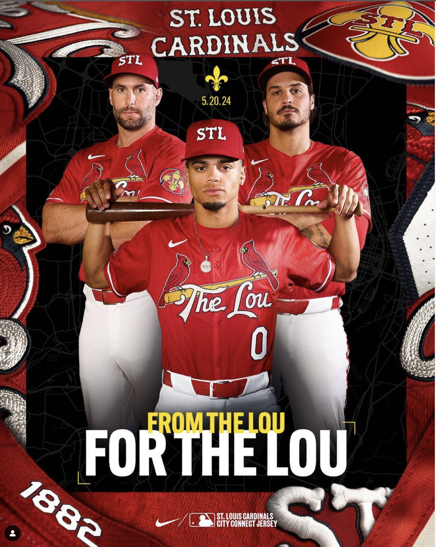


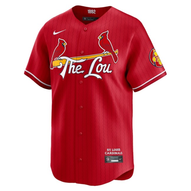
The jerseys are red. When these uniforms debut on Friday May 25th, 2024, it will be only the 2nd time in the Cardinals history, (143 seasons) that they have worn a red shirt in a regular season game. The only other time was for a Shirts Off Their Back and MDA promotion in 1999.
Looking closer, the shirt has very subtle pinstripes in a wavy lines pattern which represents our two big rivers, and how they’re depicted on the flag of St. Louis. I think the pinstriping is surprisingly tasteful. There were probably a handful of ways to make those stripes look really ugly, like putting them in white, or making them too thick, or who knows, but what is rendered on the shirt is subtle, tasteful, and doesn’t interfere with the Birds on the Bat.
Speaking of the Birds… Luckily we have the Birds on the Bat, and the design of the birds themselves was not tampered with. Instead of reading Cardinals or St. Louis, we get a familiar phrase in The Lou under the bat, styled in similar letters to our standard script. Note that the Birds and Bat has a thin white outline around them, while the lettering is rendered in white with a blue outline, and no further white outline around the letters.
At the ends of the sleeves we have white piping. ALSO at the end of sleeve, look carefully, there is another wavy line river pattern running horizontally/parallel with the ends of the sleeve. Interesting touch.


On one sleeve is the advertising mark with its colors reversed compared to our other four uniforms, and on the other sleeve we have a brand new logo. Interesting logo, not really excited about it. Yellow fleur de lis, red STL, blue Arch. Just ok. Really reminds me of a soccer logo for some reason.
While I don’t have any good photos of the pants… the pants luckily are white. I won’t even mention alternative pant colors and how bad that could have been. The piping on the seam of the pants has a unique detail. It is meant to represent the piping of the Cardinals in the 1940s when they used something called a soutache braid. The team actually started wearing the soutache braid as apart of the 1938 uniforms, but most people identify it best with the 1940s teams. It is a rather wide red pipe that ran along the sleeves, chest, and shoulders of the 1940s jerseys, along with the belt loops and down the pant seams. The soutache braid piping was worn up through 1950 before being replaced with thinner piping in 1951.
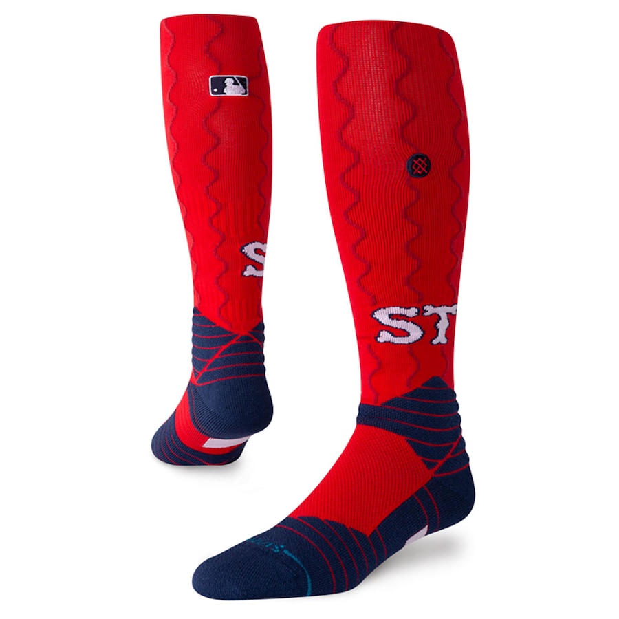

The socks are odd. Same wavy river pinstripes running vertically with the socks. Kinda odd there. most often times you see sock piping running horizontally around the leg, while these move up and down the leg. the STL from the cap is printed on the sides of the socks, with the blue ankle thingy that Stance adds to every pair of socks.
Um so yeah I kinda like these? Hate to say it, but these aren’t bad. I’ve seen a lot of hateful comments on the internet, I’ve seen a lot of comments that say this design is very safe. I’ve seen a lot people saying the anticipation wasn’t worth it. Well… My expectations were 6 feet under, and I was very pleasantly surprised with these, especially considering a lot of the other City Connect crap that’s been out there.
Yes, there are of course issues with these. There are lot of tweaks that could be made to better refine these uniforms, but all things considered, and that includes Nike forcing this concept onto us, I think we have something decent here when you factor in the circumstances.
