
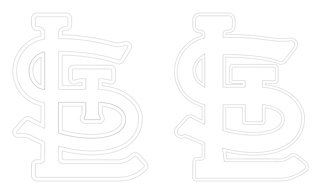
NewEra who makes all the caps for Major League Baseball, as well as all of the special occasion caps, has in past years used either the wrong STL emblem for these special occasions, or for some reason used a modified STL emblem that looks close, but is not the authentic/official STL emblem.
I saw photos of NewEra’s 2026 Independence Day caps and immediately noticed they are using a modified STL emblem that is not authentic to our official logo. Scroll through to see photos and drawings of the comparison.
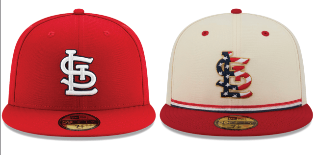
Zoom in on the cap photo above, and specifically look at a few points…
– the S at the top and bottom has been modified with less curvature and different serifs
– the T has lost it’s stylization completely and is shown in a Flat T
– the entire logo is thicker and has imbalanced negative space
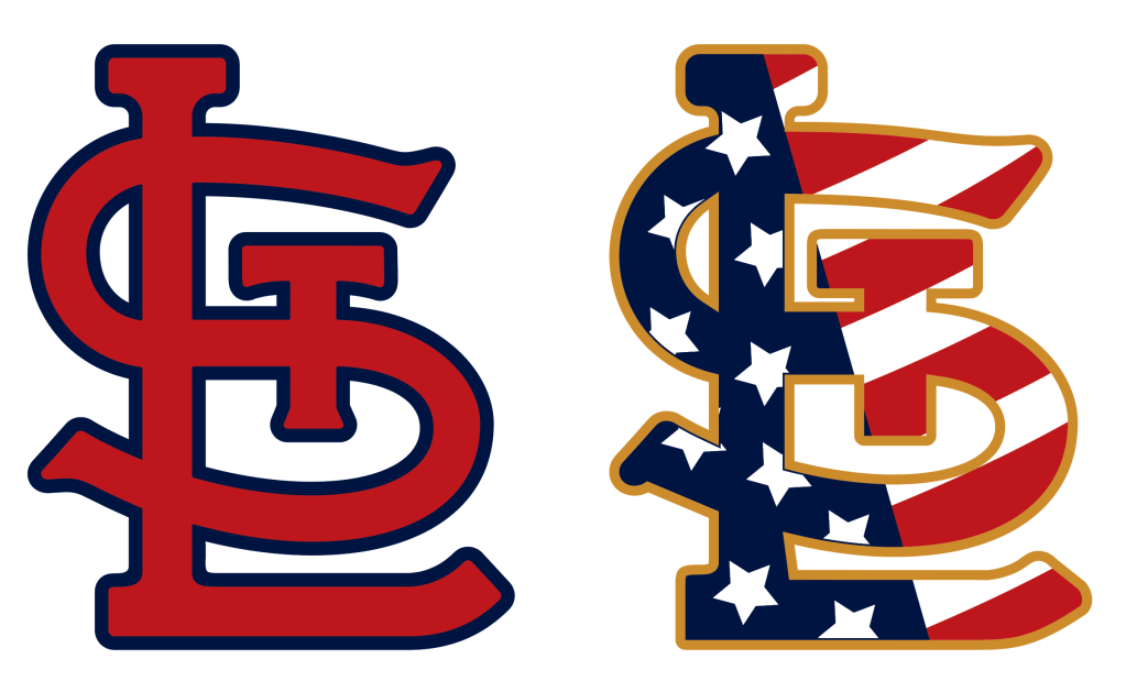
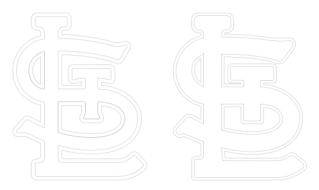
Above you’ll see the two logos drawn. Take a look at the same points.
Below you’ll see the two logos in outlines.
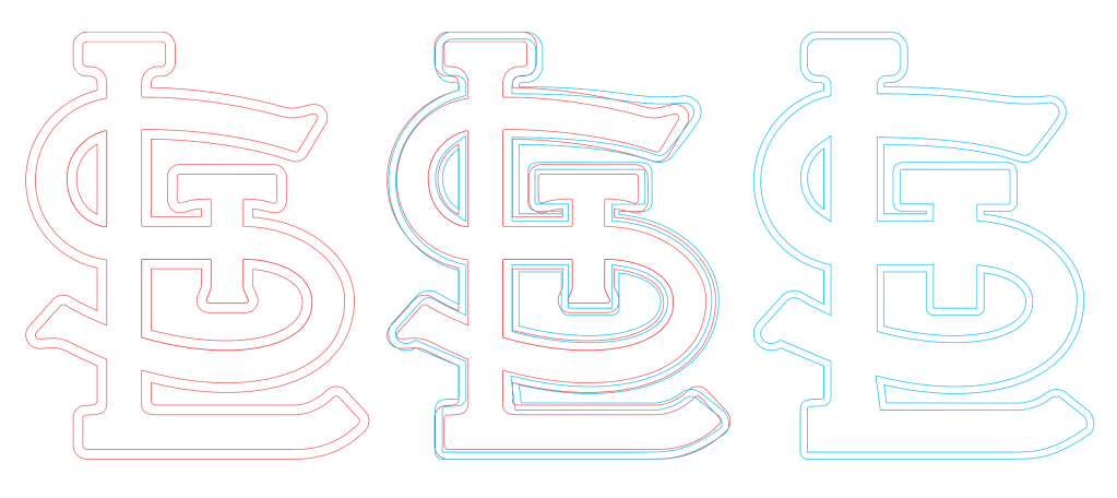
Center: Overlayed logos
Right: NewEra Independence Day STL outline (blue)
So what’s up NewEra?
Is this a conscious choice by NewEra?
Is the STL logo being modified by some NewEra graphic design employee to make your pandering-cash grab-desecration cap look the way they need it to?
Is this going to be a Nike/Fanatics situation where NewEra tries to blame this on quality control with their Chinese, or other foreign country, production facilities?
Is NewEra unaware of the situation?
Is anyone even reading this?

reading and appreciating all your hard work and details!
LikeLike