
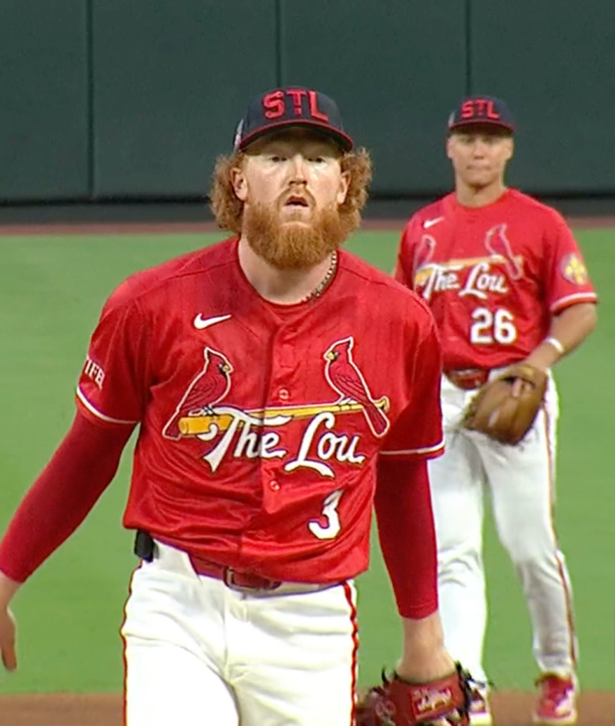
The Cardinals, along with all teams in MLB, are wearing “throwback” caps for Hall of Fame Induction Weekend. Last year the Cardinals wore a contrived and inauthentic bird on their cap. Considering that we have provided MLB with a completely detailed style guide in their own format that includes all authentic Cardinals graphics from our history, it shows how lazy and unintelligent MLB (and NewEra) can be by putting inauthentic merchandise on the field just to make a quick dollar.
This year the Cardinals wore a throwback cap with a historically accurate logo. This logo is a bit of a history mystery, though. The exclamatory STL logo was worn exclusively in the year 1940, but the team also wore a more “traditional” interlocking STL in 1940. We have a handful of photos of players wearing the Exclamatory Block STL, but we do not know its purpose or designation. Was it an alternate cap? Was it a road cap? Unfortunately we have no written documentation or other information on this cap.

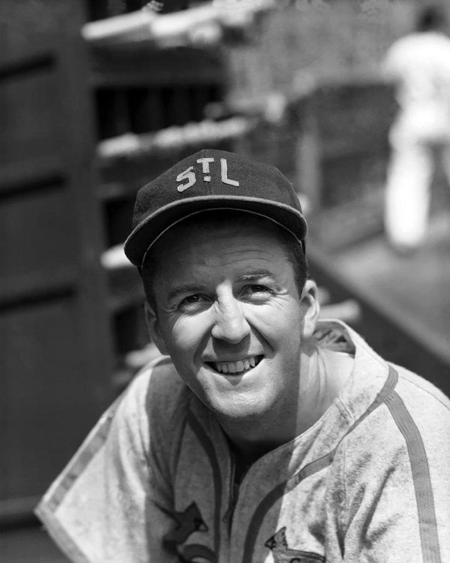
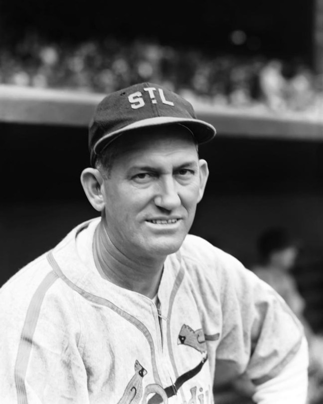
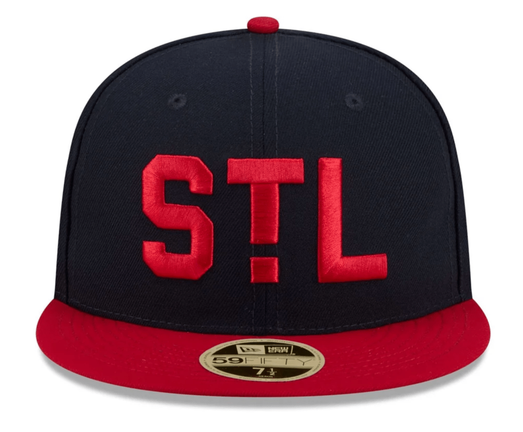
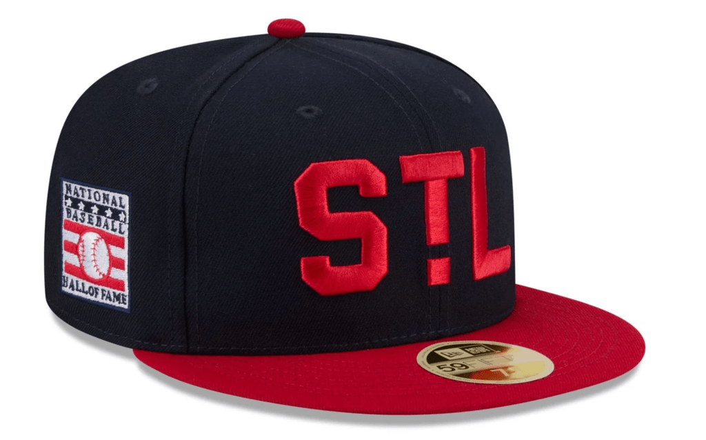
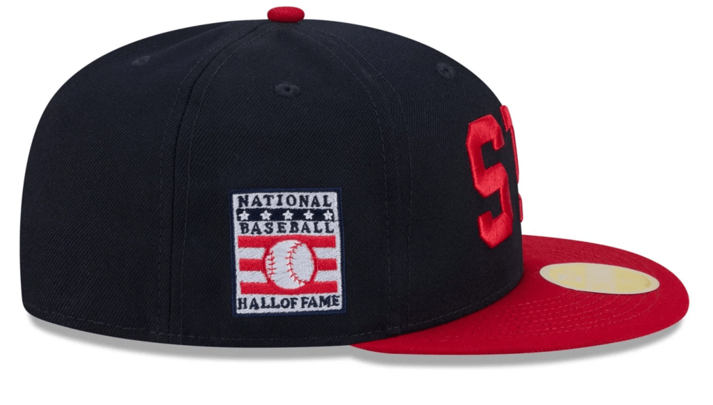
Comparing the authentic 1940 cap to the modern recreation, there are two main notable differences. One is the method in which the emblem is applied to the cap, and two is the size difference.
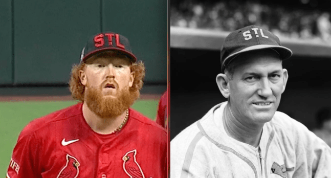
In 1940 the emblem was cut out of felt letters and sewed on to the cap around the edges of each letter.
In 2026 the emblem is applied the same way modern baseball cap logos are stitched, raised satin stitch embroidery.
In 1940 the emblem’s letters were cut out fairly small, but balanced in the space of the cap’s crown.
In 2026 the emblem is comically large. It dominates the entire front of the crown, looking enormous on the TV broadcast.
Pros and cons of this promotion…
PRO: At least MLB/NewEra chose an accurate and authentic logo.
CON: The logo doesn’t look authentic because the enormity of the letters.
This example of a throwback is why showing the entire uniform, not just the logo, along with historical photographs to corroborate is of critical importance to understanding what was actually worn and how to make a better tribute to what was worn in the past.
These caps, they’re a joke, the logo is enormous. It’s not a good representation of what was worn in 1940. It feels like some one in MLB or NewEra’s graphics department chose that logo with no consideration to what it actually looks like on a cap.
.


One thought on “Hall of Fame Weekend 2026”