
Big thank you to Phil Hecken at Uni-Watch for cross posting this article. With the RICkW0OD Field game coming up this month, I wanted to envision some modern throwbacks that accurately reflect what the St. Louis Giants and St. Louis Stars actually wore.
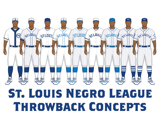
I’ve heard the Cardinals are slated to be the home team in Alabama, so I mocked up a group of 9 home uniforms that I believe would look better than the fabrication throwbacks the Cardinals have worn in years past.
Click images in the gallery to expand, and scroll down to see more details and logos. A quick note, these uniforms all use the old pre-2024 uniform template, for obvious reasons. I also decided that white shoes just look cool with these sets.


For the images below, the image on the left is the modern adaption concept, the image on the right is the research we have done to try and depict the uniforms worn as accurately as possible. Please note, these uniforms and logos are best approximations based on a scarce number of photographs. Years, colors, logos, and uniform styles have been approximated. We welcome any additional photography and newspaper accounts that will help bring the authentic St. Louis Negro League baseball uniforms back to life. If you know about some photographs we don’t know about, we’d love to see them, feel free to reach out on our contact page.
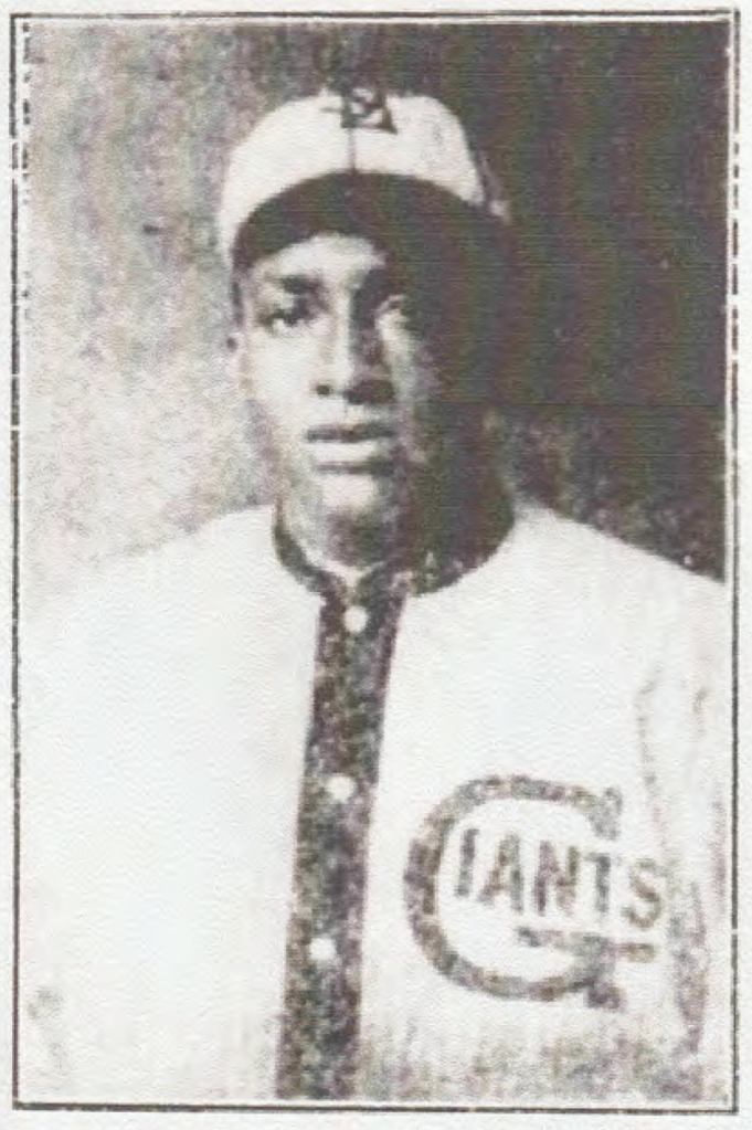
Up first we have the 1910 or the 1911 St. Louis Giants…. Or? Unfortunately we aren’t 100% sure which year this is.
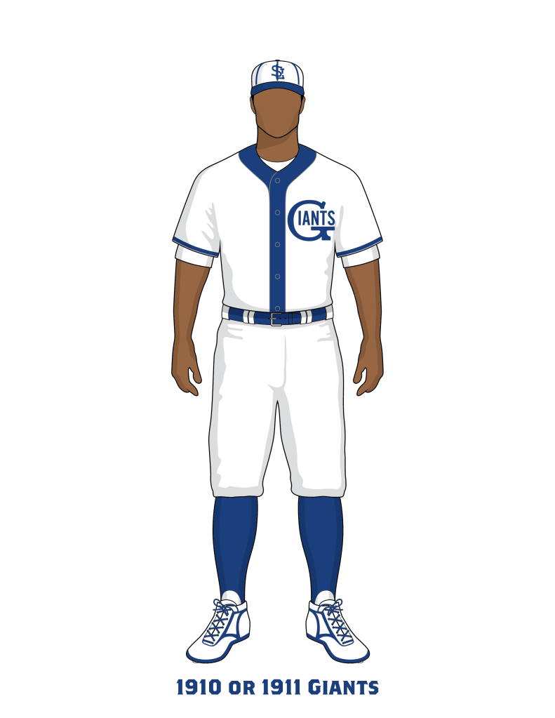

We know there is an emblem on the cap, but we aren’t completely sure what it looked like. Shown below is the closest thing we can decipher from the photography we have.

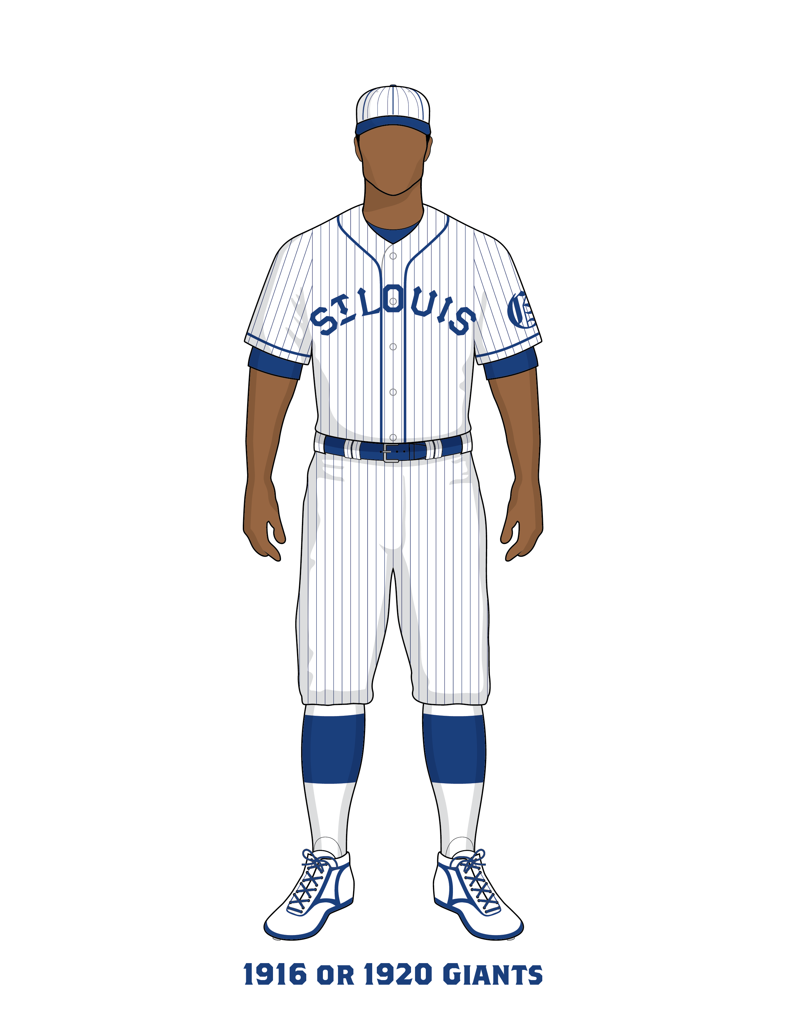
Next we have another St. Louis Giants set from 1916 or 1920.
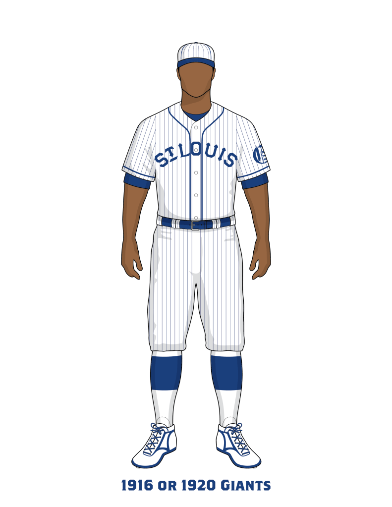

The Old English letter on the sleeve of the uniform is a G… for Giants.


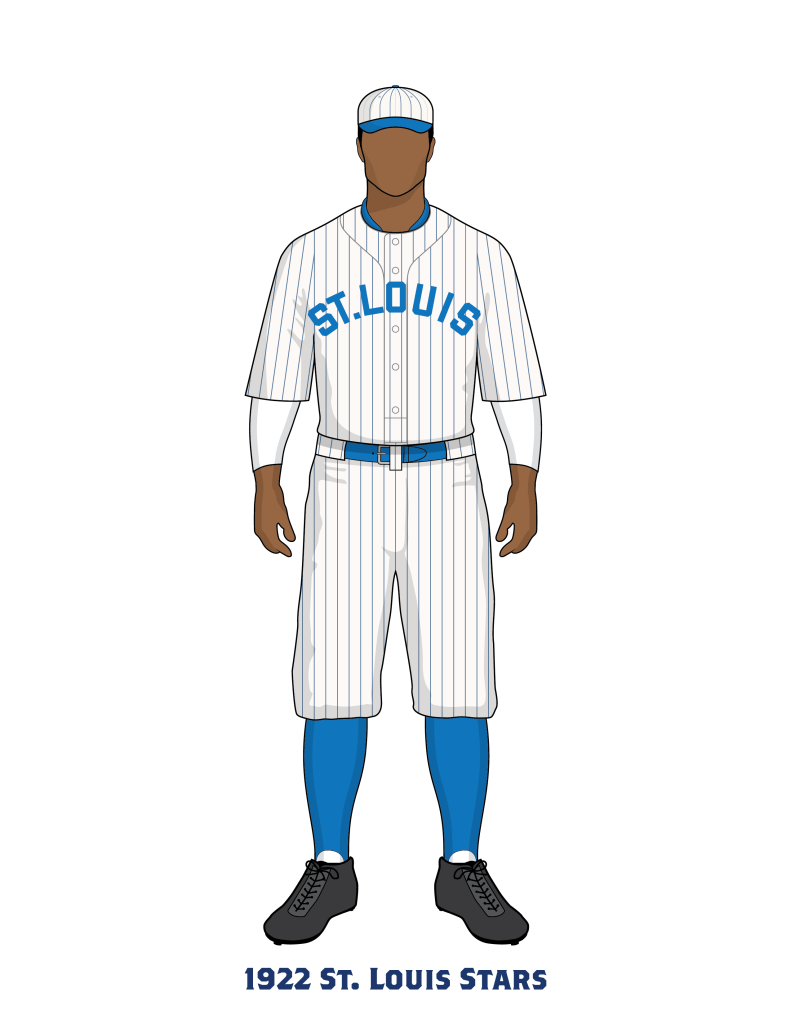
Next up we have the 1922 Stars. These uniforms feature subtle piping around the ends of the sleeve and collar. The piping is blue-white-blue, nearly identical to the piping worn by the Cardinals in 1930 on their Spalding uniforms.


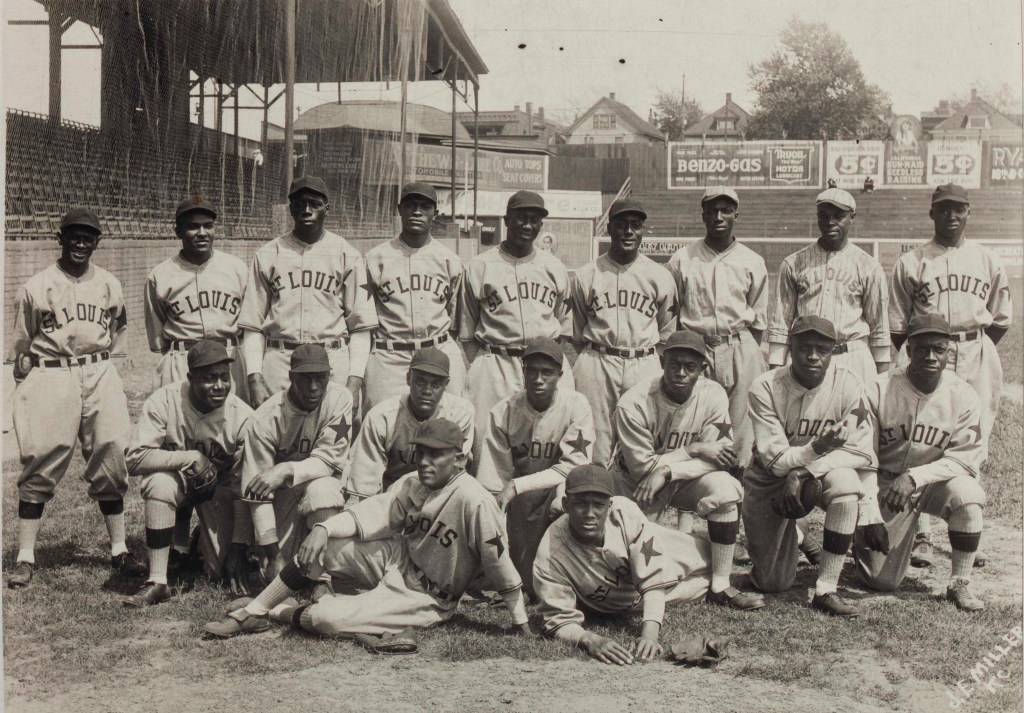
Bonus uniform not included in the gallery at the top of this article. If you look closely at the photograph above, a player in the back row is wearing a different uniform. We think this may be an alternate uniform, it could also possibly be a uniform from a previous season, or even a road uniform. We just aren’t sure, so we’ve lumped it into 1922 as well.


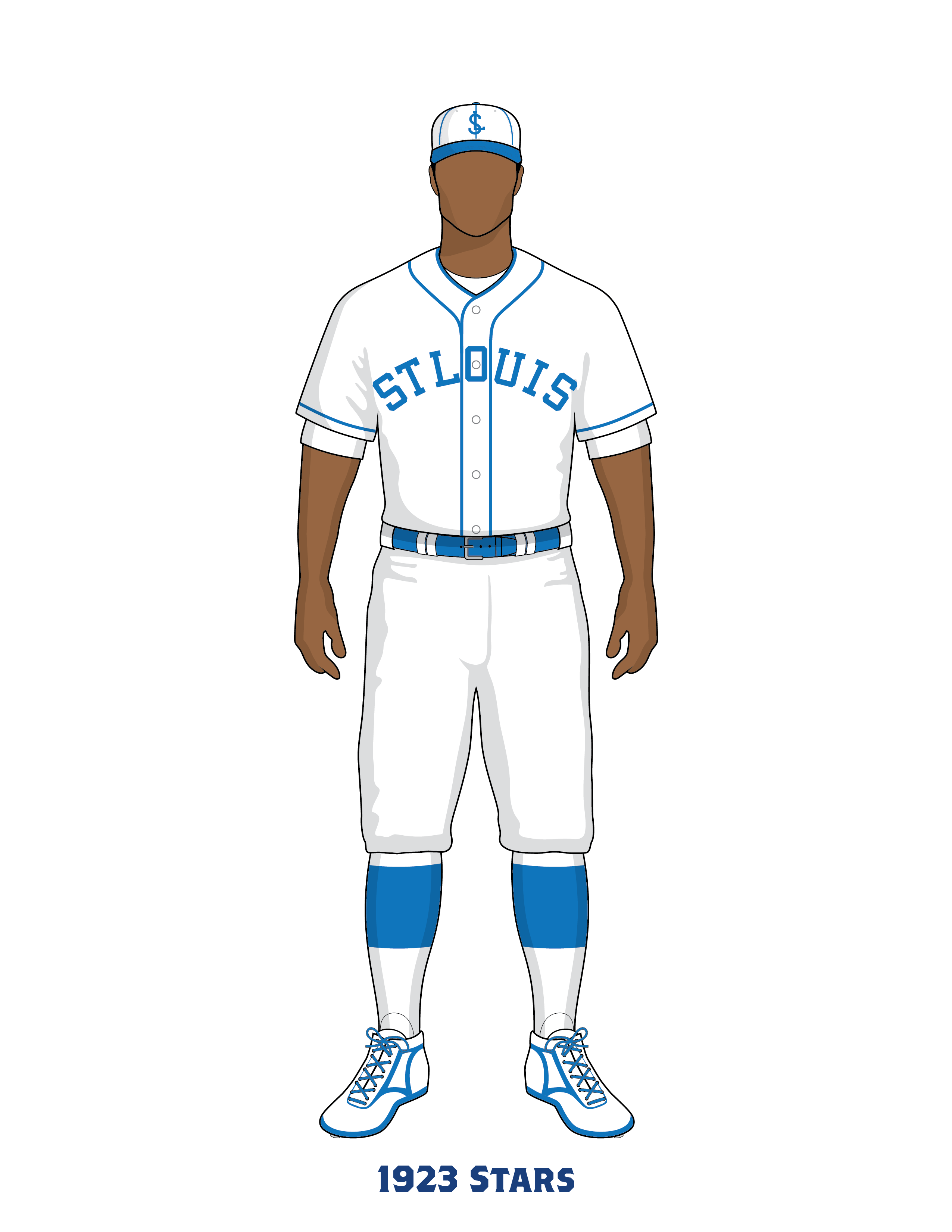
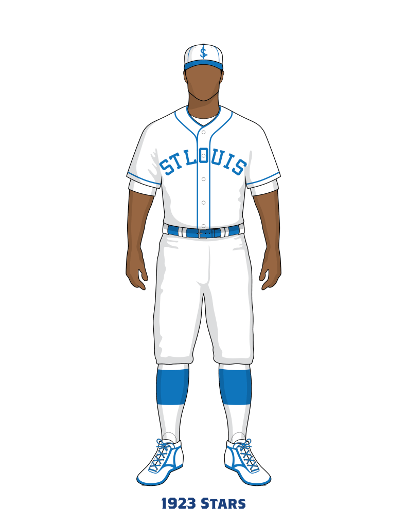
Next up is the 1923 Stars. It’s worthwhile to mention again that the color choices we have made are only approximations. We have not seen any physical samples that would lead us to know if the Stars were a navy team, a light blue team, or if they wore a different color all together.


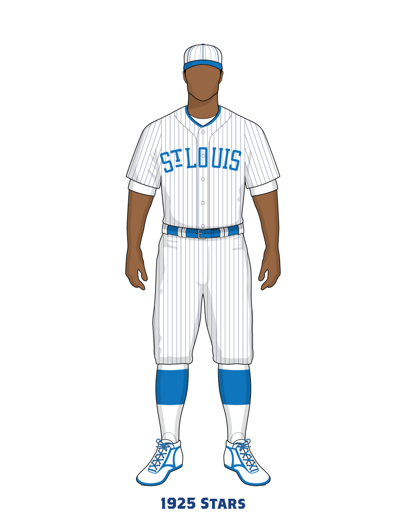
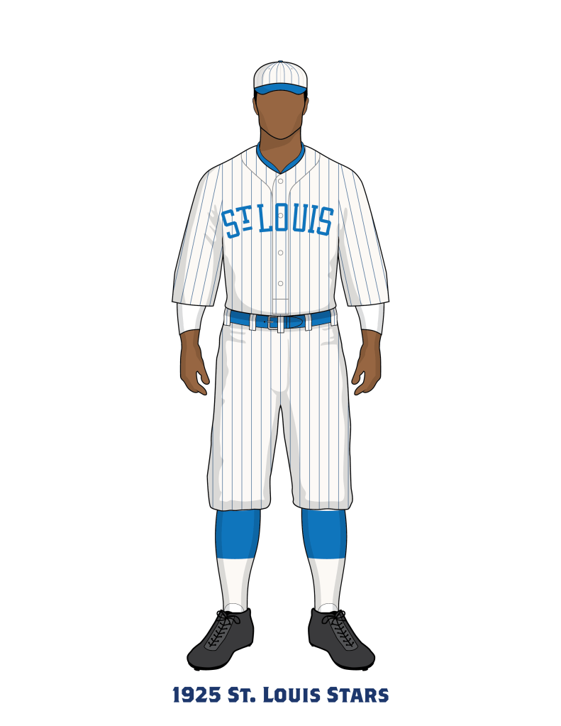
Next up is the 1925 Stars. We have a very tattered photograph, but at least shows us what the lettering across the chest looked like.


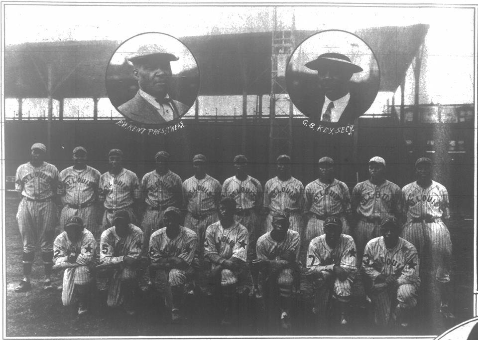
The 1926 Stars used a very simple lettering with a san serif style SL on the sleeve. It is important to note that the source photo (seen below) has a 1930 date put on it by Getty and Rucker. However, we have a team photo from 1930 and some newspaper shots in 1930 showing a different set of uniforms. We are approximating that the team photo below is from 1926.


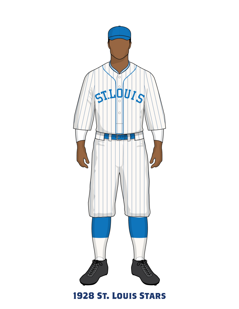
Next is the 1928 Championship Stars. The portrait photo below of Cool Papa Bell is one of the most famous photos of the Hall of Famer, and often has a multitude of different years attached to the photo. Comparing the team photo from 1928 and the Bell portrait, we believe those two uniforms are the same.


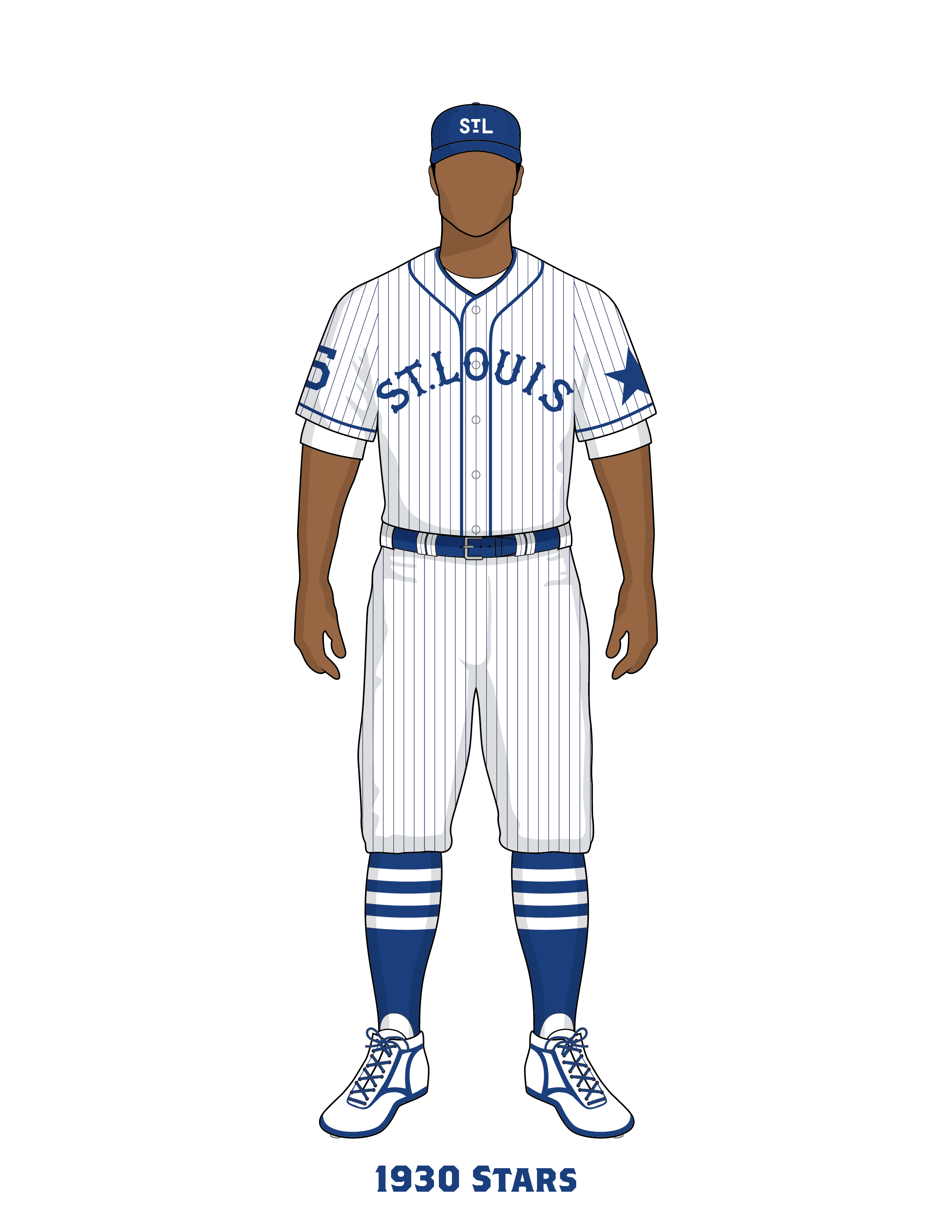
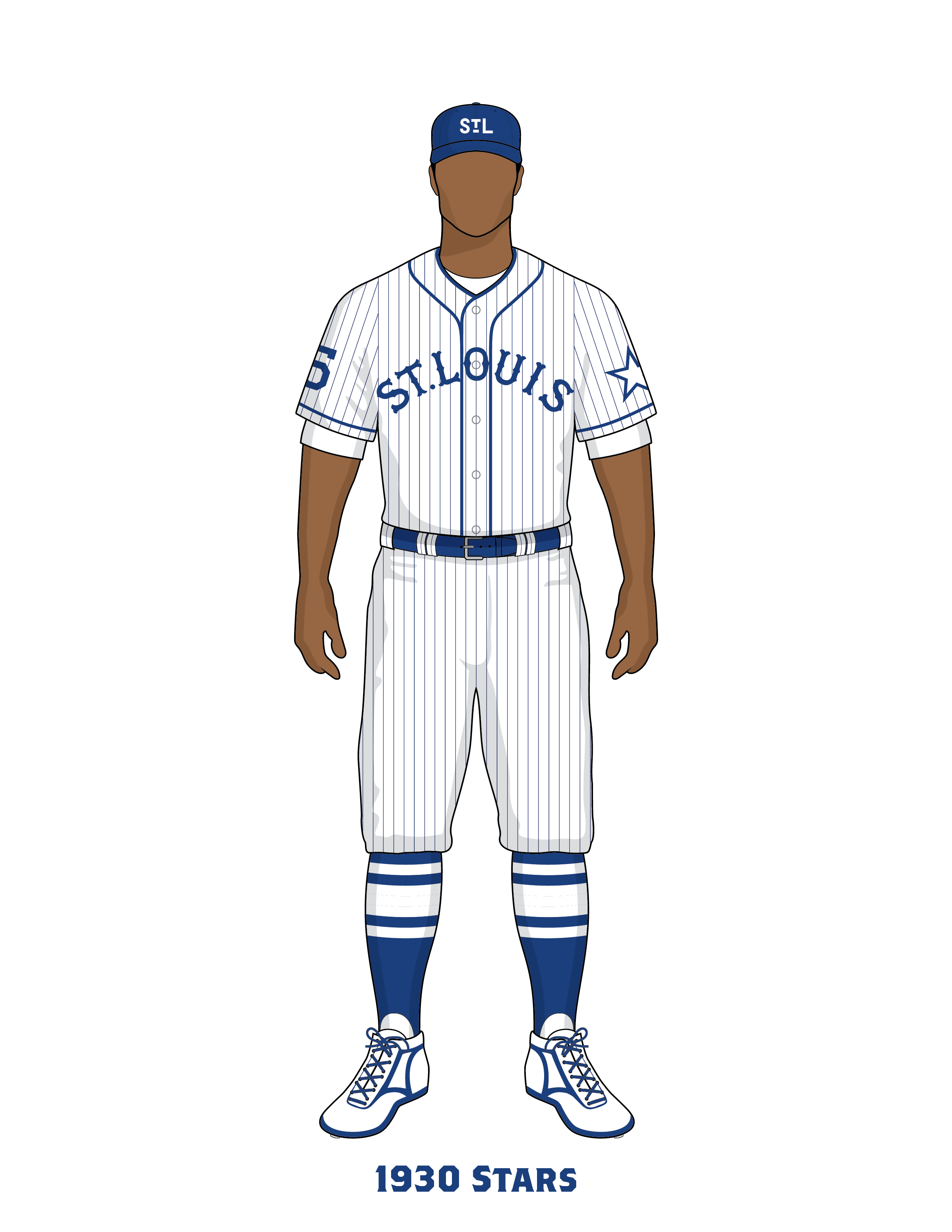
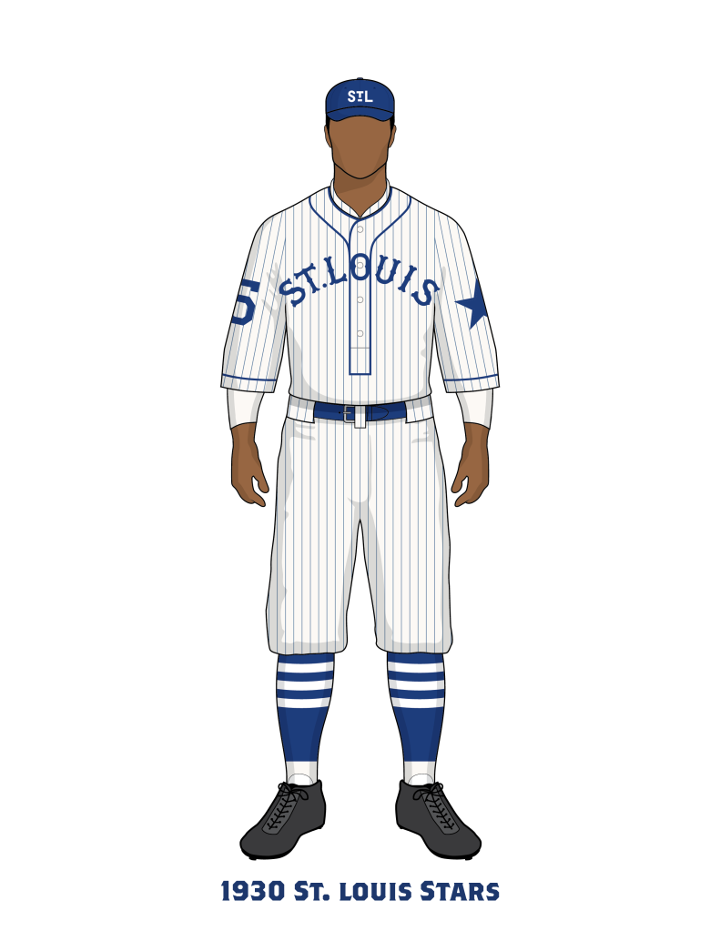
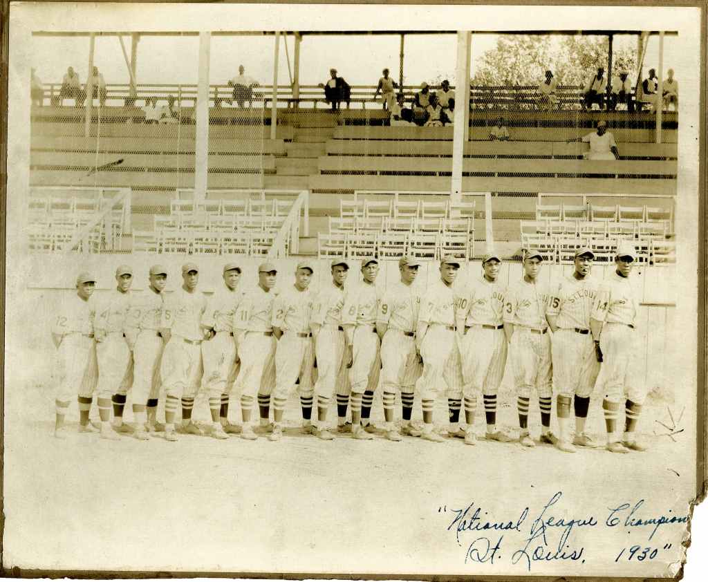
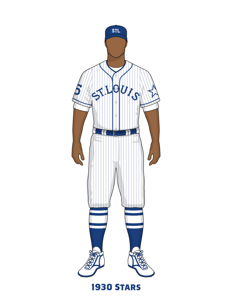
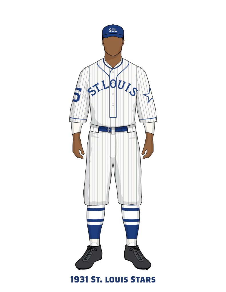
The 1930 and 1931 Stars uniforms are nearly identical, except for the piping on the socks, and the Star patch worn on the sleeve.


And as mentioned before, these uniforms and logos are best approximations based on a scarce number of photographs. Years, colors, logos, and uniform styles have been approximated.
We welcome any additional photography, newspaper accounts, and additional information that will help bring the authentic St. Louis Negro League baseball uniforms back to life. If you know about some photographs we don’t know about, we’d love to see them, feel free to reach out on our contact page.
