

Why does a team make uniform changes? And why does the team sometimes wear a specific design for only a single season? A recent Reddit thread prompted us to write this.
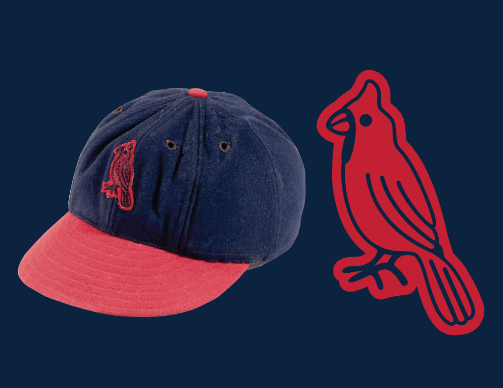
The user on Reddit asked why the Cardinals wore a bird on their cap in 1941, and then abandoned it the very next season. Unfortunately, we don’t exactly know why. But, we do know that this is not a unique situation. Countless times throughout the team’s history they have worn a design for only one or two seasons. Some of these we know exactly the reason why a change was made, and other times we have no clue.
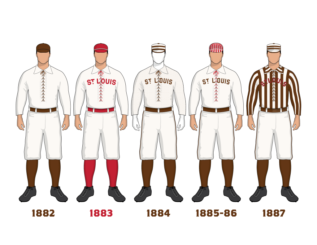
If you look at the 19th Century, the uniforms seemed to change every year. In 1882 the Browns wore different colored caps to differentiate the positions they were playing in the field. 1883 they weren’t even the Browns. The team changed their color and brand to red in 1883, only to be ridiculed by the media and change back to brown in 1884. In 1884 they wore a polka dot shirt. In 1885 and 1886 they wore hats with red vertical stripes on them. In 1887 they wore a referee style striped shirt. And these few examples are just the tip of the iceberg when talking about how many total changes the Browns went through before becoming the Cardinals. We didn’t even mentioned all of the alternate uniforms.
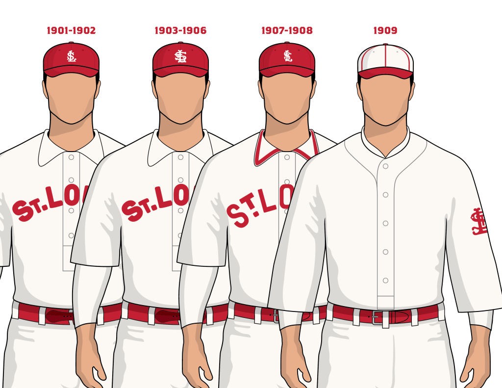
Looking at the 20th Century, the year-by-year change in uniform trend continues. The Cardinals debuted a new SL logo to wear on the cap in 1901, and wore it through 1902. In 1903 they changed it to a new STL design. And in 1907 changed to a different STL design. And in 1909 changed to another STL design, but worn on the sleeve. That’s 4 emblems in the span of 9 years.
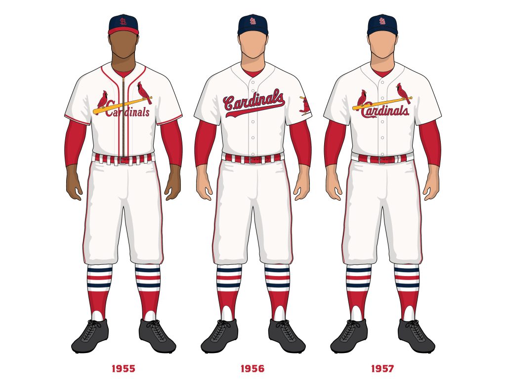
In 1922 the Cardinals introduced the famous Birds on the Bat. The very next season in 1923 the Birds on the Bat was a completely different design. And in 1924 another design. And in the 1926 World Series another Birds on the Bat design. And in 1927 and 1928 it was just a single bird on bat. And in 1929 and 1930 there was three different Birds on the Bat. It wasn’t really until 1933 that the Birds on the Bat design went mostly unchanged through 1948. But then again in 1949 we saw a new Birds on the Bat design. 1951–1955 had its own design as well.
We could go on and on and bring up countless examples of this. So with that in mind, the 1941 bird isn’t exactly unique in terms of the team making changes year to year. But the question is still, WHY? Why do these designs exist for only one or two seasons? Why does the team experiment with these things during regular season games? Who gets to decide?
We came up with a few examples throughout history where we know for a fact why the Cardinals made a uniform change. And perhaps these examples can at the least give you some ideas as to why the Cardinals make design changes throughout their history.
Prior to the 1956 season Cardinals General Manager, Frank Lane, decided that 2 birds perched on a bat was old, no longer relevant, and thought the uniform needed to be modernized. Lane made an executive decision to remove the Birds on the Bat from the uniform and replace it with cursive script lettering across the chest. The change was met with serious outrage from the fans and media. So much so, that the Birds on the Bat was restored in 1957. In this case, we see an executive, the team’s general manager, making decisions about what the team should wear.
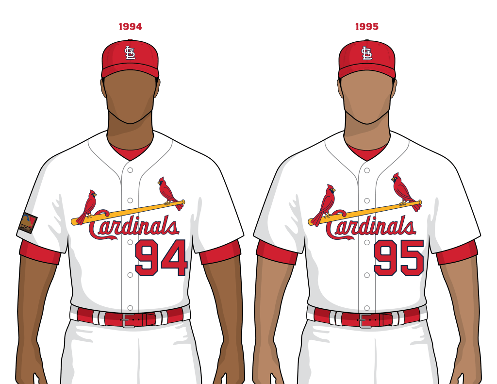
In 1993 or 1994 Cardinals President, Mark Lamping, made an observation that the Birds on the jersey had become noticeably smaller. The shrinking of the birds wasn’t a conscious change, it was an accidental change because of the way the birds were hand embroidered onto the jersey. So after some discussions with graphic designers, Lamping made the decision to enlarge the birds to ensure they appeared more prominent on the jersey. The change went into affect in 1995. Again, similar to 1956, we see a team executive who noticed something they didn’t like about what was happening to the uniform, and decided to make a change.
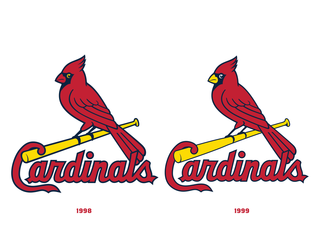
Beginning in the DeWitt ownership era around 1996-1997, Cardinals executive Bill DeWitt III took the team through a major rebranding. This rebrand included new logos, print graphics, and new Birds on the Bat for the uniform. During discussions for the rebrand, DeWitt III’s primary graphic designer at the time made an argument that the Birds should have red beaks instead of yellow beaks. The Cardinals had never used red beaks as far as we knew, but the main argument was, real cardinal birds have red beaks, not yellow. The red beak argument won, and the first iteration of the new design, which appeared on the uniforms only in 1998, featured birds with the anatomically correct red beaks. But after looking at it for an entire season, Dewitt III decided that he preferred the traditional yellow beaks, and made the change back to yellow for the 1999 season. Once again, team executive wants change, makes change.
Prior to the 2019 season, Bill DeWitt III started to take a closer look at the team’s STL emblem and had some concerns. His biggest gripe was that the logo wasn’t symmetrical and had odd negative spaces between the interlocking letters. He worked again with his graphic designer to make sure that the serifs and line weights were consistent, and that the edges were rounded off and smoother, creating a more harmonious and balanced STL logo.

In all three of those examples above from the modern era, a uniform change or a brand change has come from the Cardinals’ team president. In older cases like the 19th Century, the uniform changes were likely made by Von der Ahe, the team’s owner. Frank Lane was the team’s general manager and he was able to make a uniform change. Imagine in today’s world if John Mozeliak and Mike Girsch got together to announce that they were making a major uniform change.
So why did the 1941 bird exist and why was it abandoned after a single season? We don’t know exactly why, but we can start to take some guesses based on the previously discussed uniform changes in Cardinals history.
In 1941 Sam Breadon was the owner of the Cardinals, and had been apart of the Cardinals ownership since 1917. During his ownership, Breadon’s most famous executive and partner he worked with was Branch Rickey. Rickey gets most of the credit for implementing the famous Birds on the Bat for the first time in 1922, but let’s not forget Breadon was majority owner at the time. Breadon and Rickey continued to work together through 1942. And between 1922 and 1942, the Cardinals made numerous uniform changes, both big and small.
By our count, the team wore about 30 different uniform kit designs in that time period. That includes 9 different cap designs, 7 different STL logos, 18 different Bird designs, 22 different jerseys, 11 of which were pinstriped, and 14 different sock patterns. Yes, that’s all within a 20 year period.
Sam Breadon died in 1949, and near the end of his life sold his stake in the team to Fred Saigh in 1948. Can you guess what Fred Saigh did in 1949? He rebranded the team with a new Birds on the Bat design and all new print graphics for the Cardinals front office.
So there you have it. A new owner, a new design. And sometimes also we get an executive within the organization who takes the time to care and understand how the team looks on the field. Sometimes that executive might be a little crazy and might make changes for the sake of changing things, or makes trades for the sake of making trades, Frank… But sometimes there is a necessity for modernization, adaption, and evolution, all of which are a natural part of life and art, and how a team’s brand exists. The 1941 bird may have just been another casualty in a long list of uniform changes being made throughout the 1920s, 30s and early 40s.

I have always wondered why 19th century team changed uniforms almost annually, sometimes within the season? Did the uniforms experience so much wear and tear that it necessitated the changes? And why change the design, too? Wasn’t that expensive, even to the major league teams?
John McGraw was the one manager who carried this custom into the 20th century; the Giants changed almost annually, and sometimes radically, even, one year, going with a purple plaid outfit!
I have a 1956 Cardinals road jersey, with the script logo. I’ve read one story that the team thought the Dodgers style looked very appealing, hence the change. Maybe they thought they could emulate Brooklyn’s success. The Cards in the 50’s weren’t so good…
LikeLike
Our rough understanding is the uniforms would not hold up well throughout the season, and that Von der Ahe or a team reprepsentative would either go to a sporting goods manufacturer such as Spalding, or have a salesman come to them to show them new products and fabrics. As to why the design changed, we aren’t sure. We do know that the team did face some criticism in 1898 for their uniforms looking so poor and tattered. We think that Von der Ahe was so bankrupt that year, that he decided to recycle the same exact uniforms worn the previous season.
LikeLike
Not related to this specifically, but relating to Cardinals caps …
The Cardinals are currently wearing the red caps on the road vs. the once again red-capped Diamondbacks. This goes against the “Blue vs. Red” policy the club loosely instituted for road games in 2013 after a fan vote (which went in favor of navy caps being the primary road lid) was held.
This policy has never been clearly defined, nor followed with any degree of consistency. The last few years especially have been all over the place. From 2014-2020, it seemed the policy was (mostly) that if the home team wears red caps as their main home dome cover, the Cardinals would wear the navy caps the whole series. Since 2021, it seems like the policy is closer to, “If the possibility of the team we are playing wearing a non-red cap exists, we’re gonna wear the red.”
Here is a complete breakdown (excluding Powder Blue Saturdays) of when the Cardinals have gone Red vs. Red, and Navy vs. Non-Red since 2013.
Red vs. Red Teams/When Opponent Wore Red Caps:
April 1-3, 2013 – @ Arizona (Diamondbacks red caps and helmets all three games)
April 22-23, 2013 – @ Washington (Nationals red caps and helmets all three games; red caps and helmets presumably used by Cards because they had just worn the navy caps at Philadelphia the previous series, and God forbid they wear them in consecutive series)
April 13-14, 2019 – @ Cincinnati (played in Mexico; Cards claimed they went Red on Red so they didn’t have to take two sets of caps and helmets over the border)
April 18, 2021 – @ Philadelphia (Phillies wore their primary red caps and helmets)
April 19-21, 2021 – @ Washington (Nationals wore red caps/helmets 4/19, and their tri-colored caps with red helmets 4/20-4/21)
July 3, 2022 – @ Philadelphia (Phillies wore white and red 4th of July caps with red helmets; Cards wore white and red 4th of July caps with red helmets)
August 21, 2022 – @ Arizona (Diamondbacks wore red caps)
June 5-7, 2023 – @ Texas (Rangers wore their red alternate caps and helmets all three games)
June 19, 2023 – @ Washington (Nationals wore red caps and helmets)
April 12, 2024 – @ Arizona (Diamondbacks wore red caps and helmets)
19 Red vs. Red; Once for Holiday Purposes
——–
They have gone Navy vs. Non-Red Teams OR When Opponent Wore Blue Alternate Caps:
August 22, 2014 – @ Philadelphia (Phillies wore blue alternate caps)
August 28, 2015 – @ San Francisco (coming off a sweep in the navy caps at Arizona, Cards continue to wear navy caps out of superstition)
May 27; 29, 2016 – @ Washington (Nationals wore navy alternate caps those two games)
April 12, 2017 – @ Washington (Nationals wore navy alternate caps)
June 17-18, 2017 – @ Baltimore (wore light blue Father’s Day caps with navy road helmets)
July 2-4, 2018 – @ Arizona (wore navy 4th of July caps and regular navy road cap helmets; Arizona wore red 4th of July caps and black helmets)
September 4, 2018 – @ Washington (Nationals wore navy alternate caps)
April 30, May 1, 2019 – @ Washington (Nationals wore navy alternate caps)
2019 NLCS Games 3, 4 – @ Washington (Nationals wore navy alternate caps)
August 21, 2021 – @ Philadelphia (Phillies wore blue alternate caps and helmets
August 27, 2023 – @ Philadelphia (Phillies wore blue alternate caps and helmets)
17 navy vs. non-red caps; Five for Holiday Purposes
It’s also worth noting September 22, 2020 at Kansas City. Both teams wore Negro League throwbacks; Cards wore block white STL on navy cap and regular navy road cap helmets; Royals wore KC Monarchs throwbacks with red caps and helmets.
——
The lack of consistency I find frustrating. Personally, I greatly dislike the red and gray road combo, and want the navy caps restored as the primary lid for road games. I associate the Cardinals and red caps on the road with the sans-a-belt pants/pullover jersey look, which I hated. But, considering that Bill DeWitt III does not like the navy caps, I doubt it’ll never happen. However, wearing the navy caps fewer times per year than the Saturday Road Pajamas is a fucking crime.
If the Cardinals can haul an entire alternate uniform to a city like Cincinnati where they wear the navy road caps, why can’t they bring the navy caps and helmets to a place like Washington or Texas?
Why not do the inverse of what the Cards currently do, and instead of Navy vs. Red teams, they wear Red vs. Blue Teams? You would end up with a nearly 50/50 split of Navy and Red capped road games, which is much closer to reflecting the actual results the fans asked for back in 2013. If you’re taking both sets of caps on each trip, when you play teams like Arizona, Washington, Philadelphia, Texas (and now the Angels) that have both red and blue caps in their home catalogue, you can coordinate your cap based on what the opposition is wearing that day.
End of rant.
LikeLike